

Can’t figure out why your product catalog looks off? Check the background before you touch the product. The background determines whether your product images can hook customers.
White is the most common background color for e-commerce product photography, especially for marketplace main images. But light gray, off-white, beige, black, pastels, and muted brand colors can work better depending on your product’s color, material, finish, and where the image will appear.
A poor background choice leads to inconsistent listings, extra retouching hours, and delayed marketplace approvals. That’s why most sellers default to pure white unless there’s a specific reason not to.
This guide breaks down which product background colors to use, when each one works best, and what technical risks to check before you approve a product catalog.
One weak image can disrupt the whole catalog. Keep every product clean and consistent with our Ecommerce Image Editing Services.
Quick Background Color Selection Table
| Product or Use Case | Starting Background | Reason |
| Marketplace main image | Pure white | Compliance and catalog consistency |
| White or cream product | Light gray or warm gray | Better edge separation |
| Black or dark product | Off-white or pale gray | Preserves dark details |
| Clear glass or transparent plastic | Controlled gray or tonal gradient | Defines transparent edges |
| Jewelry or polished metal | White, gray, or black depending on image role | Controls reflections and mood |
| Natural or handmade product | Beige, cream, or warm neutral | Supports material character |
| DTC campaign image | Muted brand color | Builds visual identity |
| Social media ad | Brand color or complementary color | Creates stronger feed contrast |
Treat this table as a starting point for your own decisions, not a fixed rulebook. Your lighting setup, product finish, and brand guidelines can all shift the right call.
What Are the Most Common Background Colors for E-commerce Product Photography?
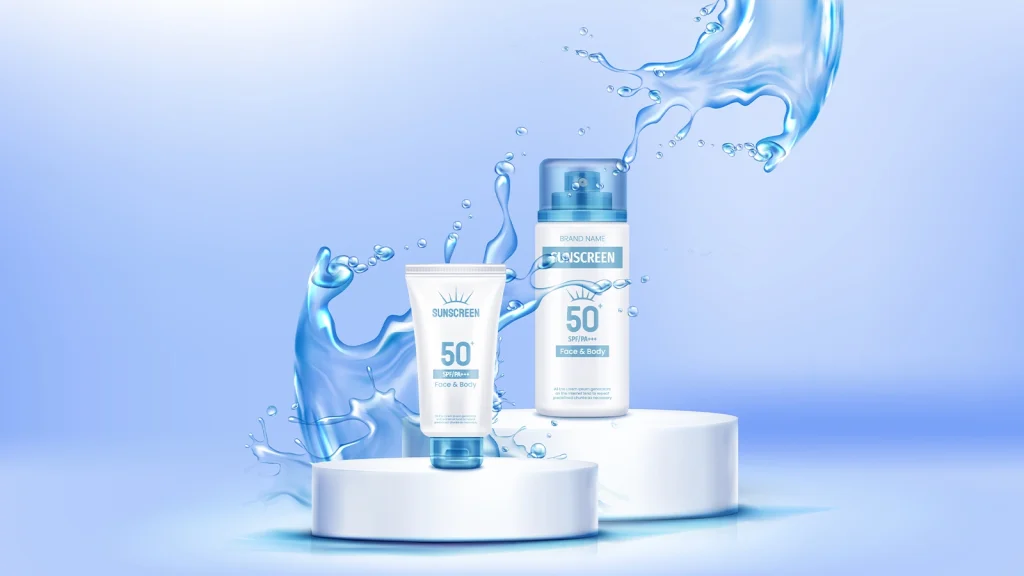
The product photo background colors you see most often are white, light gray, off-white, cream, beige, black, pastels, bold campaign colors, and muted brand colors. Each one changes edge contrast, warmth, perceived value, and how much attention your product pulls. Here’s how to think about which one fits your catalog:
| Background | Typical Strength | Best-Fit Uses |
| White | Clean, universal, easy to standardize | Marketplace main images, catalog grids, product pages |
| Light gray | Adds soft tonal separation | White products, electronics, cosmetics, jewelry |
| Off-white, cream, beige | Creates warmth and a natural tone | Beauty, wellness, home décor, handmade goods |
| Black or charcoal | Adds depth and a premium mood | Jewelry, watches, leather, fragrance, electronics |
| Pastels | Feels soft and approachable | Beauty, baby products, fashion, seasonal collections |
| Bold colors | Wins attention quickly | Social media, paid ads, launches, youth-focused campaigns |
| Muted brand colors | Supports recognition and consistency | DTC storefronts, banners, email, campaign systems |
Create clean, marketplace-ready images with our Image Background Removal Services.
White
It is the best background color for product photography. It’s clean, distraction-free, and puts the product first. It also keeps every item in your catalog photographed against the same neutral field. Which matters more than most sellers realize once a catalog grows past a few dozen SKUs.
Amazon specifies a pure white background at RGB 255, 255, 255 for standard main images. And expects that white area to stay uniform, with any permitted contact shadow kept subtle and natural. Watch for exposure falloff, mixed light, lens flare, and room reflections.
Any of these can leave a gray or yellow cast that fails a compliance check. If you’re shooting a white product on white, pay close attention to edge definition, or the SKU will disappear into its own backdrop.
Light gray
Light gray background color brings enough contrast to separate white and pale products from the frame, without looking harsh. If you want digital consistency across an ecommerce catalog, ask your team to apply a pale gray sRGB value, something like #E8E8E8 or #F0F0F0, and stick to it.
Treat those as reference points rather than universal standards. The photographed result still shifts with lighting, exposure, material, and how your color management is set up.
Off-white, cream, and beige

Soften the clinical feel of pure white background while adding warmth. These work well where a calm, tactile presentation supports the product story.
The color you use internally matters less than the RGB or Lab values you actually measure and reproduce consistently.
To keep the background color identical across multiple shoots, use the Info panel, a calibrated display, and a physical reference swatch rather than trusting your eye.
- Cool off-white background stays close to neutral and pairs well with blue, silver, white, or clinical packaging.
- Cream background adds more yellow warmth and suits skincare, ceramics, food, and home goods.
- Beige background carries a stronger earthy bias than cream, though the exact values depend on your approved brand swatch.
Black or dark tones
Black or dark backgrounds color for product photos often give a depth and a premium visual position, but they’re the least forgiving color on this list.
Black product photography gets difficult fast, when the product and backdrop share the same luminance, and raising exposure alone usually just turns black into gray. If you’re shooting a dark product on a dark background, plan for rim light, reflection cards, and negative fill so the shape still reads.
Pastels

Background colors like blush pink, lavender, mint, powder blue, pale peach, and soft yellow, give you a gentle setting without the visual weight of saturated color. They still need measurable contrast, though.
A pale pink bottle on a similar pink backdrop might look fine at full size, then lose its silhouette the moment it shrinks to a mobile thumbnail. Adjust the e-commerce photo background’s lightness, saturation, or hue until the product stays clearly readable at that small size.
Bold and bright colors
Specially built for attention, not neutrality, which makes them useful when you need a campaign to stand apart from your standard catalog. Reserve them for that purpose.
Avoid bold background color on glossy packaging, small labels, color-critical products, or any marketplace image that needs to stay clean and compliant.
Muted brand colors
Usually sit in the middle, between neutral catalog imagery and high-energy campaign design. Desaturated blues, greens, clays, peaches, and violets can build recognition without pulling attention away from the product.
If you’re a DTC brand, define a compact set of approved swatches rather than picking a new background color for every shoot. Use a dependable core neutral for most ecommerce product pages and collections, then save the muted brand tones for select campaigns and supporting visuals.
Does your white background product photo reveal dust, rough edges, and uneven shadows?Our Photo Retouching Service cleans every detail for a polished, catalog-ready finish.
Which Background Color Should You Choose for Your Product?

Start with the product, not the trend. Look at its lightness, hue, transparency, gloss, and texture, then choose a background that reveals the outline and material honestly, without shifting the product’s real color.
| Product Type | Recommended Background | Why |
| White products | Light gray, beige, or shadow-enhanced white | Pure white-on-white erases the product’s edge definition |
| Black and dark products | White, light gray, or cream | Dark backdrops swallow shadow detail that’s already hard to preserve |
| Brightly colored products | Neutral, or a muted complementary color | Lets the product’s own color carry the image |
| Metallic and reflective products | Neutral or dark, shot with polarizing filters or a light tent | Controls reflections and unwanted color casts |
| Transparent products (glass, clear plastic) | Controlled gray or a light-to-dark gradient, often backlit | Defines edges that would otherwise disappear |
| Neutral-toned products | Beige, gray, or cream with natural texture | Subtle contrast without overwhelming a quiet color |
For reflective and transparent products, the background color is only half the job. A light tent, backlighting, and a polarizing filter over the lens do as much to control glare and refraction as the backdrop itself, so budget for those before you worry about the exact shade.
Why Background Color Matters to Your Catalog
Background color shapes more than an image’s style. It controls how quickly a shopper recognizes your product, how accurately its color and material come through, and how consistent your catalog looks across products and channels.
Thumbnail clarity: Shoppers often see product images first in small search results or collection grids. Clear contrast helps the silhouette, labels, handles, textures, and transparent edges remain visible on mobile screens.
Color and material accuracy: A colored background can reflect onto glossy, metallic, or light-colored products, changing how customers perceive the actual tone or finish, sometimes enough to trigger returns.
Ecommerce Catalog consistency: Keep product image background tone, crop, scale, and shadow style uniform across variants. It makes products easier to compare and gives the catalog a more professional look at a glance.
Channel suitability: Marketplace main images generally need clean, pure white. Product pages, ads, and social media give you more room to use color creatively, as long as product accuracy holds.
How to Choose a Background Color for Product Photos
Choose the background color for the product in the following order. Channel rules first, then product-to-background contrast, then brand fit, category expectations, lighting behavior, and catalog consistency. A repeatable method like this keeps the decision out of the realm of gut feeling.

Start with where the image will be used
The same SKU can meet several background versions depending on where it’s headed.
- Amazon: Use a compliant pure white main image, then reserve contextual or colored treatments for supporting images.
- Shopify: Use white or light neutrals for comparison-focused product pages, and branded backgrounds for secondary visuals.
- Etsy: Keep the primary view simple and uncluttered, then use contextual images to show scale, material, and use.
- Social media and ads: Use stronger color, gradients, or campaign styling when it improves attention without misrepresenting the product.
Before you brief a shoot or an edit, decide whether the product image is a hero shot, a detail shot, a lifestyle asset, or campaign creative. Each one earns a different background treatment.
Check the product-to-background contrast
Compare hue and luminance separately, since two colors can share similar brightness and let a product merge into its background at thumbnail size. Run a grayscale check to confirm the silhouette and edges stay visible without color to lean on, then preview at real mobile thumbnail size, not just full zoom.
Match the background to your brand
Review your palette, packaging, and existing campaign system before adding a new background color. You’re aiming for visual continuity, not a perfect match. A muted supporting tone usually reads better than placing the product directly on your boldest brand color.
Consider your product category
Each category carries its own technical priority worth planning around. For instance reflection control for jewelry and watches, translucency and label accuracy for beauty and skincare, true fabric color for fashion, dark-surface detail for electronics, and true-to-life color for food and beverage.
Account for lighting and reflections
A white background can photograph gray or yellow the moment exposure or white balance drifts. Dark backgrounds swallow detail, colored surfaces throw color casts, and glossy backdrops create hotspots.
Face the light on product photography backdrop colors, when the exact tone matters. Increase the distance between product and backdrop to reduce spill, and use flags or negative fill to protect product edges from unwanted bounce.
Keep your entire catalog consistent
Set one approved specification for background values, crop, product scale, alignment, lighting direction, shadow, and export settings. Collection-level variation is fine, as long as the rules spell out exactly where each product image is allowed to change.
Can You Change the Background Color After the Photoshoot?
Yes, and for most sellers this is the more practical route. A background can be removed, recolored, or replaced after the shoot as long as the product is sharp, properly exposed, and separated cleanly from its surroundings. Editing usually beats reshooting when the product itself is correct and only the channel or campaign background has changed.
- Isolate the product: A clipping path is a hard-edged, vector-based cutout, useful for products with clean, defined edges. Image masking handles softer cases instead, like hair, fur, fabric texture, or semi-transparent materials, since it can preserve partial, see-through pixels that a clipping path can’t.
- Clean up edge fringing: Pulling a product off a strongly colored background often leaves a faint color halo at the edges. Defringe that before the new background goes in.
- Keep the product itself untouched: Shape, texture, labels, and any transparency need to match the original photo exactly. This is where background removal has to stay accurate, not just fast, and where a pass of photo retouching often gets bundled in to clean up dust or scratches.
- Rebuild shadows and reflections: Light direction, shadow softness, contact point, and color temperature all have to line up, or the product will look pasted in. Studios running this at scale rely on approved RGB or HEX swatches, a master template file, and consistent drop shadow presets to keep hundreds of SKUs looking like one coherent set.
- Review AI-generated backgrounds by hand: Automated tools can miss soft edges, warp product geometry, or mismatch reflections, and for transparent or reflective products they often treat every edge as fully opaque when they shouldn’t. A manual check against the original photo catches what automation misses.
Use this as a quick gut check on which route makes sense:
| Edit or replace the background | Reshoot the product |
| Product is sharp, accurately exposed, geometry is correct | Focus is missed, motion blur is visible, or source resolution is too low |
| Edges, transparency, and material detail are present in the original file | Transparent or reflective edges are clipped, blocked, or hidden by the set |
| Reflections are manageable and don’t cover important features or labels | Glare or reflections hide product information that can’t be reconstructed |
| The same source needs multiple background colors for different channels | Camera angle, perspective, or product shape is wrong for the listing |
| The product and packaging match the current SKU | The SKU, label, packaging, or physical product has changed |
Background Color by Sales Channel
The same product usually needs different treatment across the channels you sell on. Use this as a starting point, then verify current platform and category requirements before you approve a full batch.
Amazon main images
Pure white for the standard main image; verify current category-specific rules and use colored or contextual backgrounds only in supporting images
Google Merchant Center
A solid white or transparent background is the safest feed option; avoid transparent files for very light products, since the receiving surface can render dark
Shopify or DTC storefront
White or light neutral for comparison-focused product pages; branded or creative treatments for secondary visuals
Etsy
Simple white or neutral first view, then contextual images to explain size, material, and use
eBay
Clean, uncluttered background that preserves accurate detail without prohibited text, borders, or misleading elements
Social media
Brand colors, pastels, bright tones, gradients, or lifestyle scenes when they improve feed contrast and recognition
Paid ads
High contrast, campaign-specific color, while protecting label readability and product fidelity
Brand colors, gradients, or contextual backgrounds with planned space for headlines and calls to action
Solid Color vs. Textured Backgrounds

A solid background color gives your product a predictable visual field. Whereas texture adds context and material character instead. Which one you need depends on whether the image has to support fast comparison, close inspection, or a more styled brand narrative.
Weigh your options against how the image will actually be used:
| Approach | Best For | Why It Works |
| Solid-color backgrounds | Marketplace images, catalog grids, variant comparisons, high-volume production | Simpler color matching, faster batch QA, and a clearer silhouette at thumbnail size |
| Textured backgrounds (wood, marble, stone, fabric) | Handmade goods, food, skincare, home décor, natural materials | Adds context that fits the product’s real story, but only when it genuinely improves the presentation |
Watch for texture that competes. It becomes a problem the moment its pattern or contrast outweighs the product detail. View the image small, and the product should still be the first readable shape. Reduce contrast, reposition the product, or swap the surface if it’s competing.
Know your material, not just your color. The same backdrop color photographs differently depending on what it’s made of:
| Material | Strength | Watch For |
| Seamless paper | Matte and predictable | Marks easily |
| Vinyl | Durable | Some finishes show broad glare |
| Acrylic | Controlled reflection shadow | Hotspots and dust show easily |
| Fabric | Portable | Wrinkles can make color matching difficult across a batch |
Common Background Color Mistakes to Avoid
Most background color mistakes in ecommerce product photography happen when color is treated as an isolated design choice. The background also needs to work with the product, lighting, material, sales channel, and the rest of the catalog. Here is what to watch for:
- Choosing a background too close to the product’s own tone: Flattens the silhouette at thumbnail size.
- Using too many background colors across one catalog: Makes the store look unplanned and slows batch production.
- Letting the background overpower the product: Strong saturation, gradients, or texture pull attention away from labels and shape.
- Ignoring reflections and color casts: Glossy and pale products mirror or absorb the set color, which shifts how white labels, metal, or clear plastic actually look.
- Using creative backgrounds where marketplace compliance is required: A strong campaign image can get rejected the moment it’s uploaded as a main listing asset.
- Assuming white is always the right call: It’s easy to depend on a defaulted white background out of habit, even when a pale, transparent, or reflective product loses its edge definition against it.
- Forgetting how the image reads on mobile: An image can look fine approved at full size, then lose its silhouette or label readability once it’s shrunk to a mobile thumbnail.
FAQs
What is the most common background color for e-commerce product photos?
White, because it keeps attention on the product, supports consistent catalogs, and satisfies most marketplace main-image requirements. That said, light gray, beige, black, pastel, or a muted brand tone may serve you better depending on the channel and the product.
Is white or gray better for product photography?
Reach for white when the channel requires a clean, standardized main image. Reach for light gray when a white, silver, pale, or transparent product needs extra edge separation. Let product visibility and channel requirements make the call, rather than treating either color as universally better.
What background color makes products stand out?
Whatever creates clear luminance and color contrast without competing with the product. Light products tend to stand out against mid-tone or darker neutrals, while dark products stand out against white or pale gray. Keep the background’s saturation lower than your product’s own color.
What background is best for white products?
Light gray, warm gray, beige, or a controlled darker tone usually reveals a white product more clearly than pure white does. If your marketplace requires white, use side lighting, negative fill, rim definition, and a subtle contact shadow to keep the edges visible without breaking the platform’s main-image rules.
Can I use colored backgrounds for e-commerce product images?
Yes, for DTC product pages, secondary marketplace images, website banners, social media, ads, and email campaigns. Just keep the product color accurate, maintain enough contrast, and confirm the image’s role doesn’t require a pure white or neutral background.
What background color is best for Amazon product photos?
For standard Amazon main images, use pure white at RGB 255, 255, 255, and follow the current category-specific image guide. You have more freedom with colored, lifestyle, or contextual backgrounds in supporting images, as long as they stay accurate and compliant.
Can I change a product photo’s background color after shooting?
Yes, provided the source image has sharp focus, usable lighting, and enough edge detail. Background removal, masking, recoloring, and replacement can create channel-specific versions, as long as the editor preserves geometry, labels, texture, transparency, shadows, reflections, and true color throughout.
Should all products in my store have the same background?
Your core catalog images should follow a consistent background system, so customers can compare products easily. Not every asset needs the identical color. You can use approved variations for collections, campaigns, and supporting visuals, as long as crop, lighting, scale, and editing standards stay consistent underneath.