Have you ever edited a photo and felt like something still looked off? Or applied a preset and wondered what actually changed?
Many photographers use the terms color correction and color grading interchangeably, but they serve different purposes.
Color correction is about fixing a photo. It helps create accurate colors, balanced exposure, and natural-looking skin tones. Color grading comes next. It’s the creative step that gives an image a specific mood, style, or visual identity.
Think of it this way: color correction makes a photo look right, while color grading makes it feel right.
Whether you’re editing portraits, weddings, landscapes, or commercial images, understanding the difference can improve both your workflow and your results.
In this guide, you’ll learn what each process does, when to use them, and how they work together to create professional-looking photographs.
What you’ll learn in this article
What Is Color Correction?
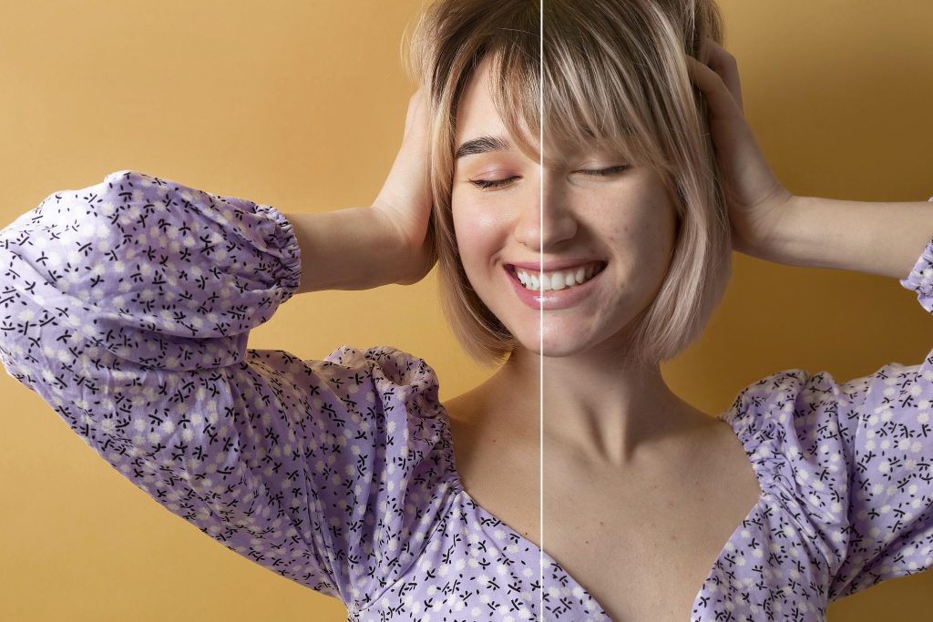
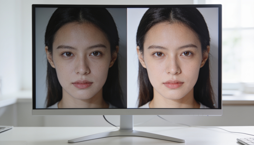
Color correction is the process of adjusting an image to achieve accurate and realistic colors. It involves correcting issues related to white balance, exposure, contrast, shadows, highlights, and color casts.
Without color correction:
- Skin tones may appear unnatural
- Whites may look yellow or blue
- Exposure may be uneven
- Different images may not match each other
What Is Color Grading?
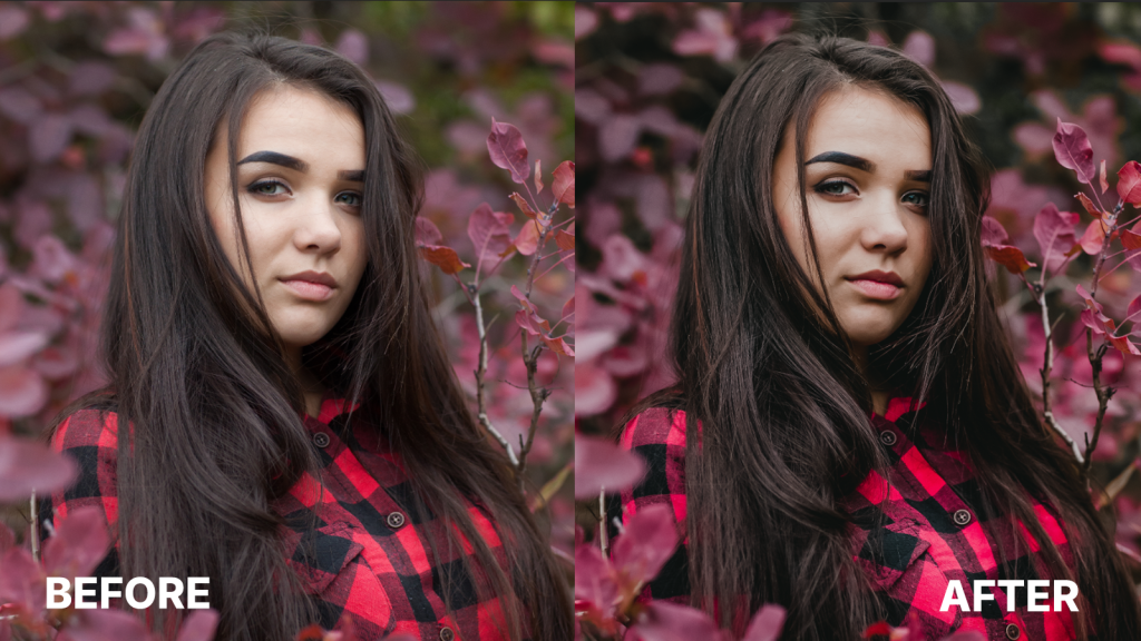
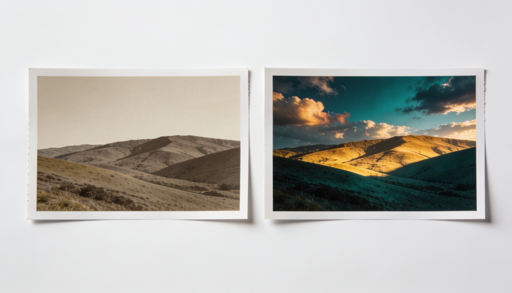
Color grading is the creative process of altering colors to create a specific mood, atmosphere, or visual style. Instead of focusing on realism, color grading focuses on artistic intent. Color grading changes how an image feels rather than how accurately it represents reality.
Examples include:
- Warm golden wedding photos
- Moody cinematic portraits
- Bright and airy lifestyle photography
- Dark, dramatic editorial imagery
Color Correction vs Color Grading: A Side-by-Side Breakdown
It’s easy to confuse color correction with color grading because they often happen in the same editing workflow. The simplest way to tell them apart is this: color correction focuses on making a photo look accurate, while color grading focuses on making it look intentional. One fixes technical issues like white balance and exposure, while the other uses color creatively to shape the mood, atmosphere, and overall style of the image.
Stage in workflow
Color correction comes first in the editing workflow. It establishes a technically accurate foundation by fixing exposure, white balance, contrast, and color balance issues. Once the image looks natural and consistent, color grading is applied.
This second stage focuses on enhancing the visual style and mood without being influenced by underlying technical problems that could affect the final result.
| Stage in Workflow | Color Correction | Color Grading |
|---|---|---|
| When it happens | First step after importing and culling images. | Applied after color correction is complete. |
| Why does it come here | Ensures the image has accurate colors and balanced tones before further editing. | Uses the corrected image as a foundation for creative styling. |
| Result | A clean, technically accurate image. | A visually distinctive image with a specific mood or look. |
Goal: Technical Accuracy vs. Creative Expression
The primary goal of color correction is to make a photo look accurate and true to the scene. It addresses issues such as color casts, improper exposure, and inconsistent tones.
Color grading serves a different purpose. It uses color intentionally to influence mood, guide viewer perception, and create a visual style that supports the photographer’s creative vision.
| Goal | Color Correction | Color Grading |
|---|---|---|
| Primary objective | Fix technical issues affecting image quality. | Create a deliberate mood, atmosphere, or aesthetic. |
| Focus | Accuracy and consistency. | Emotion and visual storytelling. |
| Example | Making skin tones look natural under mixed lighting. | Giving the image a warm, cinematic, or moody feel. |
Tools Used
Color correction typically relies on tools such as white balance controls, exposure adjustments, highlights, shadows, contrast, and histograms. These tools help achieve balanced and realistic results.
Color grading uses more creative controls, including tone curves, color wheels, split toning, HSL adjustments, LUTs, and presets. These tools allow photographers to shape the mood and color character of an image.
| Tools Used | Color Correction | Color Grading |
|---|---|---|
| Core tools | White Balance, Exposure, Highlights, Shadows, Contrast. | Color Wheels, Tone Curves, Split Toning, Color Mix. |
| What they adjust | Color accuracy, brightness, and tonal balance. | Color relationships, mood, and overall visual style. |
| Common software features | Basic panel adjustments in Lightroom or Camera Raw. | Advanced color grading panels, curves, LUTs, and presets. |
Who does it
Color correction is a fundamental part of post-production and is performed by nearly every photographer or photo editor.
Color grading is commonly used by photographers, retouchers, and creative editors who want to develop a distinct visual style.
| Who Does It | Color Correction | Color Grading |
|---|---|---|
| Typical users | Photographers, editors, retouchers. | Photographers, creative retouchers, colorists. |
| Skill requirement | Essential skill for all photographers. | Often requires a stronger understanding of color theory and visual aesthetics. |
| Purpose in professional workflows | Delivers accurate and consistent images across a gallery. | Helps create a recognizable style for a portfolio, brand, or project. |
Color Correction in a Photograph
White balance
White balance is often the first adjustment made during color correction because it affects every color in the image. Different light sources produce different color temperatures, which can create unwanted color casts if not corrected properly.
Common examples include:
- Tungsten lighting → Warm orange/yellow cast
- Fluorescent lighting → Green cast
- Open shade → Cool blue cast
- Mixed lighting → Multiple color shifts across the frame
The goal is to neutralize these color casts so that whites appear white and other colors render accurately. In Lightroom or Camera Raw, photographers typically adjust the Temperature and Tint sliders while using neutral objects within the scene as reference points.
Exposure and Highlight/Shadow
Exposure correction ensures that important image details are visible throughout the tonal range. Rather than simply making an image brighter or darker, photographers evaluate how information is distributed across shadows, midtones, and highlights.
Key adjustments include:
- Exposure → Controls overall image brightness
- Highlights → Recovers detail in bright areas
- Shadows → Reveals detail in darker areas
- Whites → Sets the brightest tonal point
- Blacks → Establishes shadow depth and contrast
A properly corrected image should retain detail in critical areas without clipping highlights or crushing shadows. Histograms are often used during this process to identify tonal imbalances and ensure data remains within the available dynamic range.
Syncing settings
For photographers handling large image sets, consistency is just as important as individual corrections. Wedding, event, sports, and commercial photographers may need to edit hundreds or even thousands of photographs captured under similar lighting conditions.
Instead of correcting each image manually, editors often synchronize key adjustments across a group of images, including:
- White balance
- Exposure
- Contrast
- Tone curve adjustments
- Basic color corrections
This approach creates visual consistency throughout the gallery while reducing editing time. Once synchronized, photographers can make individual refinements where lighting conditions or subject placement differ.
If you need professional color correction for product or e-commerce images, Offshore Clipping’s color correction service delivers accurate, consistent results at scale.
Color Grading in Photography
Once color correction is complete, color grading becomes the creative stage of the workflow. Instead of fixing technical issues, grading focuses on shaping how an image feels. By adjusting color relationships, tonal contrast, and luminance values, photographers can influence mood, direct viewer attention, and create a consistent visual style across an entire portfolio.
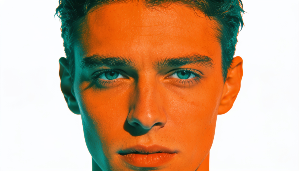
Split toning / Color Mix
Split toning allows photographers to introduce different color hues into the highlights and shadows of an image. Rather than changing the overall color balance, it selectively affects specific tonal ranges, making it useful for creating depth and atmosphere.
For example:
- Blue shadows + warm highlights can create a cinematic contrast between cool and warm tones.
- Teal shadows + orange skin tones enhance subject separation and are commonly used in editorial and commercial work.
- Golden highlights can add warmth and softness to wedding or lifestyle photography.
Using Curves for precision color grading
While many grading tools apply broad color adjustments, curves offer precise control over both tone and color. This is why they remain a preferred tool among experienced photographers and retouchers.
By working with individual RGB channels, photographers can:
- Add blue or yellow tones to shadows
- Shift highlights toward warmer or cooler colors
- Create subtle color contrast between tonal regions
- Adjust contrast without affecting overall exposure
LUTs vs. Presets
A LUT maps one set of color values to another. It affects color information only, making it popular in video production and cinematic color workflows. Presets, on the other hand, are collections of editing settings that can modify exposure, white balance, contrast, sharpening, color adjustments, and more.
| Feature | LUT | Preset |
|---|---|---|
| Applies color transformation | Yes | Yes |
| Changes exposure settings | No | Yes |
| Commonly used in video | Yes | Sometimes |
| Commonly used in photography | Less | More |
Developing a consistent style across a portfolio or brand
One of the most valuable outcomes of color grading is consistency. When images share similar color relationships, contrast levels, and tonal characteristics, they feel connected even if they were captured on different days or in different locations.
Professional photographers often build a grading workflow around recurring elements such as:
- Consistent skin tone rendering
- Similar highlight and shadow colors
- Controlled saturation levels
- Repeating contrast patterns
This consistency helps create a recognizable visual identity. Over time, clients and viewers begin to associate that specific look with the photographer’s work, which can strengthen both brand recognition and portfolio cohesion.
When to Use Color Correction or Color Grading
Before making creative color decisions, ask yourself whether the image is technically accurate. If white balance, exposure, skin tones, or tonal balance are off, start with color correction. Once those elements are properly balanced, color grading can be used to shape mood, color harmony, and visual style. In professional workflows, grading works best on a correctly corrected image.
Here is a breakdown table to understand when to use color correction and color grading:
| When to Use Color Correction | When to Use Color Grading |
|---|---|
| Colors appear different from how they looked in real life | Creating a cinematic, moody, bright-and-airy, or editorial look |
| White balance is affected by mixed or challenging lighting conditions | Establishing a recognizable style across a portfolio |
| Highlights are overexposed, or shadow details need recovery | Matching a brand’s visual identity or marketing campaign |
| Multiple images from the same shoot need a consistent appearance | Using color intentionally to support the mood of the image |
| Editing product, eCommerce, real estate, or catalog photography where color accuracy is critical | Creating consistency across a series of photographs with different lighting conditions |
| Preparing images for client delivery before applying any creative adjustments | Developing a signature editing style that distinguishes your work from other photographers |
If you’re trying to make a photo look accurate, you’re performing color correction. If you’re trying to make it look intentional, you’re performing color grading.
In professional workflows, these processes are rarely used independently. Most photographers first correct exposure, white balance, and tonal balance, then apply color grading to create the final look.
This approach produces images that are both technically sound and visually compelling.
Common Color Grading Mistakes Beginners Make
Most color grading mistakes don’t stem from a lack of creativity in photographers. They happen because it’s easy to push tools further than the image can support. A strong grade should enhance a photograph, not compete with it.
Here are the common color grading mistakes beginners make:
1. Skipping Color Correction
Many beginners jump straight into creative grading without correcting the image first. If white balance, exposure, or contrast are inaccurate, every grading adjustment builds on those problems.
Before touching color wheels or curves, make sure the image has balanced exposure, accurate skin tones, and a neutral white balance.
2. Pushing Saturation Too Far
More color does not always mean a better image. Excessive saturation can cause skin tones to look unnatural, clip color information, and make photos feel artificial.
Instead of increasing global saturation, try making small adjustments to specific color channels using HSL or Color Mix controls.
3. Ignoring Skin Tones
Even heavily stylized images need believable skin tones. When shadows become too blue, green, or magenta, skin often looks unhealthy and distracting.
A good habit is to zoom into faces periodically and check whether skin tones still appear natural after grading.
4. Applying Presets Without Adjustment
Presets are designed as starting points, not one-click solutions.
A preset that works perfectly on one image may look completely different on another because lighting, exposure, and color temperature vary from photo to photo.
Always fine-tune the preset to match the specific image you’re editing.
5. Following Every Editing Trend
Popular color trends can be tempting, but they often become outdated quickly. A heavy teal-and-orange look or extreme matte effect may attract attention today but feel dated a few years later.
Focus on developing a consistent style that supports your subject rather than chasing every trend.
6. Using Too Many Effects at Once
Color grading, split toning, curves, texture adjustments, and presets can all be useful tools. The problem starts when too many effects compete with each other.
Professional-looking grades are usually built from small, deliberate adjustments. If viewers notice the editing before they notice the photograph, the grade may be too strong.
Conclusion
Color correction and color grading are complementary processes, not competing ones.
Color correction creates a technically accurate image by fixing white balance, exposure, and tonal balance. Color grading then builds upon that foundation to create emotion, consistency, and visual identity. Professional photographers rely on both steps because accuracy alone does not create memorable images, and creativity without correction often produces inconsistent results.
When used together, these techniques transform ordinary photographs into polished, professional work that communicates both realism and artistic intent.