
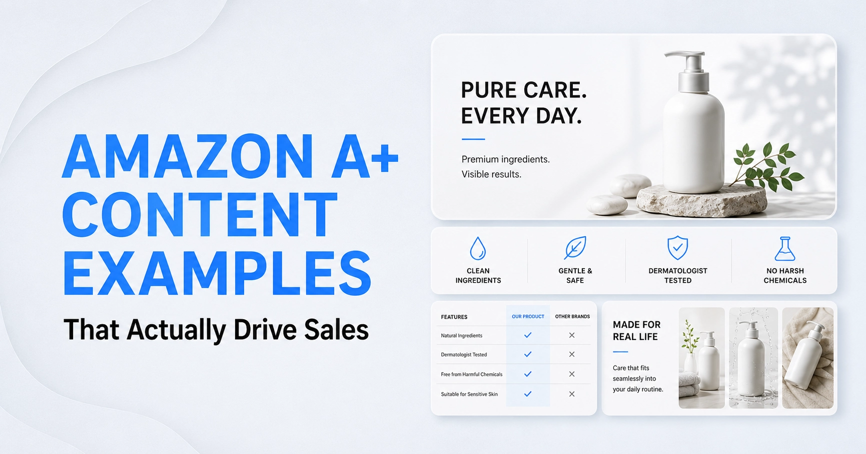
Scroll through 10 Amazon listings in the same category, and most A+ content starts to look identical. The same feature icons, the same beige lifestyle shot, and the same three-line brand story nobody reads. Then one listing makes you stop scrolling.
The difference isn’t the module Amazon hands every seller. It’s how deliberately a brand uses it. Below are 13 Amazon A+ Content examples, broken down by module type and by industry. This shows exactly what separates a page that just displays information from one that actually converts.
What Makes an A+ Content Example Actually “Good”?
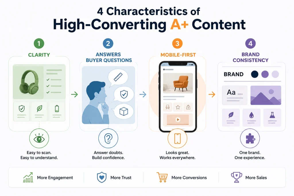
Clarity Over Decoration
Amazon A+ Content isn’t a design portfolio. Brands that treat every module as a chance to show off, with glossy filters, oversized fonts, or decorative icons with no purpose, end up burying the one thing that actually sells.
This is the information a shopper needs before checkout. The strongest examples use visuals to explain, not just decorate. Every image answers a “why should I buy this” question the shopper is already asking.
Answering Buyer Questions Before They’re Asked
Before someone adds to the cart, they’re silently asking, Does this fit? Will it last? How is it different from the cheaper option two rows down? Good A+ Content answers these mid-scrolls without forcing shoppers to dig through bullet points.
A comparison module that quietly rules out “which size do I need” or “what’s included” does more conversion work than a paragraph of brand copy ever will.
Mobile Legibility as a Non-Negotiable
Most Amazon traffic is mobile, and A+ modules that look sharp on a 27-inch monitor often collapse into unreadable text on a phone screen. Small comparison charts, dense paragraphs, and low-contrast overlays are common failure points. The examples that convert are built mobile-first, with larger type, shorter lines, and images cropped so nothing critical sits near the edges.
Brand Consistency Across Modules
A listing with seven modules in five different fonts and three inconsistent color palettes reads as rushed, even if each image individually looks fine. Strong A+ Content keeps typography, color, and tone consistent from the hero banner down to the FAQ module. So, the page feels like one cohesive brand experience instead of a patchwork of stock templates.
A+ Content Examples by Module Type
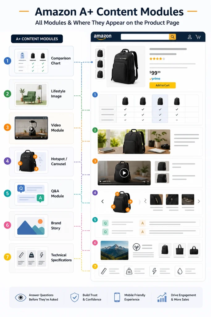
These seven A+ content examples cover the modules Amazon makes available to every Brand Registered seller. The module itself doesn’t drive conversion. What goes inside it does.
1. Comparison Chart Examples
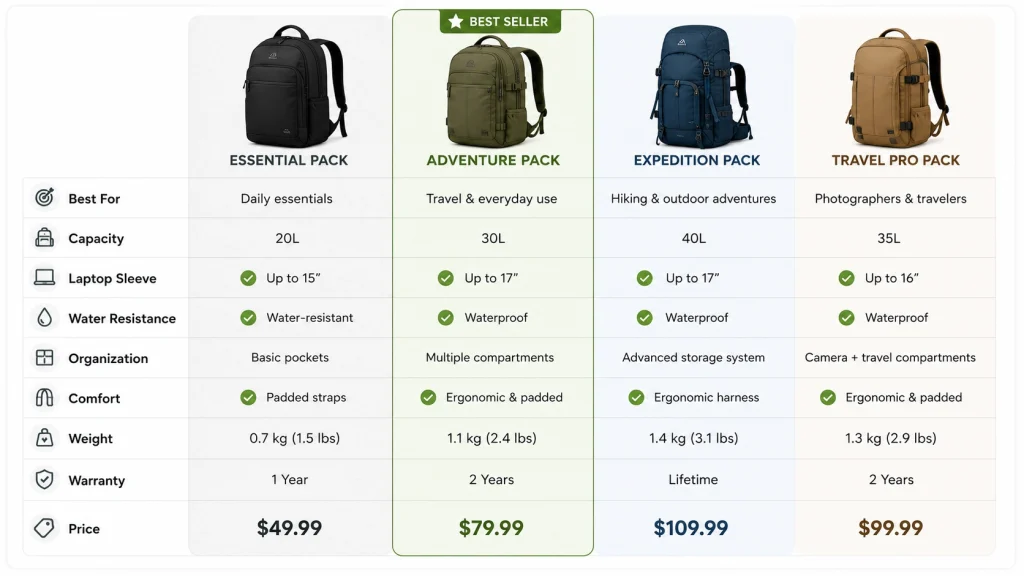
Comparison charts are one of the highest-converting A+ modules, especially for brands selling multiple variants, like SKU-heavy apparel lines or supplement bundles.
A strong example lines up three or four products side by side with checkmarks, short labels, and a highlighted “best seller” column, letting a shopper find their fit in seconds instead of opening five browser tabs. The mistake to avoid: cramming in ten rows of specs no one will actually read.
2. Lifestyle Image Examples
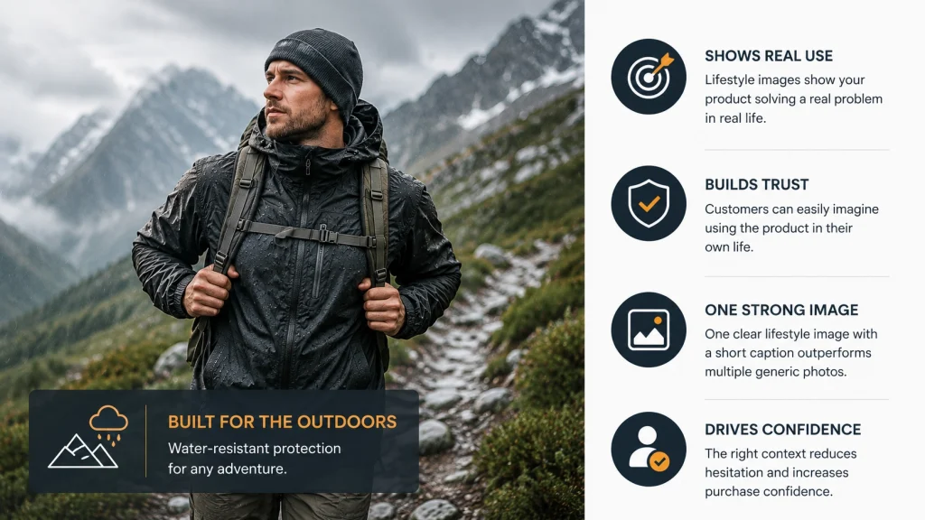
Lifestyle modules work best when they show the product solving a real, specific problem, like a jacket photographed mid-hike in visible weather rather than posed against a plain wall.
The strongest examples pair one clean lifestyle shot with a short caption naming the exact use case, which builds more trust than five generic “in use” photos with no context behind them.
3. Video Module Examples
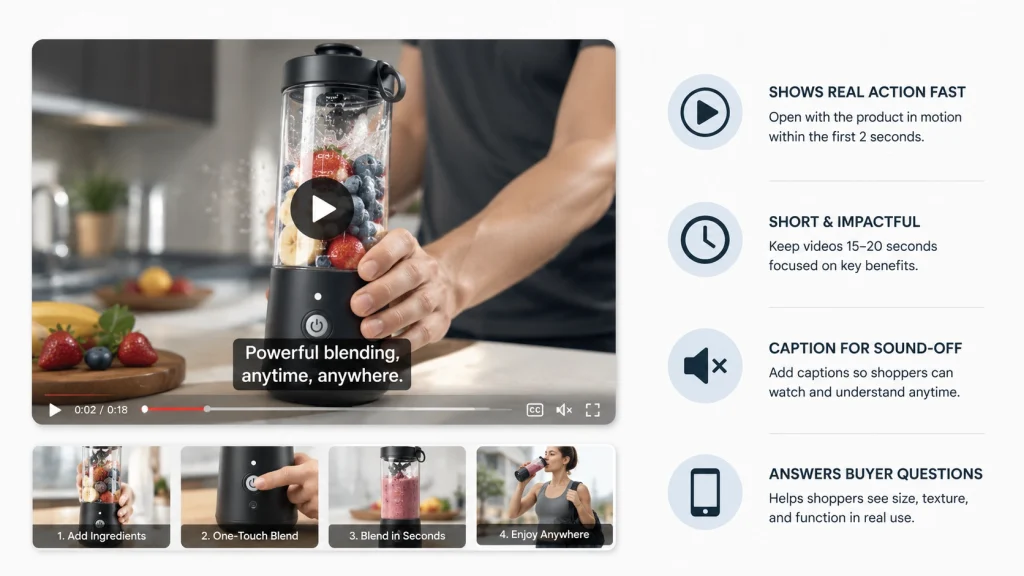
A well-placed video module, even fifteen to twenty seconds long, can lift time-on-page and answer size, texture, or function questions that photos simply can’t. The examples that perform best open with the product in motion within the first two seconds, skip the branded intro, and caption the video for sound-off mobile viewers, since most shoppers scroll with audio muted.
4. Hotspot & Carousel Examples
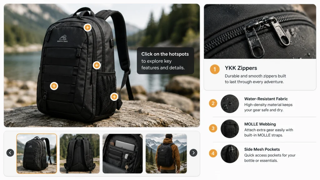
Hotspot modules let shoppers click into specific product zones, like a stitching detail, a zipper, or a control panel, without leaving the page. Good examples limit hotspots to three or four genuinely useful call-outs rather than labeling every visible surface, which keeps the module skimmable instead of cluttered.
5. Q&A Module Examples
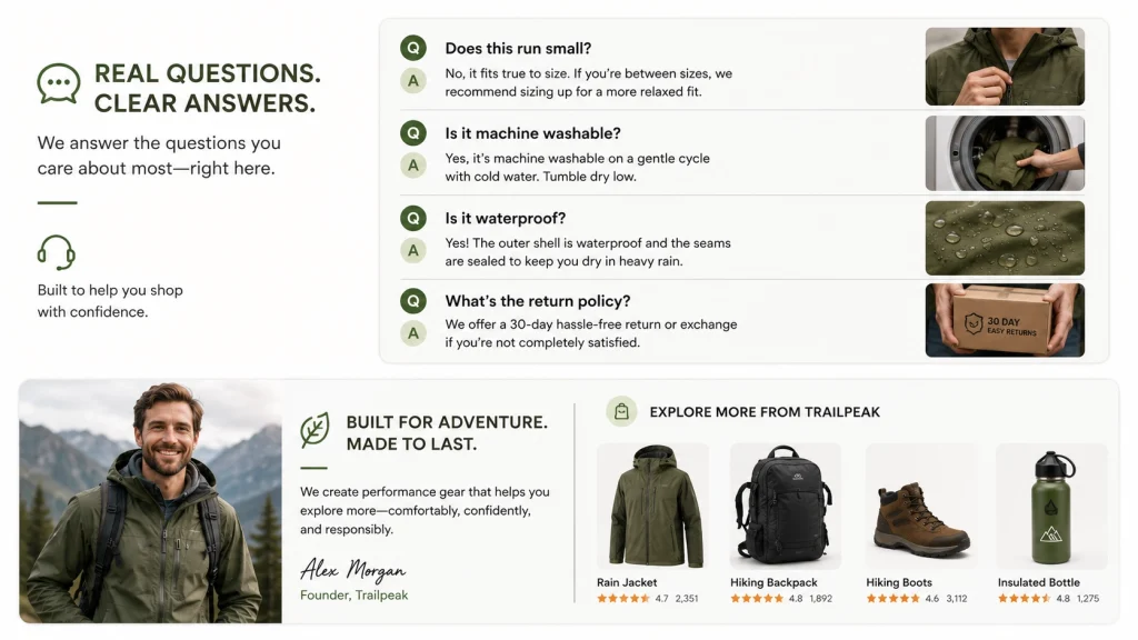
Some of the highest-performing A+ pages format real buyer questions, such as “does this run small?” or “is it machine washable?”, directly into a module, answered in one or two lines each. This preempts negative reviews and support tickets by resolving hesitation before checkout, right where the shopper is already reading.
6. Brand Story Examples
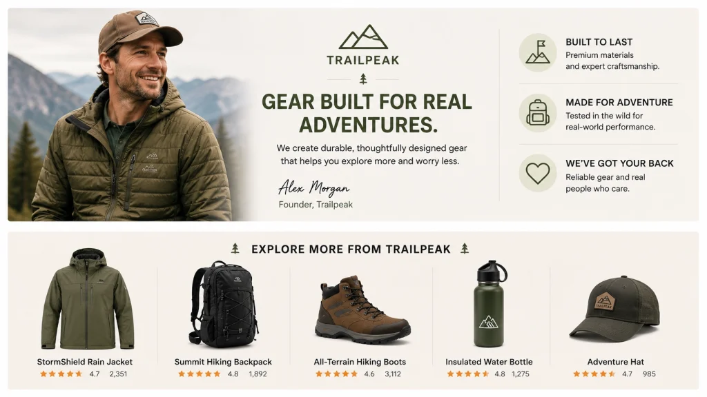
Brand Story modules often get skipped entirely, but the examples that work keep it short:
- One founder photo,
- One sentence on why the brand exists, and
- A strip of related products.
It isn’t the place for a full company history. Shoppers browsing a listing want a quick trust signal, not an “About Us” page repurposed at the bottom of a product listing.
7. Technical Specifications Module Example
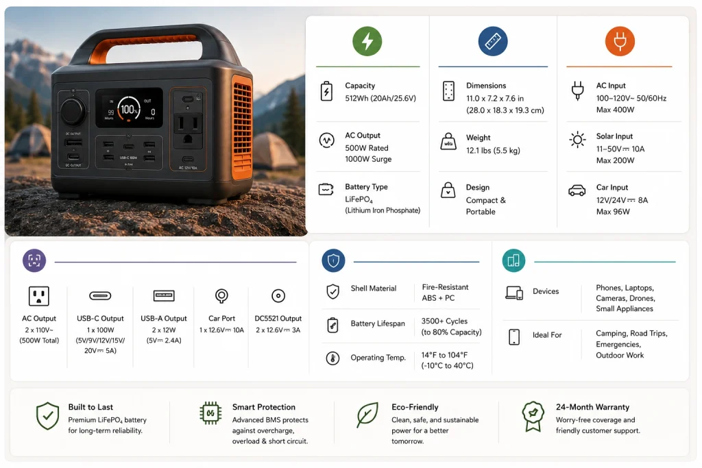
For electronics, tools, and anything spec-driven, a clean technical module (icons plus short labels for dimensions, materials, or power ratings) outperforms a paragraph of prose every time.
The best examples group specs visually by category, such as power, size, and compatibility, instead of listing them in one long undifferentiated block, which is exactly where most shoppers stop reading.
A quick side-by-side of where each module earns its place:
| Module Type | Best For | Buyer Question It Answers |
|---|---|---|
| Comparison Chart | Multi-SKU catalogs, apparel, bundles | “Which variant is right for me?” |
| Lifestyle Image | Home goods, apparel, beauty | “Will this fit my life/space?” |
| Video Module | Electronics, tools, beauty tools | “How does this actually work?” |
| Hotspot / Carousel | Products with multiple features | “What am I looking at exactly?” |
| Q&A Module | Any category with return risk | “Does this run small/last long?” |
| Brand Story | Newer or DTC-style brands | “Can I trust this seller?” |
| Technical Specs | Electronics, tools, supplements | “Does this meet my requirements?” |
A+ Content Examples by Industry
8. Beauty & Skincare Examples
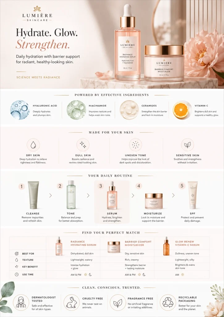
Beauty listings convert best when A+ Content addresses skin type, ingredient concerns, and routine order, the same guidance beauty founders and estheticians already give in person. A strong example: an ingredient breakdown module paired with a simple “how to layer this in your routine” graphic.
9. Electronics & Tech Examples
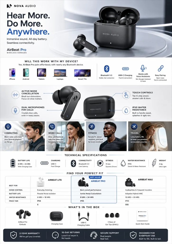
Tech listings lean hardest on comparison and technical specification modules, since shoppers are actively comparing specs across multiple tabs. The strongest examples front-load compatibility information, like what it works with and what it requires, before any lifestyle imagery, since that’s the deciding factor for most tech purchases.
10. Food & Beverage Examples
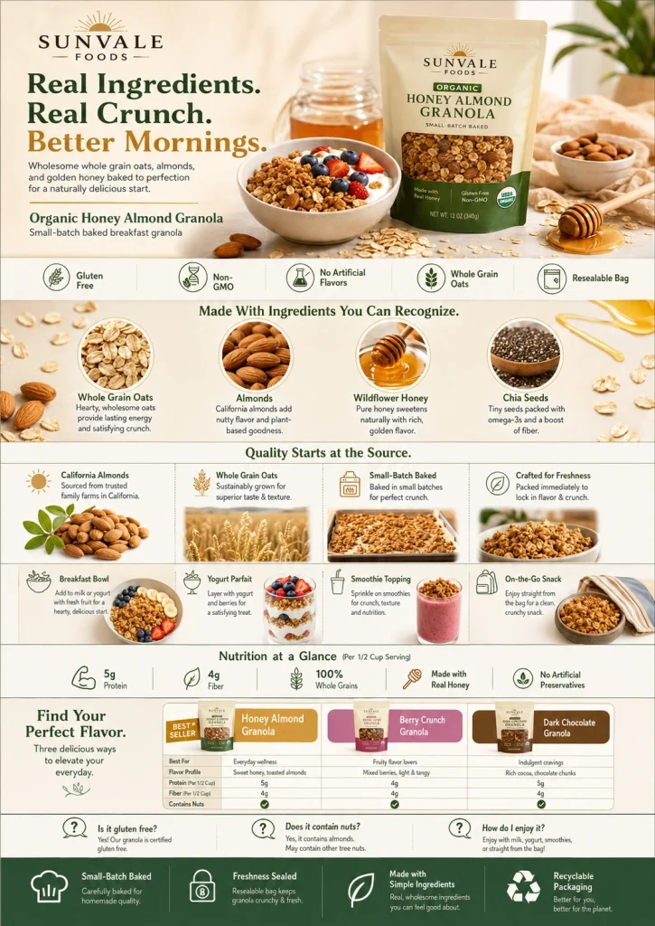
Amazon A+ Content of food and beverage performs best when it answers dietary and sourcing questions fast, covering allergens, ingredient origin, and serving suggestions. Use simple icon rows rather than dense paragraphs. Since these shoppers are often scanning for a single dealbreaker.
11. Home & Lifestyle Examples
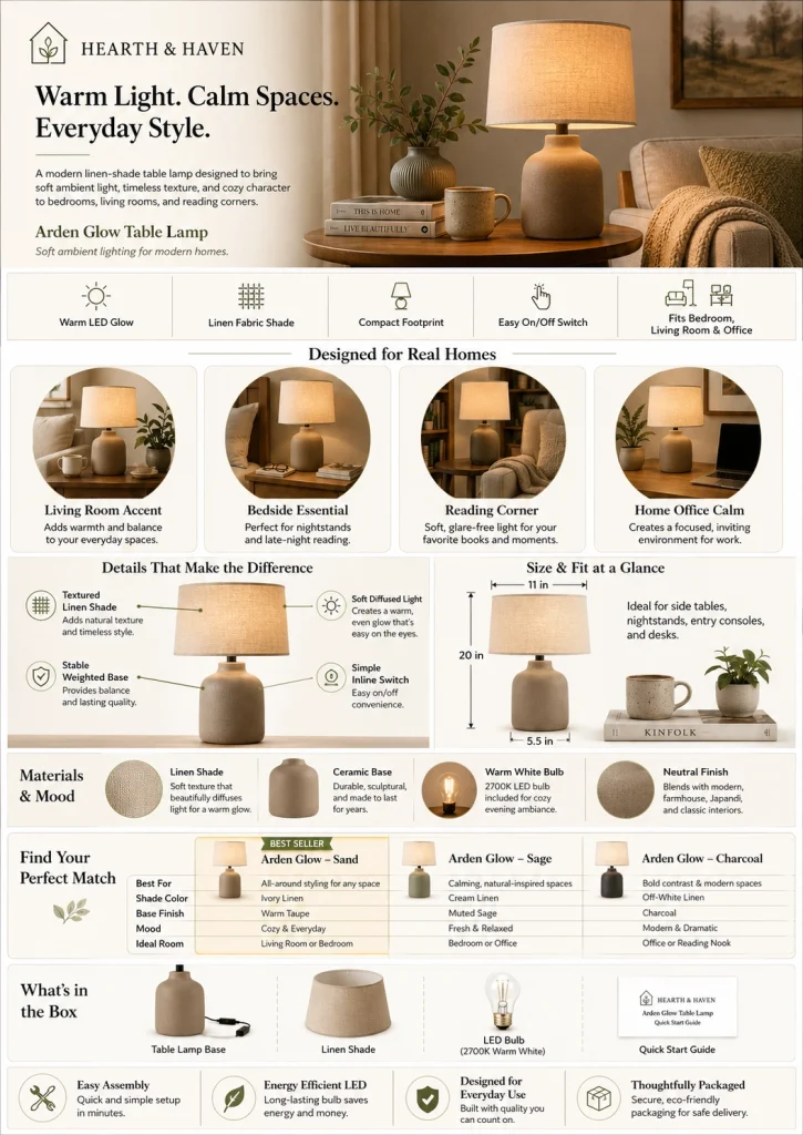
Home goods convert on scale and context: a rug shown in an actual living room, a lamp shown beside a coffee mug for size reference. The examples that work avoid empty studio shots and instead show the product doing its job in a lived-in space.
12. Apparel Examples
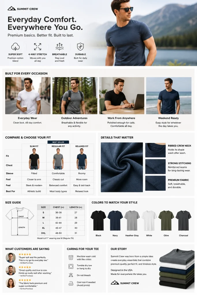
For fashion and apparel brands managing dozens of SKUs, size and fit modules matter more than lifestyle polish. Strong examples pair a fit-guide graphic with consistent, color-corrected product photography across every variant. So, a shopper browsing five colorways sees one cohesive listing instead of five mismatched product shoots.
13. Health & Supplements Example
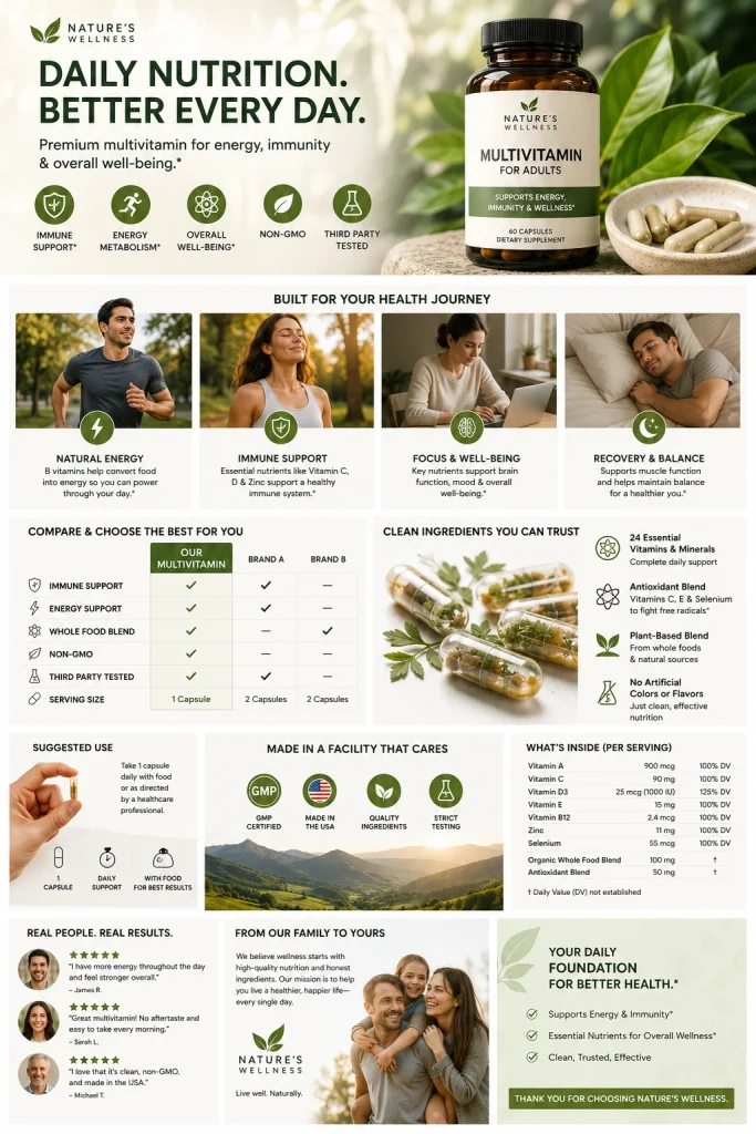
Supplement listings that convert well typically use a dosage or usage module alongside third-party testing or certification badges. This addresses the trust gap specific to ingestible products. A short, clearly labeled “how to take this” graphic does more here than another lifestyle photo.
What These Examples Have in Common (Pattern Breakdown)
Visual Hierarchy Choices
Across every high-performing example, the most important information sits in the first two modules, not buried near the FAQ. Shoppers rarely scroll through all seven modules, so the strongest listings front-load the comparison chart or lifestyle proof point that resolves the biggest hesitation first.
Text-to-Image Ratio
Examples of lean visuals instead of text include the use of brief captions beneath powerful images rather than paragraphs vying for viewers’ attention. Copy must complement the image rather than replicate it. Because when text and image vie for the same space, the image typically prevails.
Consistent Brand Voice Across Modules
Even across different module types, the tone stays the same from module one to module seven:
- Same level of formality,
- Same sentence length,
- Same product terminology.
That consistency is what makes a listing feel like a considered brand experience instead of assembled templates.
How to Apply A+ Content Examples to Your Own Listings (Without a Big-Brand Budget)
What You Actually Need (Assets, Not Just Ideas)
The gap between a generic A+ page and one of the examples above usually isn’t creative vision; it’s assets. You need clean, consistent product photography across every SKU and colorway, backgrounds pulled and standardized, and images pre-sized for each module’s dimensions.
Most brands underestimate how much of A+ Content’s polish comes from proper image prep before a single module is built, not from clever copywriting layered on top afterward.
Working With Limited Photography
If you’re working with a handful of studio shots instead of a full campaign, background removal and color correction can stretch that photography further than reshooting would.
A single clean product shot can be repurposed across a comparison chart, a technical module, and a hero banner once the background is consistent and the lighting is corrected to match across the entire set, with no reshoot required.
How Offshore Clipping Helps You Execute A+ Content the Right Way
Building Amazon A+ Content that performs isn’t just a design exercise; it’s an image production pipeline, and that’s where most in-house teams and small agencies run out of time. Offshore Clipping handles the asset side of A+ Content so your creative team can focus on layout and copy. Not spend hours prepping the same product shot for seven different modules.
- Module-ready visuals: Every image is sized, cropped, and background-corrected to fit Amazon’s module dimensions from the start. So, nothing gets stretched or awkwardly cropped once it’s live.
- Brand Story asset design: We prep founder photography, lifestyle imagery, and supporting graphics. So, your Brand Story module looks intentional instead of like an afterthought.
- Mobile-first formatting: Every module is checked against a mobile viewport before delivery. Since that’s where most of your traffic will actually see it.
- Compliance-checked delivery: Amazon rejects a meaningful share of A+ submissions over image and formatting issues. We check dimensions, file types, and content guidelines before delivery so your submission doesn’t bounce back.
- Fast turnaround: Whether you’re managing a single hero listing or updating A+ Content across dozens of SKUs at once, our turnaround times are built for launch deadlines, not open-ended timelines.
If your product photography needs cleanup before it’s ready for A+ Content, our background removal, image masking, and ghost mannequin services are a solid starting point for e-commerce and apparel catalogs alike.
FAQ
Is A+ Content worth it?
For most brands, yes. Amazon A+ Content typically improves conversion rate and reduces returns by setting clearer expectations, and it’s included free for Brand Registered sellers.
How much does A+ Content cost?
Basic A+ Content is free through Amazon’s Brand Registry. Premium (A++) access requires meeting Amazon’s eligibility thresholds. Your main cost is typically design and photography, not a platform fee.
What’s the difference between A+ Content and Brand Story?
Brand Story is one module within A+ Content, focused on brand identity and cross-selling related products. A+ Content is the full set of modules available across a listing.
Do A+ Content examples need Premium (A++) access?
No. Most of the examples in this article, including comparison charts, lifestyle modules, and Q&A blocks, are available in Basic A+ Content. Premium adds features like larger video modules and interactive comparison tables.
Does A+ Content affect Amazon SEO rankings?
A+ Content doesn’t directly factor into Amazon’s search algorithm, but it improves conversion rate and reduces returns, both of which indirectly support ranking over time.
Conclusion
The best Amazon A+ Content examples all share the same habit. They answer buyer questions visually, before hesitation turns into a bounce. Once your photography is ready to support that, the modules do the rest. If your listings need that groundwork laid first, Offshore Clipping can help you get there.