
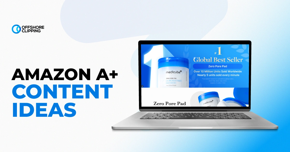
Most A+ Content sections don’t fail because the design is ugly. They fail because the modules never address the real reason a shopper hesitates. This includes unclear sizing, doubts about build quality, or no sense of how the product fits their life. A polished layout with the wrong message still leaves conversion on the table. It rebuilds module by module, guessing each time, and wastes both budget and Amazon’s limited submission attempts.
The best Amazon A+ Content ideas aren’t module templates. They’re answers to a specific shopper objection (quality, fit, use case, trust), matched to the module type and image asset that resolves it fastest. Below is an idea bank organized by objection, category, and module, plus the technical specs that keep content from getting rejected.
Key Takeaways
- Start every idea with the shopper’s hesitation, not a blank module template. Objection-first content converts more reliably than decoration.
- Standard A+ Content is free with Brand Registry; Premium A+ unlocks interactive modules but needs a sales history and approval.
- Every module idea is only as strong as the photography behind it: comparison charts, hover hotspots, and lifestyle modules all live or die on image quality.
- Amazon rejects a large share of A+ submissions for pricing mentions, unverified claims, and low-resolution images, not weak ideas.
Amazon Brand Registry is a free program that lets brand owners verify ownership of their trademark. This unlocks tools like A+ Content, brand analytics, and stronger protection against counterfeit or unauthorized listings of their products.
What is A+ Content on Amazon: Defined in 30 Seconds
A+ Content (formerly Enhanced Brand Content) is the enhanced product description area available to sellers enrolled in Amazon Brand Registry. It replaces the plain-text description on a product detail page with image-and-text modules such as comparison charts, lifestyle banners, and FAQ blocks. These are built inside the A+ Content Manager in Seller Central and applied at the ASIN level. It sits below the bullet points and above the reviews. This makes it one of the last things a shopper sees before deciding whether to hit the buy box.
For the mechanics of eligibility, module limits, and approval timelines, our full breakdown of what Amazon A+ Pages and Content is covers the setup end. This piece focuses on what to put inside it.
How to Pick the Right A+ Content Idea
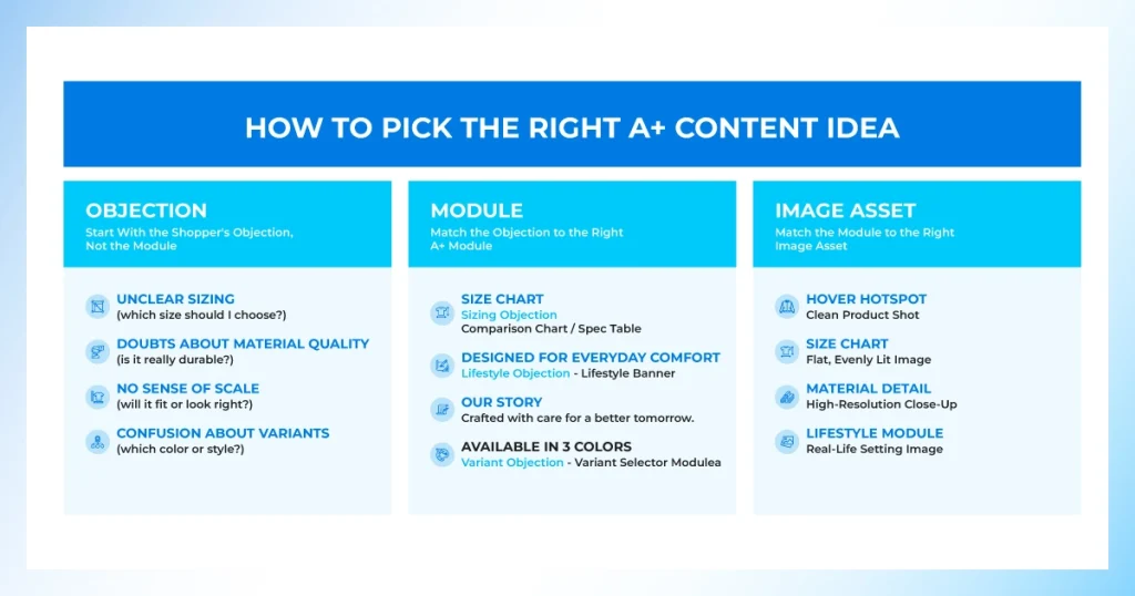
Most A+ sections underperform because they were built module-first. A brand picks a template, then fills it with whatever copy or photo is on hand. Stronger Amazon A+ Content ideas work backward from the reader’s hesitation, then choose the module and asset that resolve it.
Start With the Shopper’s Objection, Not the Module
Before opening the A+ Content Manager, list the two or three reasons a browsing shopper doesn’t convert on this specific ASIN, price sensitivity aside. Common culprits are unclear sizing, doubts about material quality, no sense of scale, or confusion about which variant to buy. Each objection becomes one content idea.
Match the Objection to the Right A+ Module
A sizing objection calls for a comparison chart or spec table, not a lifestyle banner. A trust objection calls for a brand story module with sourcing or craftsmanship detail. Pairing the objection to the module that actually answers it is what separates content that converts from content that just looks polished. And looking at real A+ content examples before you build helps confirm the module fits or is similar.
Match the Module to the Right Image Asset
Every module idea implies a photography requirement. A hover hotspot needs a clean product shot with defined zones, and a size chart needs a flat, evenly lit reference image. Planning the image assets behind each module before writing copy prevents the common scramble of retrofitting photos to a layout that was never designed for them.
A+ Content Ideas by Shopper Objection
This is the fastest way to generate usable Amazon A+ Content ideas. Pick the objection your reviews and return data point to most often, then build from the list below.
Proving Product Quality and Craftsmanship
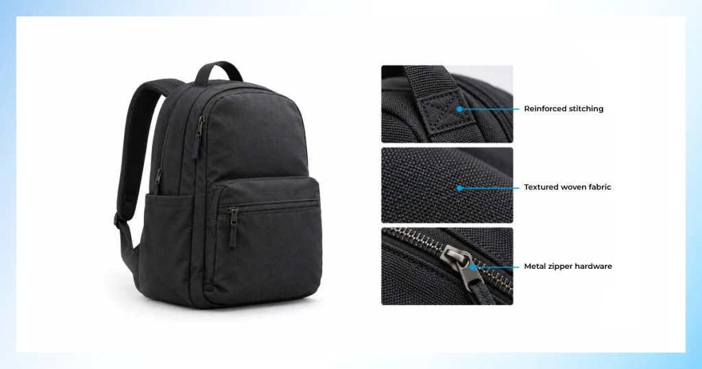
If reviews or return notes mention flimsy materials, loose stitching, or a product that felt cheaper than the photos suggested, this is the objection dragging conversion down. Quality-focused modules give shoppers physical proof (texture, construction, and materials) before they ever hold the product themselves:
- Macro close-up shots of stitching, joinery, or surface texture, each labeled with a callout pointing to the specific detail worth noticing
- A “what’s inside” cutaway or exploded-view graphic that shows every internal component, reassuring shoppers the build matches the price
- A side-by-side panel comparing raw material to the finished product, useful for handmade or small-batch goods where sourcing is part of the pitch
- A durability or stress-test visual, showing the product bent, loaded, or used under real conditions, for categories where toughness is the main selling point
Demonstrating Product Use and Assembly
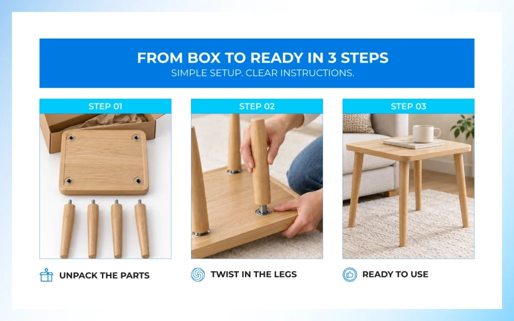
Any product with a setup curve, such as furniture, electronics, or tools, anything with more than one step out of the box, loses sales to shoppers who simply aren’t confident they’ll be able to use it. These ideas remove that doubt before it becomes a return:
- A numbered, icon-driven assembly graphic instead of a plain photo sequence. Icons scan faster on mobile than dense step photography
- A before/during/after usage sequence that walks through setup for tools, appliances, or anything with a learning curve
- A short looped video module showing the first five minutes of real use, from unboxing to first result
- A troubleshooting or “common mistakes” panel addressing the one or two setup errors that show up most often in reviews
Lifestyle and In-Context Product Imagery
Scale, fit, and context are difficult to judge from a single white-background hero shot. This is exactly the gap this group of ideas closes. Lifestyle-driven modules let a shopper picture the product in their own space before they commit to buying it:
- Room-scene or on-body lifestyle imagery shot at a realistic, believable scale rather than an obviously staged studio setup
- A contextual “a day in the life” carousel that walks through several different use occasions for the same product
- A scale-reference graphic placed next to a familiar household object, useful for anything where size is hard to judge from a listing photo alone
- An environment-specific set (outdoor, indoor, travel, office) for products used across more than one setting
Clarifying Sizes, Variants, and Bundles
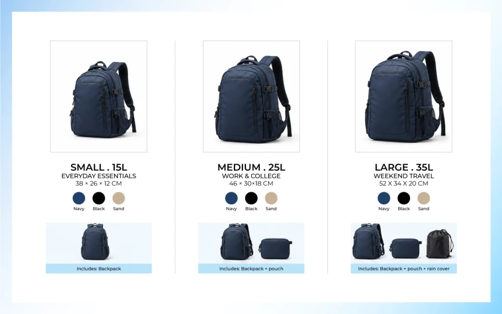
Variant confusion is one of the most common and most fixable sources of pre-purchase hesitation. Especially on ASINs with a wide size or color spread. These ideas turn a confusing variant list into a simple, one-glance decision:
- A full variant grid module laying out color, size, and pack count in a single visual instead of forcing shoppers to click through each option
- A size and fit chart paired with a model-comparison photo, showing how the same size looks on different body types
- A bundle-contents graphic that lists every included item, which cuts down on “is this everything?” pre-purchase questions
- A “how to choose” decision guide for product lines with several near-identical variants, pointing shoppers to the right one based on their use case
Answering Common Pre-Purchase Questions
Every unanswered question sitting in the Q&A section below a listing represents a shopper who almost bought and didn’t complete the purchase. Turning those same questions into a module answers them before the doubt has a chance to form:
- An FAQ or Q&A module built directly from real customer questions pulled from the listing, reviews, and seller messages
- A care-and-maintenance instruction panel, especially useful for apparel, beauty, and home goods where upkeep affects satisfaction
- A compatibility or “works with” checklist graphic for electronics, accessories, or anything sold as an add-on to another product
- A warranty or return-policy summary module. This reduces hesitation from shoppers weighing the risk of a first-time purchase
Building Brand Trust and Story
Trust-building modules matter most for newer brands that don’t yet have years of reviews doing the convincing for them. For categories where shoppers are naturally more cautious about who they’re buying from:
- Founder or workshop imagery paired with a short, specific origin story rather than generic brand language
- A certification, sourcing, or sustainability badge module for claims that are actually verifiable
- A cross-sell carousel linking related products in the catalog. This signals an established brand rather than a single-listing seller
- A customer-results or social-proof panel summarizing real outcomes, useful for beauty, wellness, and performance-driven categories
A+ Content Ideas by Product Category
Objections shift by category. So, the strongest Amazon A+ Content ideas are rarely one-size-fits-all. The table below maps quick-start ideas to categories most sellers, brand managers, and catalog teams work in.
| Category | High-converting A+ idea to try first |
|---|---|
| Electronics & Tech Accessories | Compatibility checklist + spec comparison chart against similar SKUs |
| Apparel, Footwear & Fashion | Fit chart paired with on-model imagery across body types |
| Beauty & Personal Care | Ingredient callout graphic + step-by-step application sequence |
| Home, Kitchen & Furniture | Room-scene lifestyle module with dimension overlays |
| Food, Beverage & Supplements | Nutrition/label close-up + “how it’s made” sourcing panel |
| Jewelry & Small Accessories | Macro detail shots with a scale-reference graphic |
Apparel and footwear brands managing large-size runs get the most mileage from this section. Fit charts and on-model detail directly reduce size-related returns. This A+ content can influence even before checkout. Clean, consistent on-model imagery across a whole size run usually starts with a ghost mannequin service to keep silhouettes uniform from one variant to the next.
Standard vs. Premium A+ Content Ideas
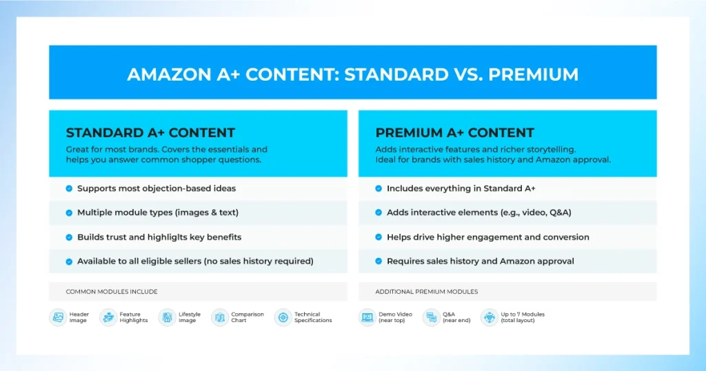
Not every idea above is available on every plan. Standard A+ Content covers most objection-based ideas. Premium A+ adds interactive layers for brands with sales history and Amazon approval.
Standard A+ Content Ideas for Most Brands
Comparison charts, image-and-text modules, multiple-image galleries, and FAQ blocks are all standard-tier, rather than starting from a generic A+ content template. These are available to any Brand Registry seller without additional approval and are enough to cover most of the objection list above. For a brand’s first pass at A+ Content, Standard modules alone can address quality, sizing, and usage objections without needing anything more advanced.
Premium A+ Content Ideas for More Interactive Experiences
Premium unlocks hover hotspots, navigation carousels between ASINs, and embedded video modules. These suit brands with an established catalog who want to turn a single product page into a mini brand showcase rather than a single-item pitch. It also suits those who have the source photography and video to support a richer layout.
Which A+ Content Tier Should You Choose?
| Factor | Standard A+ | Premium A+ |
|---|---|---|
| Eligibility | Brand Registry only | Sales history + invite/application |
| Interactive modules | No | Hover hotspots, video, carousels |
| Best for | Most catalogs, new listings | Established, high-volume ASINs |
| Build complexity | Lower | Higher, needs more source assets |
A+ Content Ideas by Module Type
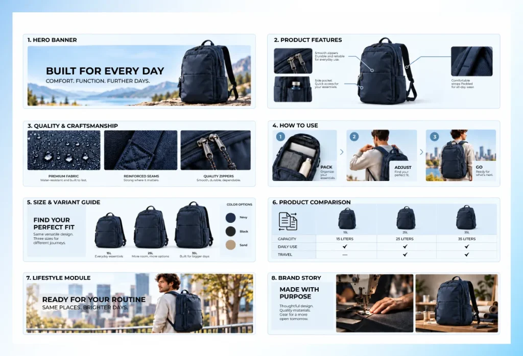
Once the objection is picked, the module type determines exactly what to brief your photographer or designer on. These Amazon A+ Content ideas are organized by the module itself. This is useful when you’re filling out an existing content plan rather than starting from scratch.
Comparison Chart Ideas
Build a feature-by-feature grid that compares products within your own line. Amazon prohibits comparisons against competitor listings. This works well as a size or variant comparison or as a simple “which model is right for you” decision chart that helps shoppers choose between similar SKUs without leaving the page.
Technical Specification Module Ideas
Use labeled dimension diagrams, material composition breakdowns, or a power and capacity spec table for appliances and electronics. These modules do best when the labels sit directly on the product photo instead of in a separate text block. Shoppers can scan a diagram far faster than a paragraph of specs.
Image and Text Module Ideas
Pair a single hero benefit with short supporting copy. This module works best for the one claim you most want every visitor to remember. It performs strongest when placed early in the module sequence, before a shopper’s attention starts to fade.
Multiple Image Module Ideas
Use a color or variant swatch gallery, a multi-angle product turnaround, or a set of in-use photos shot across different environments. All three read cleaner on a plain, distraction-free backdrop. This is where a background removal service earns its keep on a catalog with dozens of variant photos to keep consistent.
Image and Text Overlay Ideas
Layer benefit callouts directly on a product photo using a simple icon and short label for each one. Keep the claims to a handful per image. Overlay text is the module type most likely to turn unreadable once it’s resized down to mobile width.
Video and Interactive Module Ideas
Try an unboxing or first-use walkthrough, a quick demo loop, or a hover-hotspot diagram that reveals feature details when tapped. These are all Premium-tier ideas, and they only work as well as the base photography behind them. So plan for clean, well-lit source footage before building the interactive layer.
FAQ and Q&A Module Ideas
Pull the five most-repeated questions from customer reviews and seller messages. Then answer each one in a simple two-column module. This is consistently one of the easiest modules to build from existing material. It tends to be among the most read since it answers exactly what shoppers were already searching the page for.
Amazon A+ Content Technical Requirements
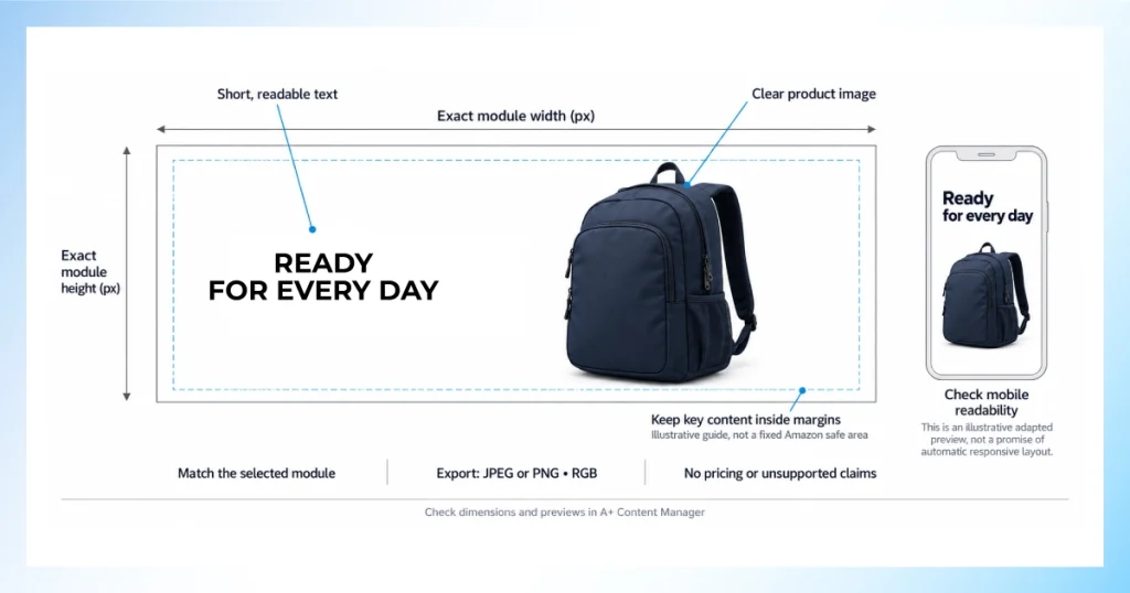
A brilliant idea still gets rejected if the file doesn’t meet Amazon’s technical bar. Most rejections have nothing to do with the concept and everything to do with a file spec that got overlooked during export. These are the checks worth running before every submission.
Module Dimensions, Aspect Ratios, and Image Sizes
Each module template in the A+ Content Manager specifies its own fixed pixel dimensions and aspect ratio. So check the exact size for the module you’ve selected rather than reusing a size from a different module. Even a few pixels off triggers an automatic resize that can blur text overlays.
File Types, Resolution, and Color Requirements
Amazon accepts JPEG and PNG files in the RGB color profile at 72 DPI minimum for web display. Images built in CMYK for print will shift color noticeably once uploaded. So confirm the profile before export.
Text, Typography, and Readability Requirements
Keep text-on-image legible at thumbnail size, avoid dense paragraphs inside a graphic, and remember Amazon restricts certain claims and symbols (like pricing or guarantee badges) from appearing inside the image itself.
Image Composition and Safe Areas
Leave margin around focal elements so nothing critical sits at the extreme edge of a module. Mobile cropping and responsive scaling can clip content that looks fine on a desktop preview.
Mobile and Desktop Display Considerations
Most A+ Content is viewed on mobile first. Preview every module at phone width before submission. Text overlays and comparison charts are the two module types most likely to become unreadable on a small screen.
Common Technical Errors That Cause Content Rejection
- Low-resolution or upscaled source images
- Text or badges implying pricing, discounts, or guarantees
- Incorrect color profile causing visible color shift
- Elements placed outside the module’s safe area
A+ Content Asset Pre-Submission Checklist
Run through this checklist as your A+ content best practices pass before submitting:
- Correct pixel dimensions for the exact module selected
- RGB color profile confirmed, not CMYK
- No pricing, discount, or unverifiable claims in image or copy
- Legible at mobile width
- Brand name and messaging consistent with the rest of the listing
A+ Content Ideas That Get Rejected and How to Fix Them
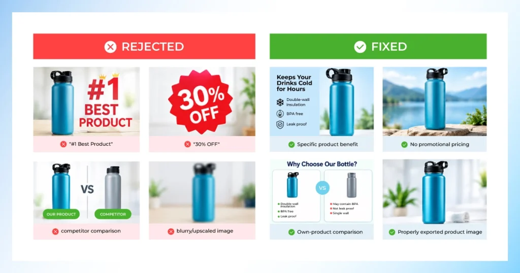
Some of the best-performing content ideas on paper never go live because they trip an Amazon guideline somewhere in copy or imagery. None of these fixes require abandoning the idea, usually just reframing the claim or re-exporting the asset. Here’s what causes most rejections and the quick fix for each.
Avoid Promotional Pricing and Discount Claims
Any mention of price, percentage off, “sale,” or a limited-time offer inside A+ Content copy or imagery goes against Amazon’s guidelines. Even if the same promotion is running elsewhere on the listing. This trips up brands most often when a banner or badge gets reused from a marketing campaign without checking it against A+ rules first.
The fix is simple: reframe the module around a product benefit or use case instead of the deal. Save pricing messaging for the space Amazon actually allows it, like a coupon or deal badge on the main listing.
Avoid Unsupported Product and Performance Claims
Phrases like “best-selling,” “clinically proven,” or “#1 rated” all need a citation Amazon can independently verify. Unverifiable claims are one of the more common reasons a submission gets bounced back. If the claim can’t be sourced to a lab result, certification, or third-party ranking, soften it to a factual, checkable statement instead. For example, describing a specific tested attribute rather than an unsupported superlative.
Avoid Competitor Comparisons and References
Comparison charts and callouts have to stay strictly within your own product line. Naming a competing brand, visually referencing a rival product’s packaging, or even implying a direct comparison through phrasing like “unlike other brands” is a near-guaranteed rejection. Keep every comparison module framed as your product versus your other models or variants. This still gives shoppers the decision-making value without crossing the guideline.
Fix Low-Quality or Incorrectly Formatted Images
This is the single most common rejection reason. It’s almost always a file-spec issue rather than a creative one. Re-export every asset at the module’s exact required pixel dimensions in the RGB color profile. Check closely for upscaling artifacts, soft focus, or compression blur that might not be obvious at thumbnail size. A quick pass through a photo retouching service before submission catches most of this before Amazon’s review process does.
Follow Amazon’s A+ Content Guidelines
When an idea sits in a gray area (a claim that feels true but isn’t easily sourced, or an image style that’s technically borderline), check the current guidelines directly in Seller Central before building the full module. Amazon updates policy details periodically without much fanfare. So a rule that applied six months ago may already have shifted. A five-minute guideline check before the design work starts is far cheaper than a rejected submission after it’s finished.
How to Create A+ Content From Ideas
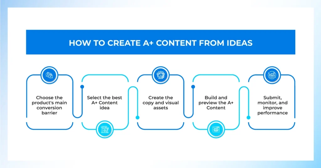
Turning an idea from this bank into a live module follows a consistent five-step build process, whether it’s the first module on a brand-new ASIN or the fortieth on an established catalog.
- Choose the product’s main conversion barrier using return reasons, review themes, and Q&A section questions as your source data.
- Select the best A+ Content idea from the objection list that most directly answers that barrier.
- Create the copy and visual assets, briefing the exact module dimensions and message before any photography or design work starts.
- Build and preview the A+ Content inside the A+ Content Manager, checking both desktop and mobile previews before submitting.
- Submit, monitor, and improve performance by tracking conversion rate and sales uplift on the ASIN over the following weeks, then iterate on the weakest-performing module.
Brands managing dozens or hundreds of SKUs typically batch step three, briefing an entire category’s worth of modules in one shot rather than one ASIN at a time. The objection categories repeat across a catalog even when the products don’t.
Building A+ modules across a full catalog?From ghost mannequin shots to comparison-ready product cutouts, our team preps the image set for every module on your list.Image Editing Services
Frequently Asked Questions About Amazon A+ Content Ideas
What Are Some Good Amazon A+ Content Ideas for a New Brand?
For a brand new to Amazon, the highest-leverage Amazon A+ Content ideas are usually a comparison chart, a size/spec module, and a short Brand Story section.
How Many A+ Content Ideas Should I Use per ASIN?
Most sellers see diminishing returns beyond five to seven modules per ASIN. More modules mean more scrolling before checkout. So prioritize the two or three objections doing the most damage to conversion rate first.
Do A+ Content Ideas Need to Be Different for Standard vs. Premium?
Not entirely. The underlying idea (prove quality, clarify fit, build trust) stays the same. Premium simply lets you express some of those ideas through interactive formats like hover hotspots or embedded video instead of static images.
Can I Reuse the Same A+ Content Idea Across Multiple ASINs?
Yes, and it’s efficient to do so for variant families or a product line with shared design language. Just update the specific imagery, sizing, or spec data per ASIN rather than copying the module unedited.
What A+ Content Ideas Work Best for Low-Differentiation Products?
When the product itself is close to commodity, lean on trust and usage-based ideas such as sourcing stories, care instructions, and real usage context. This tends to outperform another spec chart that looks like every competitor’s.
Does A+ Content Help Amazon SEO or Just Conversion?
A+ Content itself is not indexed as searchable backend text. So its primary job is conversion rate once a shopper is already on the page. That said, the sales uplift and lower return rate it drives can indirectly support organic ranking over time.
Conclusion
A strong module library doesn’t come from browsing templates. It comes from working the objection list first and letting that decide the module. The module decides the asset, and the asset decides the shot list. Treat this idea bank as a starting inventory, and rebuild it every few months as new reviews and return reasons surface fresh objections worth answering.
Whichever Amazon A+ Content ideas make it onto your roadmap next, remember the module is only ever as strong as the image behind it. So plan the shot list before the layout, not after.