
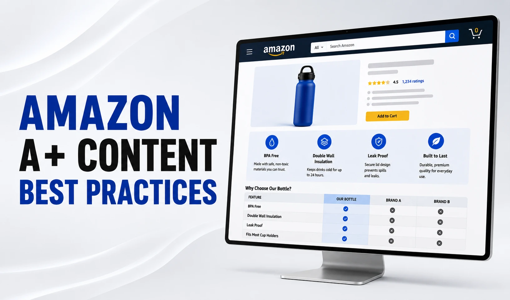
Amazon A+ content best practices start with research, not module selection. Sellers who see real conversion gains build their content around buyer objections pulled from reviews and Q&A, design for mobile first, write short benefit-led copy, and treat A+ content as a conversion tool rather than a branding exercise.
Amazon states that Basic A+ Content can lift sales by up to 8%, and Premium A+ Content by up to 20%. Those numbers only show up when the content is built strategically. Most A+ content underperforms because sellers pick modules based on how they look, not on what buyers actually need to know.
If you need that foundation first, read our complete guide to A+ Content on Amazon before coming back here. Everything below is the practical playbook for making A+ content actually convert.
Every practice in this guide applies whether you sell through Seller Central or Amazon Vendor Central. The workflow, module options, and terminology differ slightly between the two, but the underlying strategy of research, prioritization, and disciplined execution stays the same.
Need Professional Amazon A+ Content Visuals?
Our Amazon product infographic design team builds module-ready visuals, comparison charts, and lifestyle graphics that follow the practices covered in this guide. Get started with Offshore Clipping today.
Start With Research, Not Module Selection
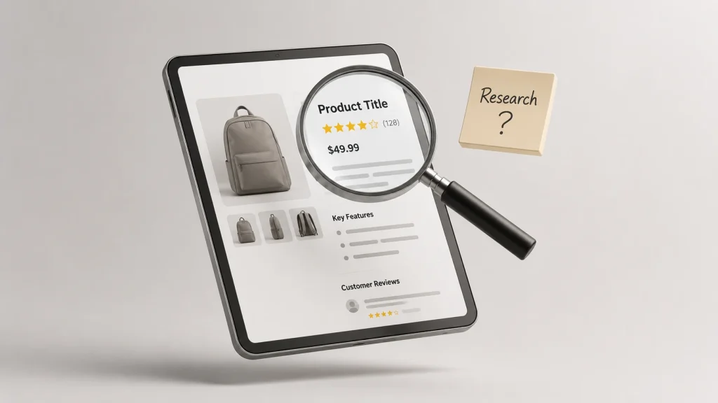
The biggest mistake sellers make with Amazon A+ Content is opening the A+ Content Manager before they know what they need to say. Module selection should be the last step, not the first.
Strong A+ content starts with a simple question: what does the shopper still not understand after reading the title, bullets, and looking at the main product images? Everything you build should answer that question.
Mine Your Reviews for Objections and Praise
Read through your product reviews and pull out the objections that show up repeatedly. Size confusion, material quality concerns, and compatibility questions are common patterns. These objections become the backbone of your content modules.
Also note what customers praise unprompted. If multiple reviews mention a specific feature or use case without being asked, that feature deserves a dedicated module. It is already proven to matter to buyers.
Read Your Q&A Section Like a Content Brief
The questions shoppers ask before buying reveal exactly what information is missing from your listing. Each unanswered or repeated question is a signal that a module should exist to answer it visually.
Treat your Q&A section as free market research. It tells you precisely where your product description page and bullets are falling short, without guesswork.
Audit Competitor A+ Content for Gaps
Look at the top three to five competitors ranking for your main keywords. Study their content modules, comparison charts, and brand story modules. Note what they explain well and where their visual content or copy falls flat.
Those gaps become your opportunities. If a competitor’s comparison chart is cluttered or their product images are low resolution, a cleaner, more specific alternative gives you a real edge. Tools like Helium 10 or Jungle Scout can help with keyword research and competitor tracking during this phase, though a manual review of the actual product detail pages usually reveals more about content quality than any dashboard.
Pay attention to how competitors sequence their content modules, not just what each module contains. A brand that opens with a comparison chart is making a different bet than one that opens with a lifestyle image, and that choice tells you something about what their research uncovered.
Build a Simple Research Brief Before You Design Anything
Once you have gathered objections from reviews, questions from your Q&A section, and gaps from competitor pages, write them down in one place. A short brief listing the top five to seven buyer questions keeps your content focused during the design phase.
This brief becomes your reference point every time you are tempted to add a module because it looks good rather than because it answers something real. Treat it as the source of truth for what your A+ content needs to accomplish.
Decide Which ASINs Deserve A+ Content First
Not every product in your catalog needs A+ content on day one. Prioritizing the right ASINs first gets you the fastest return on the time you invest.
Prioritize High-Traffic Products With Below-Average Conversion
These are your highest-ROI candidates. The traffic already exists, so A+ content’s job is simply to convert more of the visitors you are already getting. A conversion rate below your category average is a strong signal to start here.
Prioritize Products With Return Risk From Mismatched Expectations
If your return reasons or reviews mention wrong size, not as pictured, or does not work with my setup, A+ content can directly address those objections with dimension callouts, compatibility specs, and clear use-case visuals.
Confirm Amazon Brand Registry and A+ Access First
Before prioritizing anything, confirm the ASIN is fully covered under your Amazon Brand Registry enrollment and eligible for A+ content. Brand Registry also plays a role in brand protection, which matters if you are investing real design time into content you want to defend against copycats.
Know When A+ Content Will Not Fix the Real Problem
A+ content cannot compensate for weak main images, poor reviews, uncompetitive pricing, or missing bullet points. Fix those fundamentals first. A+ content is a conversion layer that works on top of a solid listing, not a rescue tool for a broken one.
Build a Simple Priority Table for Your Catalog
A short scoring exercise across your top ASINs makes prioritization concrete instead of a gut call. Rank each product on traffic, current conversion rate, return risk, and margin, then start with whichever combination scores highest.
| Signal | What It Tells You | Priority Impact |
|---|---|---|
| High traffic, below-average conversion rate | Visitors exist but are not converting | High priority for A+ content |
| High return rate tied to expectation mismatch | Shoppers are buying without full understanding | High priority, focus on objection handling |
| Weak main images or thin reviews | Listing fundamentals are not ready | Fix first, A+ content later |
| Low traffic, no clear differentiation | Visibility problem, not a content problem | Low priority for now |
Revisit this table every quarter as traffic, reviews, and return data shift. What deserved priority six months ago may not be your best candidate today.
Copywriting Best Practices for A+ Content
Copy is the most overlooked part of A+ content strategy. Most sellers spend their entire budget on visuals and treat the text as an afterthought, which is backwards.
Lead With Benefits, Not Feature Specs
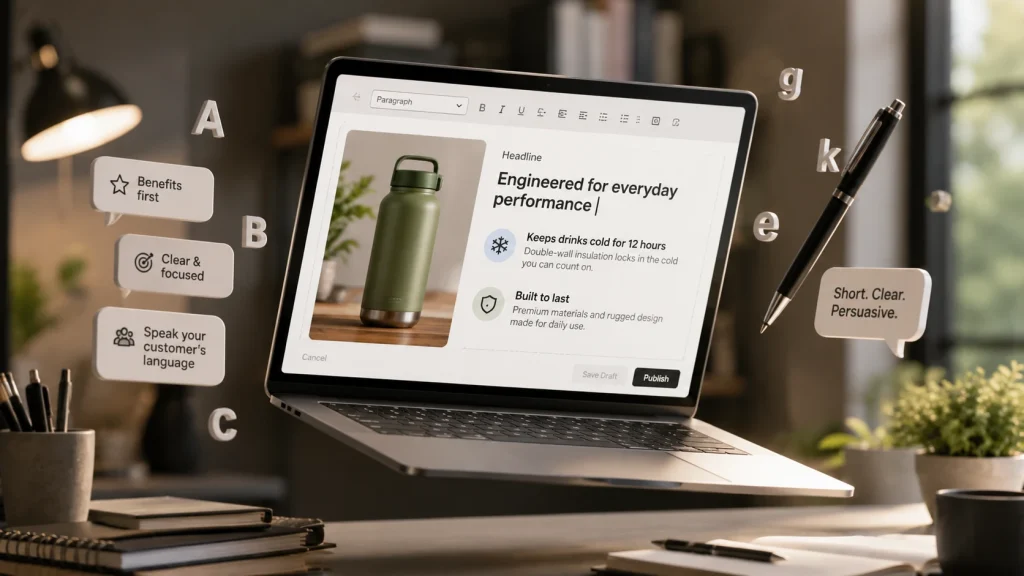
Product features tell shoppers what the product has. Product benefits tell shoppers what it does for them. Lead every module with the benefit and use the feature as supporting proof underneath it.
For example, instead of writing “double-wall vacuum insulation,” write “keeps drinks cold for 12 hours, even on long shifts or hikes.” The second version answers the buyer’s real question: what does this mean for me?
Keep Copy Short and Scannable
One to two sentences per module is the practical ceiling. Shoppers scan A+ content; they do not read it like an article. If a module needs more explanation, split it across two modules rather than writing a longer paragraph.
Mirror the Language Your Buyers Actually Use
Your reviews and Q&A section contain the exact phrases your customers use to describe their needs and hesitations. Reuse that language in your A+ copy instead of generic marketing terms. If buyers say a bag does not spill in transit, use that phrasing rather than leak-resistant design.
Avoid Claims That Get Content Rejected
Superlatives without proof (best, number one, guaranteed), unsubstantiated health claims, competitor mentions, pricing or promotional language, and contact information will all trigger rejection. Keep every claim specific and verifiable.
Use Social Proof Carefully
You cannot quote customer reviews directly inside A+ content modules, but you can reflect what reviews consistently say in your own words. If dozens of reviews mention a product holding up well after months of daily use, that durability claim, framed accurately, belongs in a module.
Write for Keyword Relevance Without Stuffing
A light SEO strategy still helps here. Natural keyword placement across your module copy supports how Google and Amazon’s AI shopping assistant interpret your product, even though A+ content is not a direct Amazon ranking factor. Keyword-rich content only works when it still reads naturally to a human buyer.
Image and Design Best Practices
For a closer look at how strong visual design plays out across different modules and industries, see our dedicated breakdown of real A+ Content examples. The practices below focus on the build process itself, not on analyzing finished pages.
Design for Mobile First
The majority of Amazon traffic now comes from mobile devices. Content modules stack vertically on a phone screen, and images shrink significantly. Design every module assuming a small screen is the primary canvas, not an afterthought.
Mobile Optimization Is Not Optional
With mobile traffic making up the majority of Amazon shopping sessions, mobile customers should shape every design decision you make, not just the final review step. Building mobile-first from the start avoids costly redesigns later.
Give Every Image One Job
The most common design mistake is trying to communicate several benefits inside a single image. Each visual should have one clear purpose. If a shopper cannot understand the point within a couple of seconds, the image is doing too much.
Don’t have time to fix thousands of product photos? Get our Image background removal service.
Keep Text Out of Images Where Possible
Text overlays that look fine on a desktop monitor often become unreadable once an image shrinks on mobile. Use Amazon’s text fields for copy and reserve your images for product shots, lifestyle context, and simple visual callouts.
Do not forget the image alt text field on every module. It supports accessibility for shoppers using screen readers and gives Amazon and search engines additional context about what each image shows.
Maintain Visual Consistency Across Every Module
Consistent brand colors, typography, and image style across all your content modules make the entire A+ section feel like one cohesive experience. Mismatched fonts or clashing visual styles between modules signal a rushed build.
Build on Professional Photography, Not Around Its Gaps
No amount of layout skill fixes a blurry or poorly lit source photo. High-resolution images, clean backgrounds, and accurate color correction are the foundation every module depends on. Our product photo retouching and background removal services exist specifically to close that gap before a single module gets built.
Design Assets Once, Reuse Them Across Modules
A single clean product shot with a standardized background and consistent lighting can be repurposed across a comparison chart, a technical specifications module, and a hero banner. Planning your visual assets before you touch the A+ Content Manager saves significant rework later.
Treat Banner and Packaging Visuals as Part of the System
Banner design at the top of your A+ section and any product packaging design shown in feature modules should follow the same visual language as the rest of your listing. A mismatched banner style at the very top of the page undercuts the consistency you build everywhere else.
If you want to see these practices applied across real modules and industries, our Amazon A+ Content examples breakdown is the next place to look.
Module Strategy Without Overbuilding
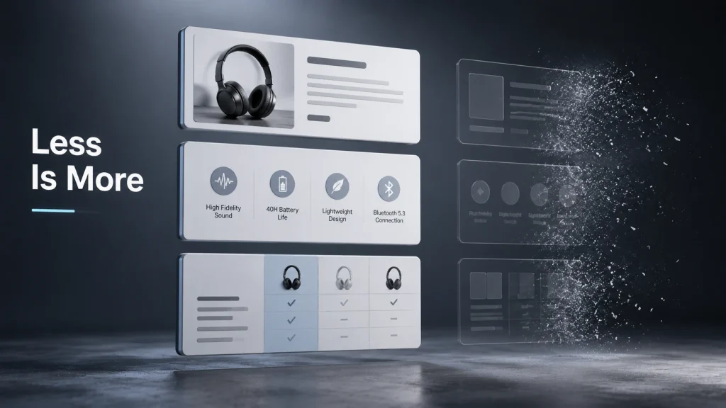
Amazon offers a wide range of content modules, from comparison charts and lifestyle images to interactive hotspots, carousel modules, and Q&A modules. This section assumes you already know what each module does and focuses purely on strategy, not definitions.
Match Modules to Objections, Not Aesthetic Preference
Choose each module because it answers a specific buyer question you identified during research, not because it looks appealing in the preview. A comparison chart earns its place when shoppers genuinely need to choose between variants. An interactive hotspot module earns its place when a product has features that are easier to show than explain in text.
Sequence Modules by What Shoppers Need First
Open with whatever resolves your buyer’s biggest hesitation. If size confusion drives your returns, lead with dimensions or a comparison chart, not a brand story. Save the brand story module and lifestyle photography for later in the sequence, once the core product questions are already answered.
Use Interactive Modules Only Where They Add Real Value
Premium and A++ Content unlock interactive hotspots, video modules, and clickable carousels, but these features are not automatically better. An interactive hotspot module earns its place on a technical product with several features worth exploring. On a simple, single-purpose product, a static image with clear labels often communicates just as well.
Let Product Family Structure Guide Comparison Charts
If you sell multiple sizes, bundles, or variants within one product family, a well-built comparison chart or product comparison widget keeps shoppers inside your catalog instead of clicking away to compare against competitors. Structure the chart around the decision the shopper actually needs to make, not every spec you have available.
How to Audit and Improve Existing A+ Content
Most best practice guides only address sellers building A+ content for the first time. If your content is already live, these steps help you find out whether it is actually working.
Check Your Unit Session Percentage Before and After
In Seller Central, under Reports and then Business Reports, review your Detail Page Sales and Traffic data. Compare unit session percentage from before and after your A+ content update to spot directional changes in conversion.
Keep in mind that price changes, new reviews, and seasonal demand can also move this metric, so treat it as a signal to investigate rather than proof on its own.
Preview on Mobile Before You Trust It
Pull up your live listing on an actual phone. Check whether text is readable, whether images crop cleanly, and whether your most important module appears within the first two positions.
Check for Repetition Between A+ Content and Bullet Points
If your content modules simply restate what your bullet points already say, they are not adding value. A+ content should introduce new information or present existing information in a clearer visual format.
Run A/B Tests Through Manage Your Experiments
Amazon’s Manage Your Experiments tool lets eligible sellers test different versions of A+ content against each other. Test module order, image styles, and copy approaches, and let real shopper behavior decide rather than internal opinion.
Give each test enough time to collect meaningful traffic before drawing conclusions. High-traffic ASINs can reach useful results faster than lower-volume products, so factor that into how long you let a test run.
Refresh Content When Products or Buyer Behavior Change
A+ content is not something you build once and forget. Packaging changes, updated specs, new use-case scenarios, or a shift in what your reviews and Q&A reveal all justify revisiting your existing modules and updating them accordingly.
Common Best Practice Mistakes That Undermine A+ Content
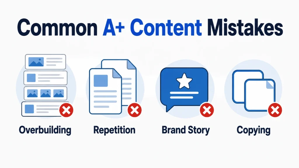
Filling Every Module Slot Just Because You Can
More modules don’t mean a stronger listing. Filler modules with no clear purpose dilute the impact of the modules that are actually doing work. Build only what earns its place.
Repeating Bullet Points Instead of Adding New Information
A+ content is wasted space when it simply reformats your existing bullet points. Every module should answer a question the bullets could not, or present proof visually rather than as another line of text.
Prioritizing Brand Story Over Product Education
Unless you already have strong brand recognition, shoppers care more about understanding your product than reading your origin story. Lead with product education and objection handling. Save deeper brand storytelling and brand messaging for later in the sequence, once product-level brand trust has already been earned.
Brand Story still matters for long-term brand loyalty and customer engagement across your catalog. It just should not be the first thing a first-time shopper sees on an unfamiliar product.
Skipping Research and Copying Competitor Structure
Copying a competitor’s module layout without understanding why it works (or doesn’t) for your own product family produces generic content. Use competitor research for gap-finding, not as a template to trace over.
Frequently Asked Questions
How Often Should I Update My A+ Content?
Review performance every few months, and update sooner if your reviews or Q&A reveal new objections, your product details change, or a competitor’s content clearly outperforms yours. A+ content is not a one-time task.
Does A+ Content Improve Amazon SEO?
Not directly. A+ content is not a primary ranking factor in Amazon’s search algorithm the way your title and backend search terms are. It can indirectly support performance by improving conversion rate, which contributes to your listing’s overall competitiveness over time.
Can I Use the Same A+ Content Across Multiple ASINs?
Yes, for products within the same product family that share the same core benefits and specs. Just make sure the content stays accurate for each Amazon Standard Identification Number individually. Do not apply identical content to products that differ in size, material, or function.
What Is the Best Module for Increasing Conversions?
There is no single best module across every category. A comparison chart helps most when shoppers choose between variants. A technical specifications module helps most for spec-driven products. The right module depends entirely on the objection it needs to resolve.
How Do I Know if My A+ Content Is Actually Working?
Track unit session percentage over time, preview your content on mobile regularly, and use Manage Your Experiments to A/B test specific changes. Directional metrics combined with structured testing give you the clearest picture.
Do These Practices Apply to Vendor Central as Well?
Yes. Amazon Vendor Central sellers have access to a similar system, sometimes still referred to by its earlier name, Enhanced Marketing Content. The research, prioritization, and design principles in this guide apply the same way, even though the module names and workflow differ slightly from Seller Central.
Is It Worth Hiring Help for A+ Content Design?
If your team is spending more time fighting image dimensions and compliance rejections than actually improving your messaging, professional support usually pays for itself. Sellers managing A+ content across dozens of ASINs especially benefit from a dedicated visual production process rather than handling it ad hoc.
Final Thought
Amazon A+ content best practices come down to a simple discipline: research before you design, write for the objection rather than the aesthetic, and build every module on top of professional, high-resolution photography.
And if your product photography needs work before any of this can happen, our ecommerce photo editing team can help you get there.