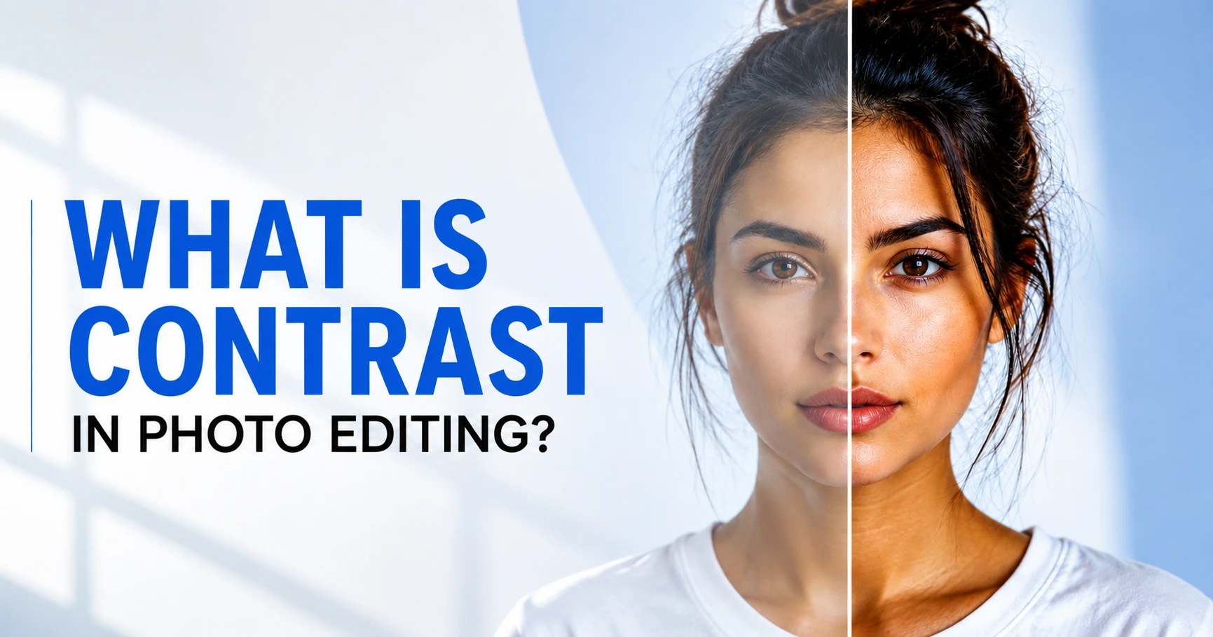
Open a flat, dull photo and ask yourself what’s actually wrong with it. In most cases, it isn’t exposure; it’s an image contrast issue that bothers you.
So, what is Contrast in Photo Editing? Well, in simple terms, it’s an adjustment that separates your subject from everything behind it, making the subject the lead.
A good contrast can make your eye land exactly where you want it. Even a perfect shot can feel muddy or lifeless, no matter how sharp the focus is.
That’s what we’re untangling in this article. What contrast really does to a photo, the five types you’ll be working with, how high and low contrast stack up against each other, and which control (Brightness/Contrast, Curves, Levels, or masking) fits the problem sitting in front of you.
Want to skip the trial and error? Our color correction services team handles this exact kind of tonal and color balancing on product and portrait images every day.
What Is Contrast in Photo Editing, Really?
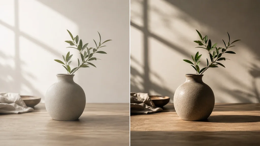
Contrast in photo editing controls the difference between the lighter and darker areas of an image. That tonal relationship influences how much depth and texture you see, the mood the photo creates, and where your eyes naturally go first.
When the contrast is stronger, the image often feels bolder and more dramatic. Softer contrast brings the tones closer together, giving the photo a calmer and more subtle look.
But contrast does not create new detail. It simply changes how the existing tones relate to one another. For example, a dark jacket is easy to notice against a light wall, but against a dark wall, its shape can start to blend into the background.
New to the concept entirely? It helps to zoom out and look at what photo editing actually covers, since contrast is only one piece of a much bigger toolkit.
Contrast vs. Brightness: Not the Same Thing
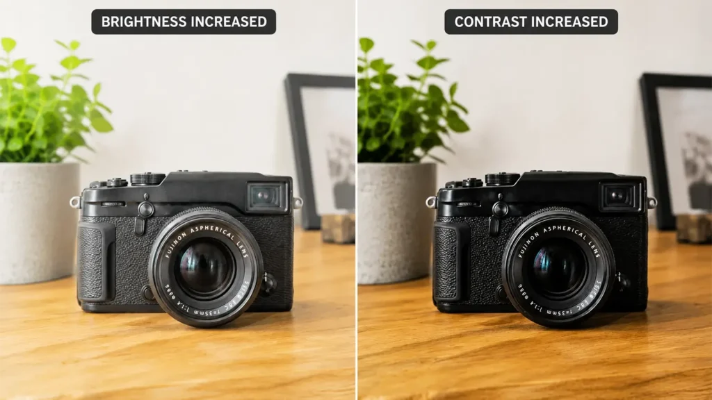
Brightness and contrast can both change how a photo feels, but they solve different problems. Brightness controls the overall lightness or darkness of the image, while contrast controls the separation between light and dark tones. Knowing the difference helps you avoid fixing an exposure problem with the wrong adjustment.
| Point | Brightness | Contrast |
|---|---|---|
| What it controls | Overall lightness or darkness | Separation between light and dark tones |
| Main visual effect | Makes the image lighter or darker | Makes tonal differences stronger or softer |
| Best used when | The overall exposure feels too dark or too bright | The image lacks depth or tonal separation |
| What happens when increased | More tones shift toward brighter values | Highlights and shadows become more separated |
| Main risk | Washed-out highlights or overly dark exposure | Crushed shadows, harsh highlights, lost detail |
| Quick diagnosis | “Is the image too dark or too bright?” | “Does the image look flat or lack separation?” |
Why Contrast Actually Matters the most in Photo editing
Contrast doesn’t just make a photo look “punchier.” It changes the image’s structure, which is exactly why a small tweak can sometimes transform the whole shot. Here are some reasons of why it matters:
When Everything Feels Flat, check the depth
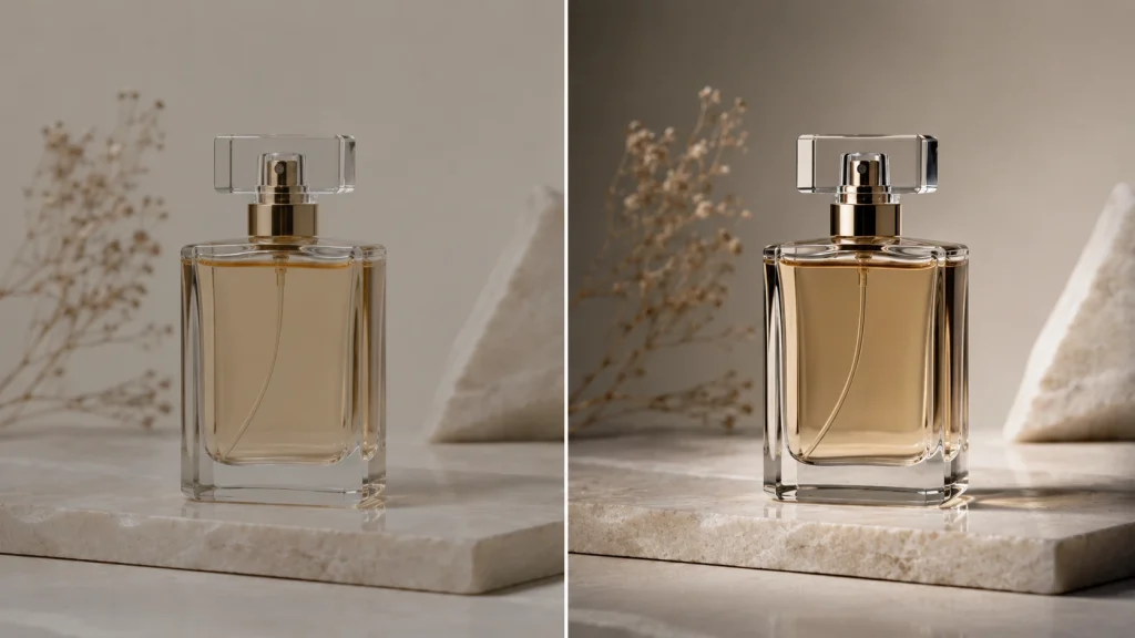
Look at the subject, foreground, and background. If they all sit within a similar brightness range, the image can feel almost compressed into one plane.
Technically, this often comes down to weak luminance separation, especially through the midtones. You do not necessarily need deeper blacks or brighter whites. A small Curves adjustment through the middle of the tonal range can create more depth while leaving the endpoints almost untouched.
That is why an S-curve is not always the answer. Sometimes the image only needs a little more space between specific midtone values.
A Subject Can Be Sharp and Still Disappear
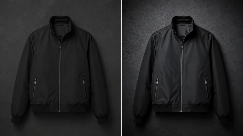
Imagine a black jacket against a charcoal wall. The edges may be perfectly sharp, but both areas are so close in luminance that the jacket still blends into the background.
Sharpening cannot fix that because this is not an edge-detail problem. It is a subject-to-background contrast problem.
You could solve it by lifting the jacket slightly, darkening the background, changing their color relationship, or working locally with Curves. Sometimes the better fix even starts with background editing rather than touching global contrast at all.
Contrast Also Controls Where an Audience Looks First
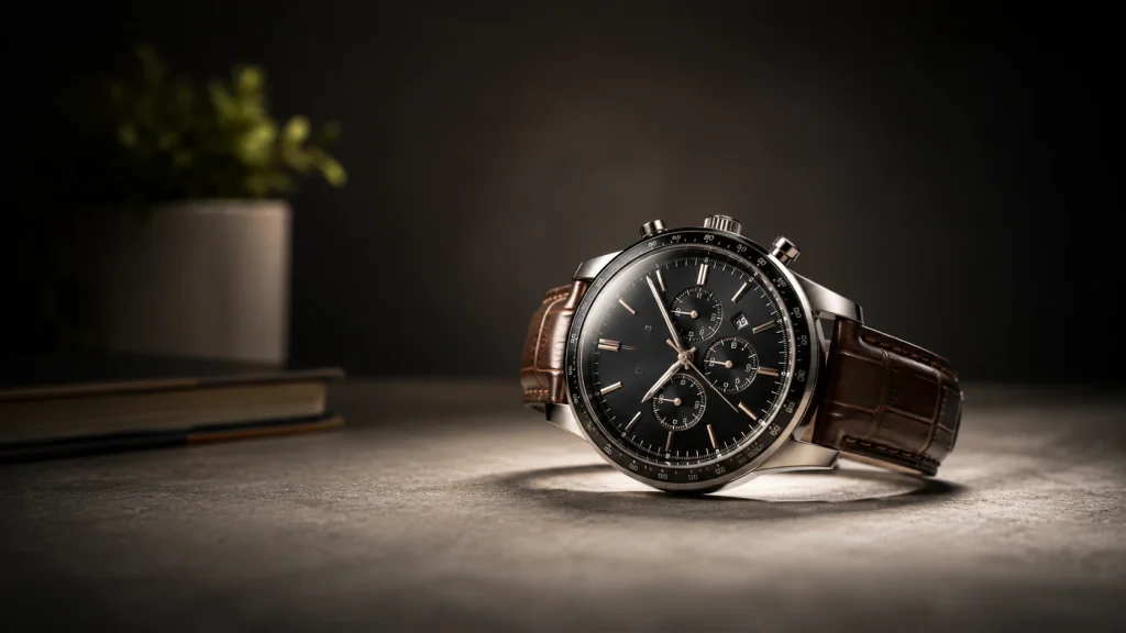
Your eyes naturally move toward noticeable differences in brightness, color, and edge detail. That is why a brighter face surrounded by darker tones usually attracts attention quickly.
This is where contrast becomes more than a correction tool. It becomes a way to control visual hierarchy.
Instead of increasing contrast across the whole image, you can create stronger local separation around the subject and leave secondary areas softer. The subject gets attention without the background becoming unnecessarily harsh.
Think of it like this: not every part of the photo needs to speak at the same volume.
Want a Different Mood? Look Beyond the Contrast Slider
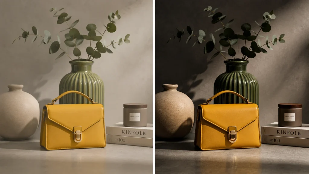
Strong blacks and bright highlights can make a photograph feel dramatic, but mood is not decided by the endpoints alone. The way the midtones transition between them matters just as much.
A portrait can contain a deep black point and still feel soft if the midtone transitions remain gentle. On the other hand, increasing separation through those middle values can make the same image feel harder and more graphic without dramatically changing the brightest or darkest pixels.
So when an image feels “too soft” or “too harsh,” do not judge the Contrast slider alone. Look at the entire tonal curve.
And Texture? That Is Contrast on a Much Smaller Scale
Zoom into hair, skin, denim, wood, or leather. What makes those surfaces readable is the tiny brightness difference between neighboring details.
That is local contrast, or at an even smaller scale, micro-contrast.
Increase it carefully and fabric texture becomes clearer, hair gains definition, and materials feel more dimensional. Push it too far and the effect turns against you. Skin starts looking rough, hair becomes wiry, and clean fabric develops a gritty appearance.
A useful editing test is simple: zoom back out. If the texture becomes one of the first things you notice instead of the subject, you have probably pushed it too far.
The 5 Types of Contrast Hiding Inside “Contrast”
Here’s where a lot of editors get stuck. There isn’t one Contrast slider. It’s several different visual relationships bundled under one word, and they don’t all respond to the same fix.
Tonal Contrast
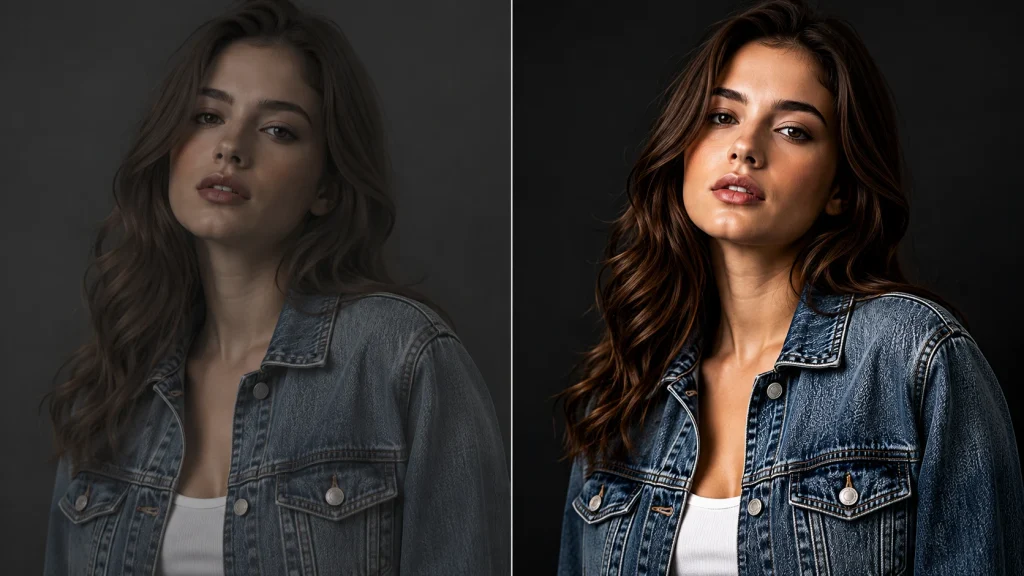
Ever notice how a bright face immediately stands out against a dark background? That is tonal contrast at work. It comes from the difference in brightness between areas of the image. If those values sit too close together, the photo can feel flat. Curves, Levels, and Brightness/Contrast are usually the tools to reach for.
Color Contrast
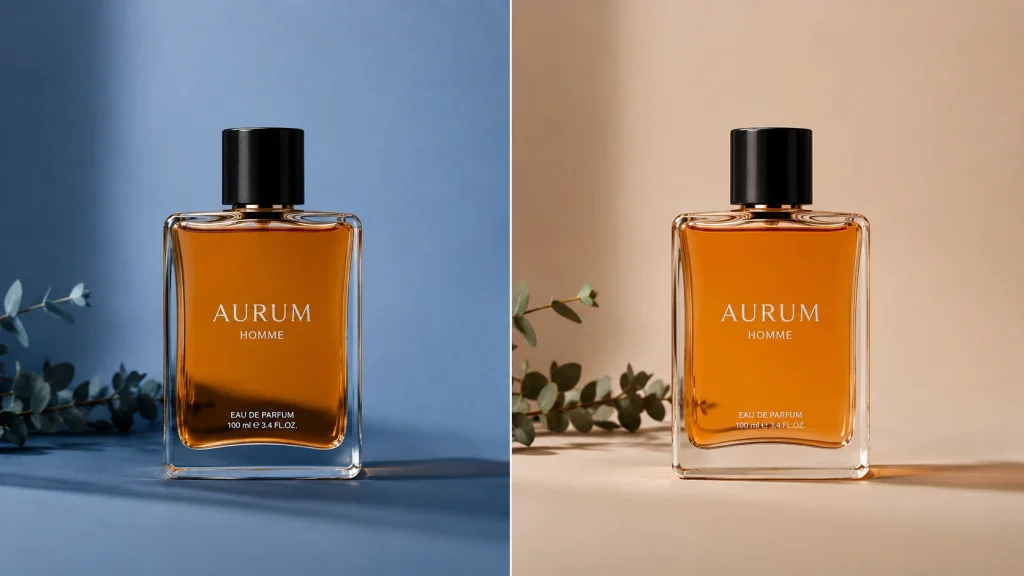
Sometimes the tones are perfectly fine, but the subject still does not separate well. That is when color becomes the bigger factor. A warm orange subject against a cool blue background can stand out even when both have similar brightness. Here, Hue, Saturation, Color Balance, or selective color adjustments usually make more sense than changing the black point.
This is also why choosing the right product background color before the shoot can prevent separation problems that tonal adjustments may struggle to fix later.
Global Contrast
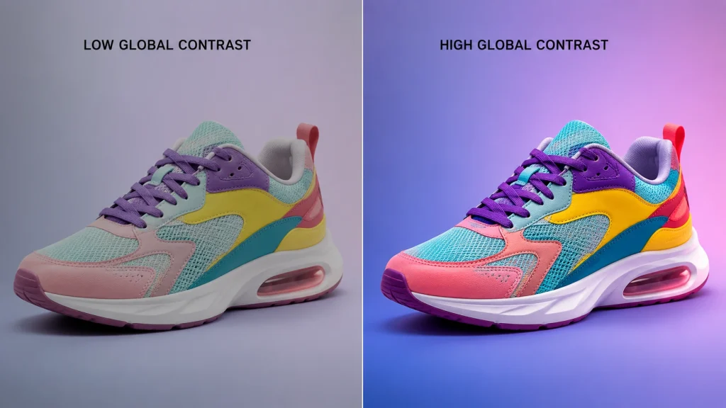
If the whole photo feels dull, a broad adjustment can be enough. This is global contrast, where the change affects most or all of the frame at once. A Contrast slider or a wide Curves adjustment can strengthen the overall tonal range, but it can also push already-good shadows or highlights too far.
You will see the same approach in car photo editing, where broader tonal and white-balance corrections usually come before more detailed local work.
Local Contrast
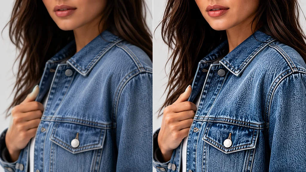
What if the background already looks good and only the face or product feels flat? Changing the whole image would create more problems than it solves. Local contrast lets you work only where the separation is missing, often with a masked Curves or Levels adjustment, while leaving the rest of the frame almost untouched.
If masking is still new to you, this layer mask tutorial shows how to isolate an adjustment without affecting the full image.
Micro-Contrast
Now zoom into hair, fabric, skin, or wood grain. Those tiny details become visible because neighboring areas have small differences in brightness. That small-scale separation is micro-contrast. Clarity, Texture, sharpening, and selective local adjustments can strengthen it, but too much quickly makes skin rough, hair wiry, and fabric unnaturally gritty.
High Contrast vs. Low Contrast: Which Does Your Photo Actually Need?
Neither is the “right” default. It depends on the subject, the light you shot in, the mood you’re chasing, and how much tonal range you’re starting with.
| Aspect | High Contrast | Low Contrast |
|---|---|---|
| Tonal separation | Strong | Subtle |
| Shadows | Deeper | Softer |
| Highlights | More prominent | More restrained |
| Common use | Product shots, drama, black and white | Soft portraits, fog, pastel or film looks |
Pros of High Contrast
- Defines shapes and edges clearly
- Strengthens silhouettes and product outlines
- Adds drama and boldness
- Makes texture pop
Cons of High Contrast
- Crushes shadow detail into solid black
- Blows out highlight texture
- Can make skin look harsh
- Ages badly in a portfolio when overdone
Pros of Low Contrast
- Keeps skin tones smooth and natural
- Suits foggy, pastel, or film-inspired looks
- Feels calm and atmospheric
- Leaves room for a later color grade
Cons of Low Contrast
- Can let the subject blend into the background
- Risks looking washed out or unfinished
- Reads as a mistake instead of a style choice if overdone
- Loses punch when printed
The Photoshop Tools That Control Contrast
Once you know what’s wrong, picking a tool gets easy. Skip the impulse to reach for the most powerful option. Reach for the least aggressive one that actually solves your problem.
| Tool | Best For | Main Risk |
|---|---|---|
| Brightness/Contrast | Quick, whole-image correction | Too broad for local problems |
| Curves | Precise control over specific tonal ranges | Easy to overcook the S-curve |
| Levels | Fixing black point, white point, midtones | Clipping detail if pushed too far |
| Shadows/Highlights | Recovering one problem tonal region | Can look artificial if overused |
| Layer masks | Selective, local contrast | Rough edges create bad transitions |
Brightness/Contrast
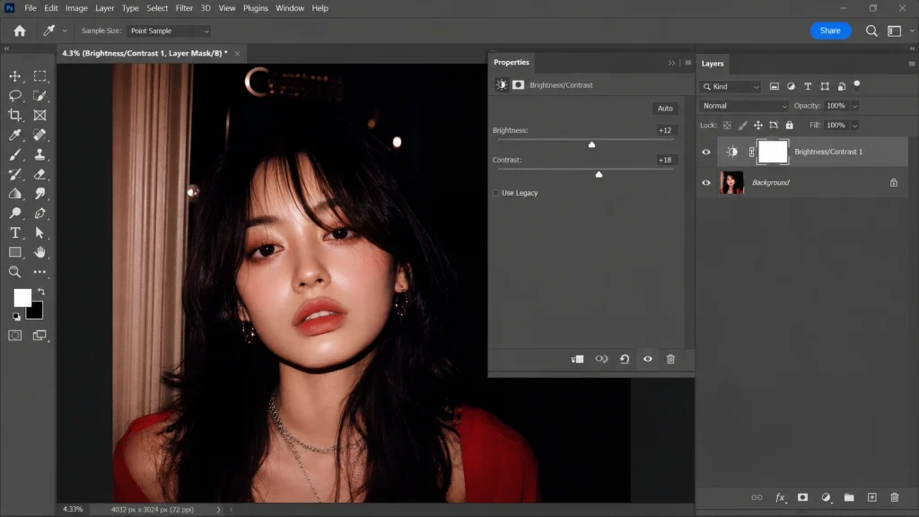
Fast, and genuinely good for a small, even boost across the whole image. Worth knowing: Adobe’s own documentation puts the Contrast slider’s range at -50 to +100, tighter than most editors assume.
The catch? It touches everything equally. Need more definition in a face while the background’s already fine? A global Brightness/Contrast pass just created a new problem for you.
Curves
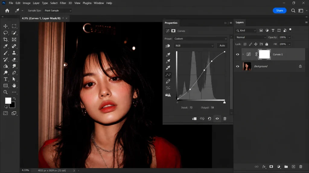
This is where real control lives. A gentle S-curve- shadows down slightly, highlights up slightly, midtones mostly left alone- is the classic move. Curves let you isolate specific tonal ranges that the Contrast slider simply can’t reach.
Still finding your way around the panels? This Photoshop toolbar reference is worth bookmarking before you start pushing points around a Curves graph.
Levels
Levels set your black point, white point, and midtone balance straight off the histogram. Handy when a photo isn’t using its full tonal range. Push the endpoints too far, though, and shadow detail turns to featureless black fast.
Shadows/Highlights
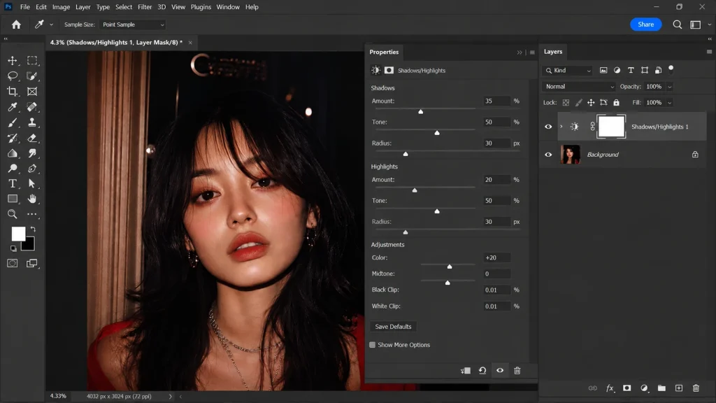
Sometimes contrast isn’t even the real issue. Heavy shadows or blown highlights might be the actual culprit, and targeting that specific region beats nudging overall contrast and hoping for the best.
Layer Masks for Local Contrast
This is where things get surgical. Add the adjustment, mask it to just the area that needs it, and refine the edge so it doesn’t look pasted on. It’s standard practice in professional photo retouching work, and for good reason.
How to Adjust Contrast in Photoshop Without Losing Detail
Here’s the condensed, practical version. You don’t need every tool in the list below. You need to stop the second the photo has enough separation, and not a click more.
Step 1: Add a Brightness/Contrast Adjustment Layer
Go to Layer > New Adjustment Layer > Brightness/Contrast.
In the Properties panel, move the Contrast slider slowly to the right. Watch the subject while you do it, not just the slider value. Stop when the image gains enough separation between light and dark areas.
Also check dark hair, black clothing, white fabric, and bright backgrounds. If those areas start losing detail, pull the slider back slightly.
Step 2: Use Curves When the Contrast Slider Changes Too Much
If Brightness/Contrast makes the whole image too strong, create a Curves adjustment layer from:
Layer > New Adjustment Layer > Curves
Click once around the darker part of the curve and drag it slightly downward. Then add another point in the brighter area and move it slightly upward.
This creates a gentle S-curve, which increases contrast with more control.
Keep the movement small. A steep curve can quickly make shadows too dark or highlights too harsh.
Step 3: Use Levels to Set the Dark and Bright Range
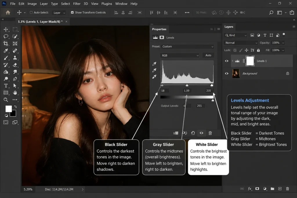
Add a Levels adjustment layer from:
Layer > New Adjustment Layer > Levels
You will see three sliders under the histogram:
- Black slider: controls the darkest tones
- Gray slider: controls the middle brightness
- White slider: controls the brightest tones
Move the black slider slightly inward if the shadows look washed out. Move the white slider inward if the highlights need more brightness.
Use the middle slider when the image needs a general brightness correction without changing the endpoints too aggressively.
Step 4: Apply Contrast Only Where You Need It
Apply it when the overall photo looks good, but the subject still gives a flat feeling.
Create a Curves or Brightness/Contrast adjustment layer, make the correction, then click the white layer mask thumbnail beside that adjustment layer.
Press Ctrl + I on Windows or Cmd + I on Mac to turn the mask black and hide the adjustment.
Choose a soft white brush and paint over the subject. The contrast adjustment will now appear only where you paint.
This is much safer than pushing the whole image harder.
Step 5: Lower the Adjustment if It Looks Too Strong
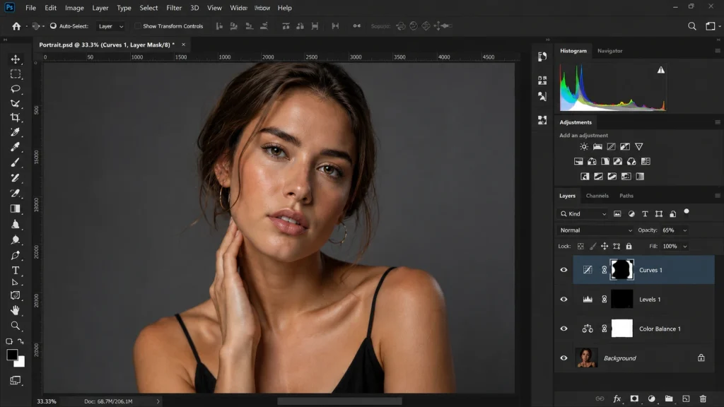
If the correction feels right but slightly heavy, you do not need to rebuild it.
Select the adjustment layer and reduce its Opacity in the Layers panel. For example, lowering the opacity softens the effect while keeping the same tonal shape.
This is especially useful with portraits, skin, reflective products, and images containing delicate highlight detail.
Step 6: Check for Lost Detail
Zoom in and inspect areas where contrast problems usually appear first:
- hair
- skin
- black clothing
- white fabric
- glass
- metal
- product labels
- deep shadows
If a textured black area turns into solid black or a white surface loses its texture, reduce the adjustment.
Step 7: Compare Before and After
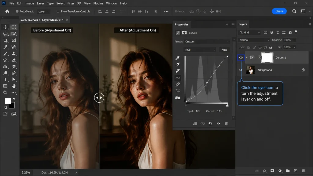
Click the eye icon beside the adjustment layer to switch the correction off and on.
Do not only ask whether the edited version looks stronger. Check whether the subject is easier to see, the image has better depth, and important details are still intact.
If the photo looks clearer without looking obviously edited, your contrast is probably in the right place.
Signs You’ve Pushed Contrast Too Far
Use this quick checklist after increasing contrast. If you notice several of these problems, the adjustment is probably stronger than the image needs.
- Dark hair, black clothing, or shadow areas have turned into solid black patches with little visible detail.
- White fabric, skin highlights, glass, or reflective surfaces look overly bright and lose texture.
- Skin looks rougher than before, with exaggerated pores or overly heavy facial shadows.
- Hair looks wiry, fabric feels gritty, or fine edges appear unnaturally sharp.
- Bright or dark halos appear around the subject or high-contrast edges.
- Colors start looking too intense, especially skin tones, product colors, skies, or clothing.
- Noise, grain, or compression artifacts become much more noticeable.
- Smooth transitions from light to dark start looking abrupt or harsh.
- Background details begin competing with the main subject for attention.
- You keep fixing shadows, highlights, color, or texture just to correct problems created by the contrast adjustment.
Does Contrast Affect Color Too?
Contrast and saturation aren’t the same control, but they’re not strangers either. Shift tonal relationships, and colors can look stronger even without touching Saturation, simply because color perception moves along with tonal separation.
After any contrast pass, glance at skin tones, product colors, anything brand-specific. Feeling too intense all of a sudden? Usually the fix is refining that contrast adjustment, not scrapping it entirely.
This interaction isn’t Photoshop-specific either. It shows up across most photo editing effects and software, so the same check applies whether you’re in Lightroom, Capture One, or Photoshop.
FAQs
Is high contrast better than low contrast?
Neither wins outright. High contrast means stronger tonal separation. Low contrast means softer transitions. The right pick depends on your subject, your lighting, and the mood you’re going for.
Can too much contrast actually lower image quality?
Yes. Push it too far and you hide the tonal information the photo needs. Crushed blacks, blown highlights, harsh skin, exaggerated texture: all signs an adjustment went further than the image could handle.
What’s the real difference between contrast and brightness?
Brightness is how light or dark the whole image looks. Contrast is how different those light and dark values are from each other. A photo can be bright and low contrast, or dark and high contrast.
What exactly is local contrast?
Tonal separation applied to one specific part of an image instead of the whole frame. In Photoshop, that means masking an adjustment layer to just the area that needs it.
Does increasing contrast affect color?
Not directly, but tonal shifts can make colors read as more intense even without a saturation change. Worth checking skin tones and product colors after any contrast edit.
Brightness/Contrast, Levels, or Curves: Which should I actually use?
Brightness/Contrast for a quick, even correction. Levels for fixing the black point, white point, or midtones. Curves when you need precise control over one specific tonal range.
Conclusion
Once contrast in photo editing clicks, the slider stops feeling like a magic “make it better” button. Sometimes the whole image needs more separation. Sometimes only the subject does. And sometimes the softer version was right all along.
Photoshop gives you plenty of ways to get there: Brightness/Contrast, Curves, Levels, masking. The real skill isn’t reaching for the most powerful tool every time. It’s knowing exactly how much contrast the photo needs, and stopping the moment you get there.
Would you rather hand that judgment call to someone who makes it daily? Our Photoshop editing team handles contrast, color, and retouching across full product and photography catalogs.