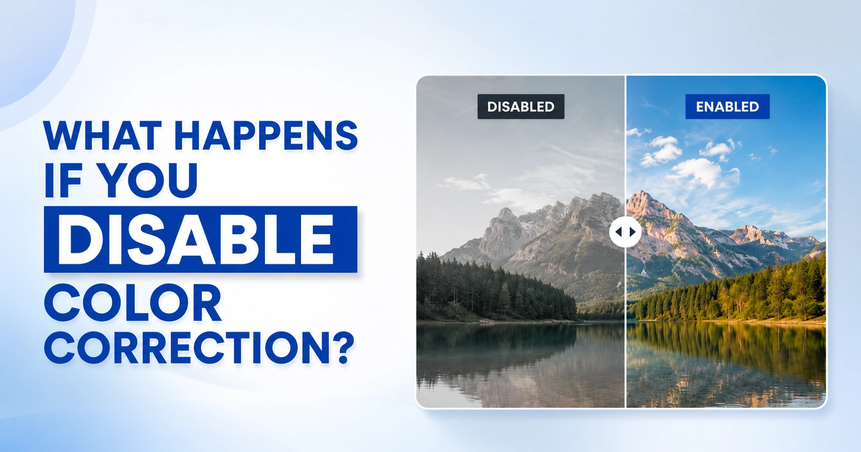
When you disable color correction, exposure errors, white balance shifts, and color casts stay uncorrected in the image or footage. This makes editing harder, lowers color accuracy, and produces inconsistent results across screens, cameras, and export formats. The exact impact depends on three things: the footage itself, your editing software, and where the final content gets viewed.
Color correction exists to solve this before it becomes a problem. In professional photo and video editing, it creates a consistent starting point by balancing white balance, exposure, and color accuracy before any creative grading or retouching begins. Disable it, skip it, or leave it off, and the same image or video can look different from shot to shot, camera to camera, and screen to screen.
This guide covers exactly what happens when color correction is disabled, where that setting actually lives in your editing software, when skipping it is genuinely safe, and when it quietly wrecks your final output.
Defining Color Correction in the Digital Age
Color correction prepares an image or video for editing. It fixes white balance, exposure, contrast, and unwanted color casts before creative work begins. You can find color correction tools in editing software like Adobe Photoshop, Lightroom, Premiere Pro, DaVinci Resolve, and Final Cut Pro.
Today, editors lean on it most when working with RAW photos, Log footage, AI-powered editing tools, and content viewed on different devices. It creates a balanced starting point that keeps colors consistent from capture to final delivery.
Tired of fixing poor exposure and uneven colors by yourself? Try our photo color correction services to restore natural, consistent colors, so you can spend less time editing.
Where Is Color Correction Actually Disabled?
The setting isn’t always labeled “disable,” so it helps to know where it actually lives.
In Adobe Premiere Pro, it’s a direct toggle: open the Lumetri Color panel, go to Settings → Sequence Settings, and choose Disable Color Management from the Color Setup dropdown. This turns off automatic color space conversion and keeps media in its original color properties — no auto-adjustment applied.
In Lightroom, there’s no single “disable” switch, but the closest equivalent is turning off Auto Settings (Settings → Edit tab → Auto Settings → Auto Edit), which stops Lightroom from automatically nudging exposure and color on import.
Premiere’s Lumetri Color panel also lets you enable or disable individual correction sections with their checkboxes, which is useful for comparing a corrected clip against its original look before deciding whether to keep the adjustment.
The Dual Nature of Color Correction: Creative vs. Accessibility
Color correction serves two purposes. For editors, it creates a technically accurate foundation for creative grading. For viewers, it improves color clarity and consistency across different screens and viewing conditions. These roles make color correction essential for both creative workflows and accessibility.
| Aspect | Creative Purpose | Accessibility Purpose |
|---|---|---|
| Goal | Prepare footage for color grading | Keep colors and brightness consistent across displays |
| Focus | White balance, exposure, shot matching | Readable contrast, natural colors, clear visibility |
| Benefit | Greater creative control | Better viewing experience for every audience |
Why “Disabling” Correction is Rarely a Neutral Choice
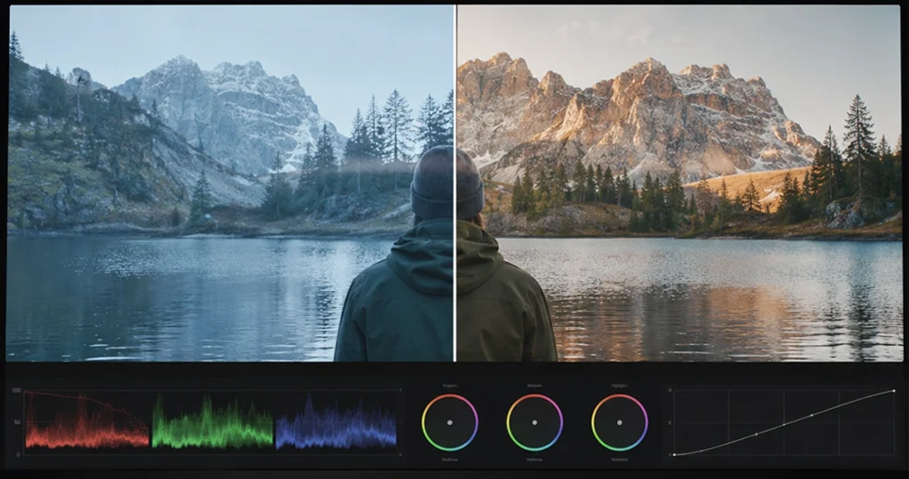
When you disable color correction, the technical adjustments that keep footage visually consistent are removed; nothing replaces them. Any issue the camera captured, whether incorrect white balance, uneven exposure, or a color cast, stays in the image and carries forward into every edit that follows.
Instead of building a creative look from a balanced starting point, editors end up spending more time fixing technical problems than making creative decisions. That’s why professional workflows treat color correction as the foundation of post-production, not an optional pass.
The Creative Fallout: What Happens to Your Visual Media?
Color correction provides the balanced foundation every creative edit depends on. Without it, exposure, contrast, tonal balance, and shot consistency become harder to control, making it difficult to maintain a cohesive visual style.
The following sections explain the most common creative consequences and why professionals correct footage before grading.
The Loss of “Ground Truth”: Why RAW Images Look Flat
Professional editors use color correction to build a balanced baseline often called the “ground truth” before applying any creative look. Many beginners assume RAW photos or Log footage look flat because something went wrong during capture.
In reality, RAW files and Log profiles are built to preserve more image data for editing. They look flat because they deliberately hold less contrast and saturation than a fully processed image.
That extra data gives editors room to recover highlight and shadow detail, adjust white balance, match footage shot on different cameras, and apply more accurate grading. Skip the correction step, and every adjustment downstream becomes less predictable.
Struggling to balance colors in your footage? Let Offshore Clipping handle the color correction, so you can focus on editing your videos. Get Video editing Services
Unnatural Color Casts and White Balance Issues

Indoor and outdoor scenes rarely share the same color temperature. A camera may record one shot with a warm orange cast and the next with a cool blue tint, even though both looked natural to the eye. Without proper color management and white balance, those differences become obvious once the clips appear together on the timeline.
Editors usually notice problems such as:
- Blue or orange skin tones
- Green or magenta color shifts
- White objects appearing yellow
- Inconsistent product colors
The larger the project becomes, the harder those mismatched colors are to correct consistently.
The Degradation of Contrast and Saturation in Post-Production
Contrast and saturation adjustments work best on a balanced image. If footage already has incorrect exposure or an unwanted color cast, pushing contrast or saturation further usually makes the problem worse not better. Increasing contrast can clip highlights, crush shadows, and hide fine detail. Increasing saturation can make an existing color cast more noticeable and push colors into unnatural territory.
Every clip also reacts differently to the same adjustment, which makes shot matching across a sequence even harder. Color correction gives editors a balanced starting point, so contrast and saturation moves stay controlled and consistent from shot to shot.
Impact on Exposure: Why Highlights Blow Out, and Shadows Become Muddy
Exposure controls how much light the camera sensor records. When highlights exceed the camera sensor’s dynamic range, they clip and lose detail that is difficult to recover.
Dark areas receive too little light, so lifting shadows during editing also increases digital noise, making them look muddy and less detailed.
Color correction balances exposure before creative grading, helping preserve highlight detail, improve shadow separation, and create a more consistent tonal range.
Need consistent shadows across your product photos? Offshore Clipping’s Drop Shadow Services create clean, realistic shadows for a professional look.
The Technical Consequences for Photographers and Editors
Skipping color correction doesn’t only affect the final image; it changes the entire editing workflow. Photographers spend more time fixing exposure and color inconsistencies, while video editors struggle to match shots and apply creative grades consistently.
This section explains how color correction supports faster, more reliable post-production and why many professional tools assume technically balanced footage from the start.
The Foundation of Filmmaking: Why You Can’t Grade Without Correction
Color grading changes the mood of a scene, but it assumes the footage is already technically accurate. If white balance, exposure, or color casts remain uncorrected, grading builds on existing problems instead of improving the image.
Professional filmmakers correct footage first because it helps them:
- Match shots captured under different lighting
- Create consistent skin tones
- Apply creative looks instead of exaggerating color problems
- Maintain visual continuity throughout the project
A strong grade begins with technically balanced footage, not with creative adjustments.
Using Color Wheels and Curves to Fix the “Disabled” Damage
When color correction has been skipped, editors have to manually restore the image before creative grading can even start. Rather than one blanket adjustment, they reach for tools like color wheels and curves to correct specific color and exposure problems while preserving as much detail as possible.
These tools are commonly used to:
- Neutralize an unwanted color cast
- Balance shadows, midtones, and highlights independently
- Restore natural-looking contrast
- Improve overall color consistency across a sequence
Most editing software also offers a color auto-correct option that adjusts white balance, exposure, and color balance automatically. It works fine for simple, single-source footage, but it tends to struggle with mixed lighting, strong color casts, or footage that needs precise matching across multiple cameras.
That’s why professional workflows still lean on manual color correction for anything client-facing. It takes longer, but it gives far more control over white balance, exposure, contrast, and color balance control that matters when shots need to match perfectly across a final deliverable.
Why LUTs (Look-Up Tables) Fail on Uncorrected Footage
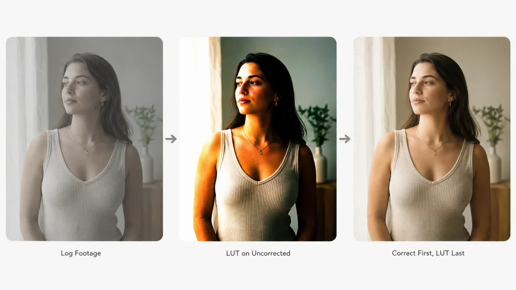
Not all LUTs do the same job. Technical LUTs convert Log footage into a standard color space, giving editors a proper starting point. Creative LUTs add a specific style a cinematic or film-inspired look, for example. Both are built to work on already-balanced footage.
Apply a LUT to footage with uncorrected exposure, white balance, or color casts, and those problems don’t disappear they get more visible. Editors commonly see:
- Oversaturated colors
- Crushed shadows
- Blown highlights
- Uneven skin tones across the same scene
The reliable sequence: normalize Log footage with a technical LUT or color transform first, correct exposure and white balance, then apply the creative LUT last. Skipping the order not just the correction step is what causes most of the visible damage.
The Role of Photoshop and GIMP in Restoring Natural Appearance
Although Photoshop and GIMP offer different feature sets, both follow the same color correction editing process. Editors first remove technical problems such as exposure errors and unwanted color casts before applying any creative retouching.
Typical adjustments include:
- White balance
- Tonal correction
- Contrast
- Color matching
The tools differ, but the editing sequence remains the same.
Hardware and Environment: The Invisible Correction
Accurate color correction depends on both software and the editing environment. Monitors, lighting, and calibration tools determine how colors appear on screen, directly affecting editing decisions. That’s why professional editors treat hardware calibration as a core part of the color workflow, not a final quality check.
The Risk of Working on Uncalibrated Monitors
It’s surprisingly common for editors to spend hours correcting colors on an uncalibrated monitor, only to discover the final export looks completely different on another display. The problem isn’t always the edit; it is often the screen itself. In the case of calibration, every color decision is based on inaccurate visual information.
This often results in:
- Incorrect color adjustments
- Inconsistent exposure decisions
- Skin tones that change across devices
- Unexpected differences after export
A calibrated monitor reduces guesswork and helps editors make decisions based on accurate visual data.
How Does Color Management Support Color Correction?
Color correction adjusts the image, while color management keeps colors consistent across cameras, monitors, printers, and other devices. Together, they help ensure the colors you edit match the colors your audience sees.
Using Colorimeters and Spectrophotometers to Establish a Baseline
Accurate color correction starts long before you adjust exposure or white balance. It starts with a trusted color baseline: a monitor that displays colors according to an accepted standard.
Even with that baseline, editors may unknowingly correct colors that were already accurate or miss problems that appear only after export or printing.
Calibration devices create this baseline by measuring how your display colors.
| Device | Primary Purpose |
|---|---|
| Colorimeter | Measures monitor brightness, white point, and color accuracy for display calibration. |
| Spectrophotometer | Measures a wider range of colors and creates profiles for both monitors and printed media. |
Once the monitor is calibrated, every editing decision is based on reliable color instead of visual guesswork. That consistency becomes especially important when projects move between different displays, editors, or print workflows.
Why Reference Displays Are Essential for True Color Accuracy

Professional productions often use reference displays instead of standard consumer monitors. These displays are designed to reproduce color according to industry standards, allowing editors to evaluate footage without unwanted shifts caused by the screen itself.
Reference displays are especially important when:
- Delivering commercial work
- Matching footage from multiple cameras
- Preparing projects for broadcast or streaming
- Maintaining consistent brand or product colors
They help ensure the final output looks as intended, not just on the editor’s screen but on every supported display.
Image Color Matching (ICM) and Its Role in Print vs. Screen
Photographers often notice color problems only after printing. An image that looked accurate on screen may print darker, warmer, or with incorrect brand colors. In many cases, the issue isn’t the printer but an unmanaged color workflow.
Image Color Matching (ICM) uses ICC color profiles to keep colors consistent between cameras, monitors, printers, and paper. Instead of letting each device interpret colors differently, ICM creates a predictable workflow from editing to final output.
Without ICM, you may experience:
- Prints that appear darker or warmer than expected
- Inconsistent brand colors
- Different colors across multiple displays
- Mismatches between digital and printed images
Although ICM cannot make every device identical, it significantly improves color consistency across the entire workflow.
Use Cases: When Disabling Color Correction Ruins the Result
Some editing processes can recover from minor color problems, while others depend on accurate color from the very beginning. Skipping correction in these situations often reduces image quality, limits editing flexibility, or produces inconsistent results.
The following examples show why color correction is an essential first step in many modern editing workflows.
AI Photo Restoration: Why Correction Must Come Before the AI
Many editors expect AI to automatically fix bad color. In practice, most AI restoration tools analyze the image data they’re given rather than reconstruct missing color information from scratch.
Feed an AI model incorrect white balance, uneven exposure, a strong color cast, clipped highlights, or deep shadows, and it treats those flaws as part of the original image — sometimes preserving them, sometimes exaggerating them further.
Correcting white balance, exposure, and color casts, and recovering what highlight and shadow detail is still recoverable, before AI processing gives the model cleaner data to work from. That’s what produces more natural skin tones, sharper facial detail, and a noticeably higher-quality restoration result.
Low-Light Image Enhancement: The Struggle with Digital Noise and Color Loss
Low-light images are difficult to enhance because camera sensors capture less light and a weaker color signal. As ISO increases, digital noise becomes more visible while colors lose accuracy and saturation.
Brightening the image without correcting these issues often amplifies noise, introduces color artifacts, and reduces fine detail.
Professional editors correct exposure, white balance, and tonal balance before enhancement so the image contains cleaner color information, producing more natural results with less visible noise.
Restoring Old Prints and Faded Scans: The Correction Checklist
Old photographs often fade unevenly over time. They may lose contrast, develop yellow or magenta color casts, or suffer from exposure inconsistencies. Color correction restores a balanced foundation before retouching or AI restoration begins.
A typical correction workflow includes:
- Correct white balance
- Restore overall exposure
- Remove unwanted color casts
- Recover contrast
- Balance faded colors before detailed restoration begins
This sequence produces a more reliable starting point for the remaining restoration work.
Your old photos may fade, but your memories shouldn’t. Let Offshore Clipping restore natural colors and repair damaged photos with expert Image Restoration Services.
The Psychological and Narrative Impact
Color influences more than technical quality. It also shapes how people interpret emotion, atmosphere, and visual storytelling. When color correction is missing, the intended mood of a scene can change, making the final image or video communicate something different from the creator’s original vision.
Storytelling Through Tone: How Color Correction Dictates Mood
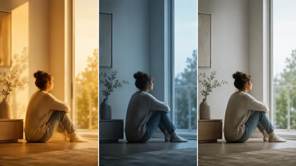
Every visual story begins with believable color. Once the image is technically balanced, editors can shape its emotional tone through creative grading. Even though the foundation is set, mood becomes inconsistent because unwanted color shifts compete with intentional creative choices.
For example:
- Warm tones often suggest comfort, nostalgia, or intimacy.
- Cool tones can create distance, tension, or isolation.
- Neutral colors help maintain realism in documentaries or commercial work.
Color correction ensures that these creative decisions reflect artistic intent rather than technical errors, allowing every scene to communicate the intended emotion consistently.
Conclusion
Whether color correction gets disabled intentionally or skipped by mistake, the result is usually the same: a longer editing workflow and a less consistent final output. It affects exposure, white balance, contrast, skin tones, and color consistency at every stage that follows — making grading less predictable, AI restoration less reliable, and results more likely to mismatch across screens and print.
Color correction isn’t a creative effect layered on top of an edit — it’s the technical foundation everything else in post-production stands on. Whether you’re restoring old photos, editing commercial video, or prepping eCommerce images, correcting color first is what gives you real control over the result, instead of chasing consistency after the fact.
Ready to skip the guesswork? Get a free trial of Offshore Clipping’s photo color correction services and see the difference a proper baseline makes.