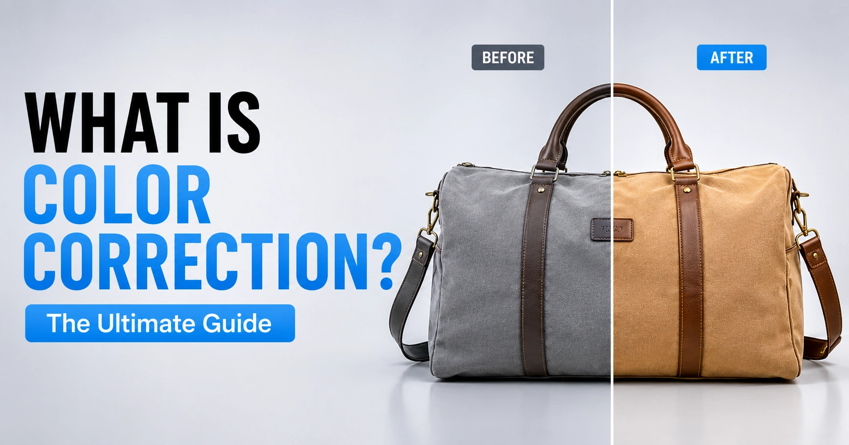
You shot 40 product photos in your studio session. Half look slightly blue-gray, a few have a yellow cast from your softbox, and none quite match the product’s actual color on your desk. This is the exact problem color correction solves, and it’s the single most overlooked skill in photo editing, because most beginners either skip it or do it in the wrong order relative to everything else.
What Is Color Correction, Exactly?
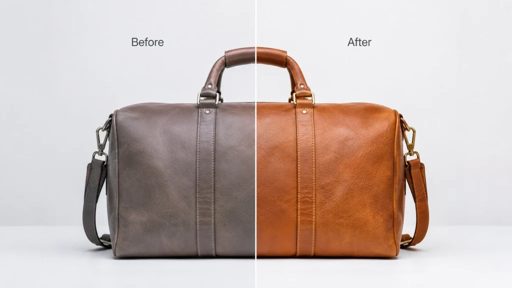
Color correction is the technical process of adjusting an image’s white balance, exposure, contrast, and color casts. Hence, it looks accurate and true to life the way the scene actually appeared to the eye, not the way the camera or a mismatched light source recorded it. It includes more than “color” in the narrow sense; density, saturation, dynamic range, and contrast are part of the same pass. Even black-and-white images go through color correction, since tonal balance still matters without hue.
It exists because no two devices see color the same way. A camera sensor, a phone screen, a laptop display, and a printed page all operate in different color spaces (sRGB vs. Adobe RGB being the most common split) and render the same file differently; color correction is the step that accounts for those gaps. For a broader look at where this fits into the full editing process, see our guide on what photo editing actually covers.
What Our E-Commerce Image Editing Fixes
- White balance removes unnatural warm/cool casts so whites look truly white and skin tones read naturally
- Exposure recovers detail in images that are too dark or too bright, and restores lost dynamic range
- Contrast restores depth in flattened shadows and highlights
- Saturation brings oversaturated or washed-out color back to natural intensity
- Color cast/consistency neutralizes tints from mixed lighting and matches a whole set of photos so they feel shot under the same conditions
- Chromatic aberration and gamut clipping: minor lens-based color fringing and out-of-range colors that get flattened or corrected in the same pass
Color Correction vs. Color Grading
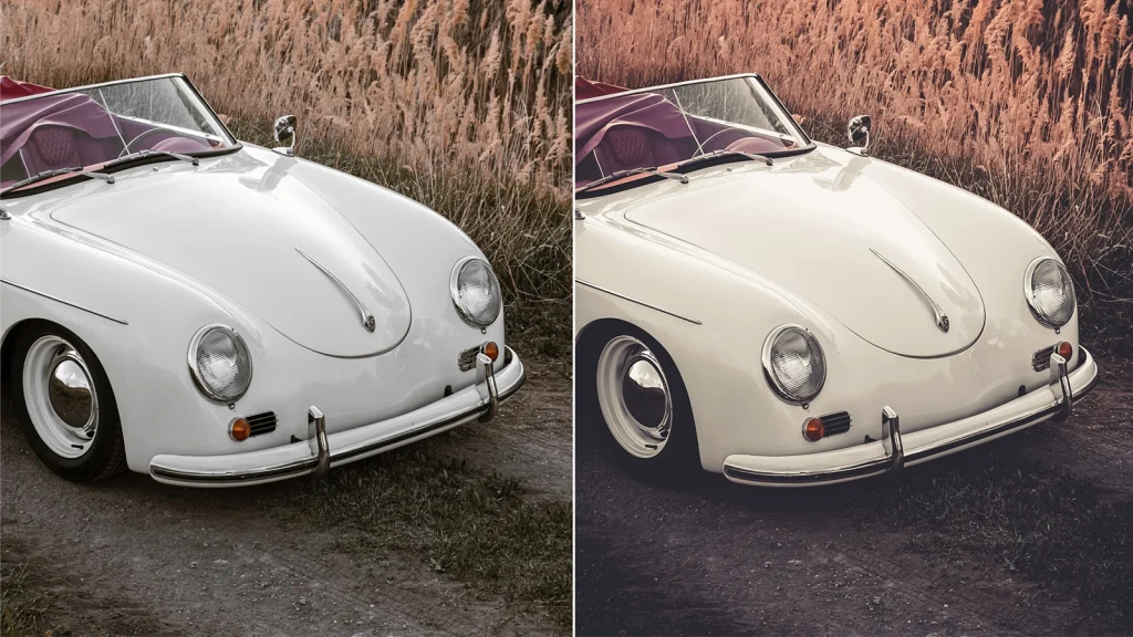
Correction is restoration, removing a flaw the camera or lighting introduced. Grading is addition, applying a deliberate stylistic choice on top of an already-accurate image (things like split toning or a stylized color palette, covered in our color grading guide.
The practical test: compare your edited photo to the real object under neutral light. If it matches, that’s correction. If you’ve deliberately pushed it away from reality for mood or style, that’s grading. For a side-by-side breakdown of both, see our color grading vs. color correction comparison.
Why Correcting Color Order Matters
If your product photo has a 10% blue cast from LED panels and you skip straight to a stylized cool-toned grade, you’re stacking a deliberate cool grade on top of an accidental cool cast; the result reads as 20% blue, not the look you wanted. Correct first; always skipping this step entirely causes its own compounding problems, which we break down in what happens if you disable color correction.
For e-commerce, correction is often the whole job. Most marketplaces require product photos to match delivered items within a set color tolerance. Returns increase when photos do not match. This is a growing concern as product photography trends shift toward more lifestyle and editorial styling; the correction baseline still has to hold underneath any of it.
Why Color Correction Matters: Who Needs It and When
Who Actually Needs Color Correction
- Photographers. Wedding, portrait, and event shoots involve mixed lighting and multiple skin tones in one frame; correction keeps everyone looking natural in the final gallery.
- E-commerce and retail sellers. Accurate product color directly affects return rates and trust; a shirt that photographs bluer than it is will generate complaints regardless of how good the photo otherwise looks. See our full breakdown of product photography types and standards.
- Graphic designers and digital artists whose work is displayed across multiple platforms and formats need one consistent color baseline to start from.
- Marketing teams and agencies whose brand visuals need to look intentional and consistent across every channel, not shot-dependent.
- Content creators and social media accounts. A cohesive feed depends on every image starting from the same corrected baseline before any creative filter is applied.
When Should You Actually Correct a Photo
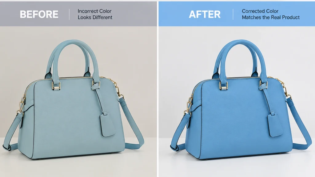
- The photo has an unnatural color cast from tricky lighting or a wrong camera white balance setting
- You’re printing or publishing a set of photos and need them to look like one consistent shoot
- The photo looks fine on your screen but reads differently once printed or viewed on another device (a color space or gamut mismatch, often)
- The same image needs to go across multiple platforms or print materials and stay consistent
- Skin tones look slightly orange, gray, or waxy compared to the actual person
Photo sets are the trickiest case in practice; mixed lighting across a multi-hour shoot, or a batch of product photos taken at different times of day, will drift in tone even if each shot looks “fine” in isolation.
Identifying Common Problems
Before touching a slider, learn to name the problem; this is the step most beginners skip, which is why they end up dragging sliders at random until something “looks better.”
Identifying Common Color Casts
Look at anything that should be pure white or neutral gray: a background, a shirt collar, a gray card if you shot one. If it isn’t neutral, you have a cast. Greenish casts come from fluorescent tube lighting. Orange/amber casts come from tungsten bulbs or warm LEDs. Blue casts come from open shade, overcast daylight, or cool-set LEDs.
White Balance Problems
The single most common beginner mistake is shooting on Auto White Balance under mixed lighting (daylight through a window plus a tungsten lamp) and letting the camera guess wrong. Old prints and faded scans have a related but different problem. They shift toward yellow, red, or sepia over time because the print material ages. This change is not from the original lighting. We cover this separate restoration process in our guide on restoring old photos in Photoshop.
How To Identify Exposure Imbalance Using Histograms
Turn on your histogram and watch the edges. Slammed against the left wall = crushed shadows, permanently lost detail. Slammed against the right wall = blown highlights, most common on white studio backdrops and bright skies. Both are, at core, a dynamic range problem: the scene had more range than the sensor or the file format could hold onto.
Banding and Noise
Banding shows as visible stepped lines instead of a smooth gradient, usually from shooting JPEG instead of RAW or pushing a gradient too hard on an already-compressed file. Noise specifically worsens in shadow areas the more you brighten them after the fact.
The Color Science You Actually Need
Kelvin and Light Sources
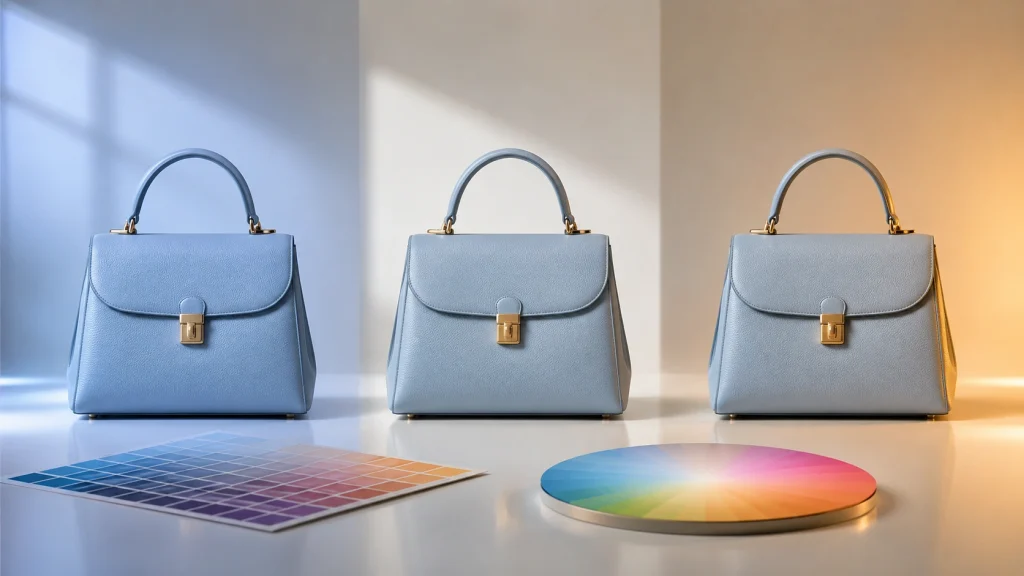
Daylight sits around 5500–6500K. Tungsten/incandescent bulbs sit around 2700–3200K. Fluorescent tubes vary, often 3500–5000K with a green shift. Knowing your light source tells you which direction to correct before you start guessing.
Hue, Saturation, Luminance (HSL)
This is the panel that lets you adjust individual colors instead of the whole image globally. If your reds look too orange but everything else is fine, you go into HSL, select Red, and shift its Hue; this is the precision tool; global sliders are the blunt instrument.
The Color Wheel and Complementary Colors
Red↔Cyan, Green↔Magenta, Blue↔Yellow sit opposite each other. This is why the fix for a green cast is adding magenta; not suppressing green directly suppressing a color outright tends to gray out the whole image instead of neutralizing it, and can push pixels outside the image’s usable gamut.
Essential Tools for Accurate Color Correction
Scopes: Histogram and RGB Parade
The histogram reads shadow and highlight clipping before you adjust anything, available in every serious editor. The RGB Parade (Photoshop’s Channels panel) separates red, green, and blue so you can see exactly which channel is causing a cast.
Curves and Color Wheels
Curves correct shadows, midtones, and highlights independently, more surgically than a single brightness slider the same tool covered step-by-step in our Photoshop color correction and photo editing tips.
Why Calibrated Monitors Ensure Accurate Color
If your own screen runs warm, you’ll “correct” images to compensate for a problem that only exists in your room. An inexpensive colorimeter pays for itself after the first client complaint about mismatched colors.
Best Software Options For Image Correction
Use Lightroom for fast, consistent batch correction across a whole shoot. It handles 90% of e-commerce and event work. Use Photoshop for pixel-level fixes on individual hero images. GIMP is a free alternative with similar manual controls. AI-based tools do fast first-pass fixes at volume, followed by manual review.
The Professional Workflow: Step by Step

Correcting in Lightroom
- Fix exposure first, before color. Set your black point (Blacks slider) and white point (Whites slider) using the histogram as your guide. Hold Alt/Option while dragging either slider to see exactly where you’re clipping detail.
- Neutralize white balance. Use the White Balance eyedropper on a known neutral point (gray card, white background, white tag) if one exists in frame. If not, adjust Temp (left = cooler, right = warmer) and Tint (left = green, right = magenta) manually while watching a neutral reference area.
- Check skin tones or product-true color. Zoom to 100% and compare against the physical product or person under neutral light.
- Sync and batch across the shoot. Correct one image from a shot family, click “Copy” in Develop, select the rest from that session, and “Paste” or “Sync Settings.”
Correcting in Photoshop
- Set a neutral baseline. Duplicate your background layer to preserve the original, then use Levels or Curves (Image > Adjustments, or as adjustment layers) to set accurate shadow, midtone, and highlight points.
- Adjust white balance and tint. Use Camera Raw Filter (Filter > Camera Raw Filter) or the Color Balance adjustment to remove unwanted casts; fine-tune Temperature and Tint until a known-neutral area actually reads neutral.
- Refine specific tones. Use Hue/Saturation or Selective Color for targeted fixes, applied through a clipping mask if the adjustment should only affect one layer or object.
- Compare and export. Toggle adjustment layers on/off to check before/after, then flatten and export.
For a deeper walkthrough of these same Photoshop panels (Levels, Curves, Hue/Saturation) applied across different photo types, see our full photo editing tips guide.
GIMP as a Free Alternative
Same logic, free tools: Colors > Levels and Colors > Color Balance for the base fix, Curves for contrast and depth, Hue/Saturation for final refinement. More steps to reach the same result, but a fully capable manual option if Photoshop isn’t in budget.
Mastering Skin Tones: The Beginner’s Greatest Challenge
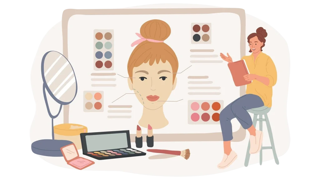
Skin tones are the reference point viewers instinctively judge accuracy by; get literally everything else right, and one wrong skin tone will still read as “off” to someone who couldn’t tell you why.
The practical test after correcting: zoom to 100% on the face and ask, does this look like a real, healthy version of this specific person, or has it shifted toward orange (overcorrected warmth), gray (over-desaturated), or waxy (over-smoothed)? The most common beginner mistake is trying to get even skin tone by overusing noise reduction or smoothing. They fix color by destroying texture instead of adjusting hue and brightness separately. This makes the skin look plastic, not natural.
Working with RAW Files and LUTs
RAW vs. JPEG
A JPEG loses highlight and shadow data during in-camera compression. RAW files keep that data recoverable. This difference means a blown-out background in a JPEG cannot be fixed. But in a RAW file, you can reduce highlights by a stop and a half using the Highlights slider. This dynamic range advantage that makes restoring old, damaged photos possible when a usable original file exists.
LUTs as a Starting Point, Not a Fix
LUTs (Lookup Tables) are preset color transforms; one click applies a whole style. They’re a starting point for grading, never a fix for correction. Applying a moody film LUT to an image with an uncorrected green cast just gives you a moody film look with the green cast baked in. Correct first, then layer a LUT on top if you want a stylistic finish.
Common Beginner Mistakes
Avoid Over-Saturation: Use Vibrance for Natural Colors
Cranking Saturation to make colors “pop” pushes past realistic and clips individual channels; fast reds especially lose internal detail. Use Vibrance instead, since it protects already-saturated tones (like skin) while boosting duller ones.
Crushing Shadow Detail
Pulling Blacks down aggressively for “punch” permanently loses texture a customer or client might notice missing in a product’s dark seams or folds. Holding Alt/Option while dragging Blacks and seeing large solid color patches appear means you’re clipping.
Ignoring Your Viewing Environment
Editing next to a window with warm afternoon light, or under a yellow ceiling bulb, biases your perception; you’ll “correct” the image to compensate for a problem that only exists in your room. Neutral gray walls and consistent, color-neutral lighting (5000–6500K) prevent this, along with taking breaks every 20-30 minutes, since visual fatigue shifts color perception more than most people realize.
From Correction to Storytelling
Once correction is solid, exposure balanced, casts neutralized, skin tones or product colors accurate, consistency held across the whole batch, you have a trustworthy base. Everything after (grading for mood, brand-consistent looks) is optional styling on top of a foundation that’s already true. Skip the foundation, and no amount of stylistic tweaking makes the image feel right.
Frequently Asked Questions
Do I need color correction if my photo already looks fine on my screen?
Possibly screens vary in calibration and color space, so “fine” on your monitor doesn’t guarantee accuracy on someone else’s screen or in print. Checking a neutral reference point in the image is more reliable than eyeballing your own display.
Can color correction fix old or faded photos?
Yes, to a large extent. Old prints usually shift toward yellow, red, or sepia as the print material ages. Levels and Curves corrections can restore much of the original color balance. However, heavily damaged originals have limits on how much detail can be recovered. See our step-by-step old photo restoration guide for the full process.
Do I need special software to color correct?
No, Lightroom and Photoshop are industry standard, but GIMP (free) offers equivalent manual controls with more steps, and AI-based batch tools can handle a fast first pass on high-volume work before a manual review.
Why do my skin tones look slightly orange or gray after I correct white balance?
This usually means the white balance fix was based on a background or object reference that wasn’t perfectly neutral, or a global HSL adjustment pushed too far. Zoom into the face specifically and check it against the correction rather than judging the whole frame at once.
If managing many product or e-commerce shots wastes your time, our team at Offshore Clipping can help. We do daily color correction for clients. We handle hundreds of images per batch. We meet marketplace-accurate standards. Feel free to request a quote, or run a free trial image through first to see the before/after yourself.