
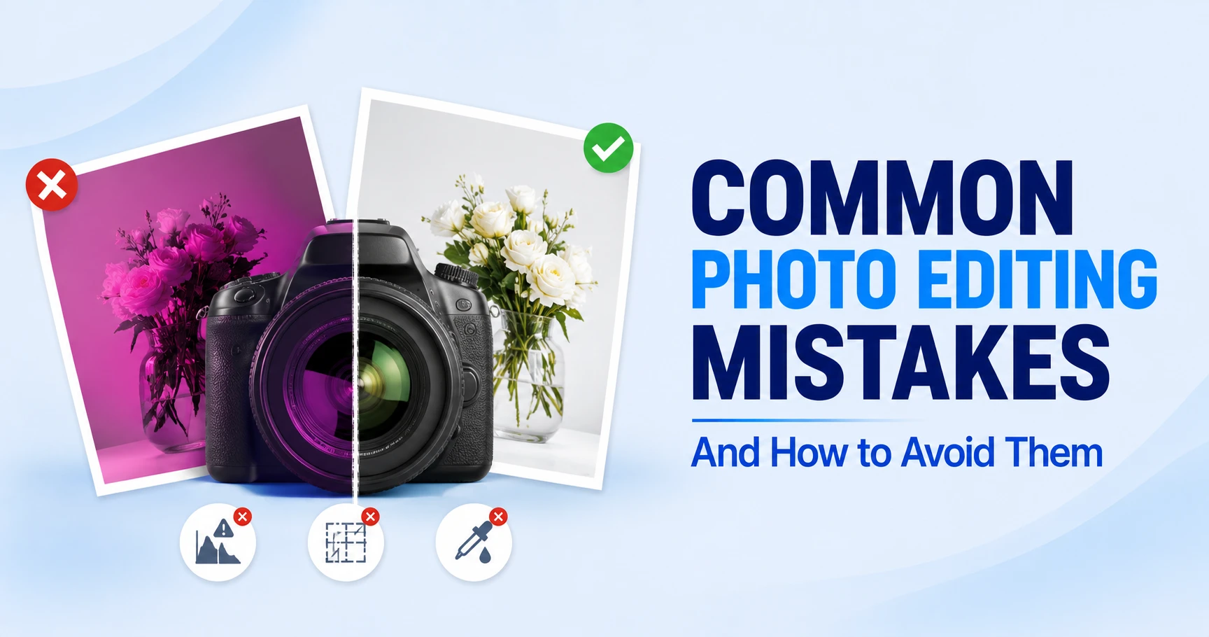
A photo can be well focused and properly exposed, yet still fall apart in post-production. I see this when an editor keeps fixing one small issue until the image becomes too bright, too smooth, too sharp, or simply less believable than the original.
The tricky part is that common photo editing mistakes rarely feel obvious while you are making them. Your eyes adapt to each adjustment, so aggressive contrast, warmth, or smoothing can start to look normal. This guide shows what those mistakes look like, why they happen, and how to correct them without creating another problem.
Managing hundreds of inconsistent edits? Our professional photo editing services keep every image clean, accurate, and consistent.
Here are the Mistakes Photo Editors Often Make at a Glance:
- Pushing exposure too far: Protect highlight texture and avoid dragging noisy shadows too far upward.
- Using contrast to create detail: Strong blacks can add punch, but crushed tones remove information.
- Oversaturating color: Watch skin, grass, skies, and product colors for the first warning signs.
- Sharpening at the wrong view: Check detail at 100% zoom, then judge the final image at normal size.
- Retouching away texture: Remove distractions without erasing pores, fabric grain, or real surface character.
- Fixing a local problem globally: Mask the affected area instead of changing the whole frame.
- Ignoring consistency: A good single edit can still look wrong beside the rest of a set.
- Trusting AI without review: Check generated edges, text, reflections, hands, logos, patterns, and proportions.
- Editing destructively: Keep the original and make important changes reversible whenever possible.
- Skipping final QC: Review detail, normal viewing size, and a reference before export.
When Does an Edit Actually Become a Mistake?

An editing mistake appears when an adjustment unintentionally damages an image’s realism, detail, color accuracy, or consistency. Thus lose the information the viewer needed, misrepresenting the subject, or breaking uniformity across a set. There is no universal correct style. A dramatic campaign and an eCommerce listing can need completely different treatment.
For a broader foundation, see our guide on what photo editing is, which explains the differences between correction, enhancement, retouching, and creative manipulation.
Start Editing Without Knowing What the Final Image Needs
This is the most common photo editing error an editor makes. A web thumbnail, fine-art print, Amazon image, and beauty campaign each require different levels of sharpening, cropping, contrast, and retouching. The goal is to decide which elements need adjustment and which should remain true to the original.
For instance, a portrait image requires a clean background and believable skin, while an ecommerce product catalog requires accurate color, shape, texture, and consistency. Landscapes, on the other hand, require tonal depth without flattening the direction of light.
Mistaking a Creative Choice for a Technical Correction
Creative photo editing effects are not mistakes by themselves. Even an inverted or unconventional look can be effective when it is intentional. The problem begins when an effect hides a technical flaw or conflicts with the image’s intended use.
To avoid such mistakes, build a sound base first. Even without the creative treatment, the image should have controlled exposure, believable color, clean edges, and sufficient detail. Style should enhance a well-edited image, not compensate for one that is technically flawed.
Exposure and Tonal Mistakes That Destroy Detail
Exposure problems are not just about making an image too bright or too dark. What matters is how much usable tonal information survives the edit. Once highlights lose texture or shadows lose separation, later corrections may change brightness, but they cannot always bring the original detail back naturally.
Blowing Highlights Until the Texture Disappears
Don’t judge overexposure by brightness alone. Check areas such as white fabric, clouds, pale skin, polished metal, jewelry, and glossy packaging. If those areas become flat white shapes, useful highlight variation may be gone.
Lower Highlights before making a large Exposure change, then check Whites with the histogram or clipping warning. A RAW file may still hold recoverable data. Truly clipped pixels can be darkened, but normal tonal correction cannot recreate the original texture.
Lifting Dark Shadows Until Noise and Flatness Take Over
Recovering shadows becomes a mistake when every dark area is lifted. Applying deep shadows can describe shape and lighting better. And raising them too far reduces depth and can reveal luminance or color noise that was previously hidden.
Check whether the shadow contains information the viewer actually needs. Recover important details, such as a face, garment texture, or product edge. If the darkness is simply creating depth, keep some density and use local masks instead of lifting the whole frame.
Crushing Blacks Just to Make Contrast Look Stronger
Applying heavy blacks can make an image feel punchy, but make sure the contrast gives separate tones rather than collapsing them.
Check the black clothing, dark hair, tires, furniture, and packaging. If different materials merge into one block, the lower tonal range has gone too far.
Back off Blacks or the bottom of the Curve. A gentle S-curve often gives enough separation without sacrificing texture. If only one area needs more depth, protect the rest of the image with a mask.
Color Mistakes That Make an Image Look Fake

Color can go wrong even when an image initially looks more vibrant or polished. I usually notice the problem when familiar colors such as skin, white fabric, greenery, or branded products stop looking believable. Good color work should improve separation and mood without making the viewer question what the subject actually looked like.
Pushing Saturation Until Colors Turn Neon
Oversaturation is usually easy to spot, especially in reds, oranges, greens, and blues. Skin can turn orange, grass may look unnaturally vivid, skies can shift toward cyan, and red products may lose subtle texture.
But before you lower global Saturation, check the Vibrance, HSL channels, and local masks. If only a red dress is too intense, correct that range instead of draining the rest of the frame. Check out our color correction guide; you’ll get more detailed information on how white balance, HSL, and curves work together.
Letting White Balance Shift From One Photo to the Next
White balance errors may seem minor when viewing a single image, but they become much more noticeable when images are viewed as a set. As one image looks neutral, the next feels yellow, and the third is magenta. Each file may pass alone, but the gallery feels inconsistent.
Use a neutral reference when available and synchronize the baseline across images shot under the same light. Then fine-tune only where conditions changed. A biased display can also make you correct a problem that exists only on your screen, so a color-accurate monitor matters for critical work.
Leaving Color Casts on Skin, Whites, and Product Surfaces
A local cast can remain even when global white balance is close. Grass, colored walls, modifiers, or nearby clothing may tint a cheek, white shirt, silver product, or transparent bottle.
At that point, stop moving global Temperature and Tint. Correct the affected region with selective color, HSL, curves, or a masked adjustment. Keep some natural variation. Perfectly neutral skin or metal can look less believable than a controlled, realistic reflection of the environment.
Sharpening Mistakes when creating details
Sharpening should make existing detail easier to perceive, not manufacture the appearance of detail that the camera never captured. Once edge contrast becomes too aggressive, textures start looking brittle and smooth transitions become harsh. The tricky part is that these problems can look impressive while you are still zoomed into the edit.
Sharpening Until Halos Appear Around the Edges
Another common photo editing mistake is applying sharpening without first identifying where it is actually needed. Before sharpening, inspect details such as hair against a bright wall, a dark product against a white background, branches against the sky, or packaging text. If you notice a bright or dark outline along an edge, you’re likely seeing a classic sharpening halo.
Adobe currently recommends evaluating sharpening at 100% zoom and warns that over-sharpening can create unnatural halos. Use 100% for the technical check, then return to fit view before deciding the final amount.
Using Clarity or Texture to Rescue a Soft Photo
Clarity and Texture can make detail feel stronger, but neither fixes missed focus. Push them too far, and skin becomes rough, clouds turn brittle, and products gain exaggerated surface contrast.
If the source is soft, use modest selective sharpening on the important subject area and avoid the smooth background or skin. The aim is a believable definition, not an artificial impression of detail the camera never captured.
Using the Same Sharpening for Web and Print
A large print, a 2,000-pixel web image, and a small social thumbnail all resample detail differently. One sharpening setting cannot suit every destination.
Keep editing-stage sharpening moderate. Resize for the final output, then inspect that exported size. Web files should look clean at 100%. Print sharpening also depends on viewing distance and paper, since softer media can reduce perceived edge definition.
Retouching Mistakes That Remove Real Texture
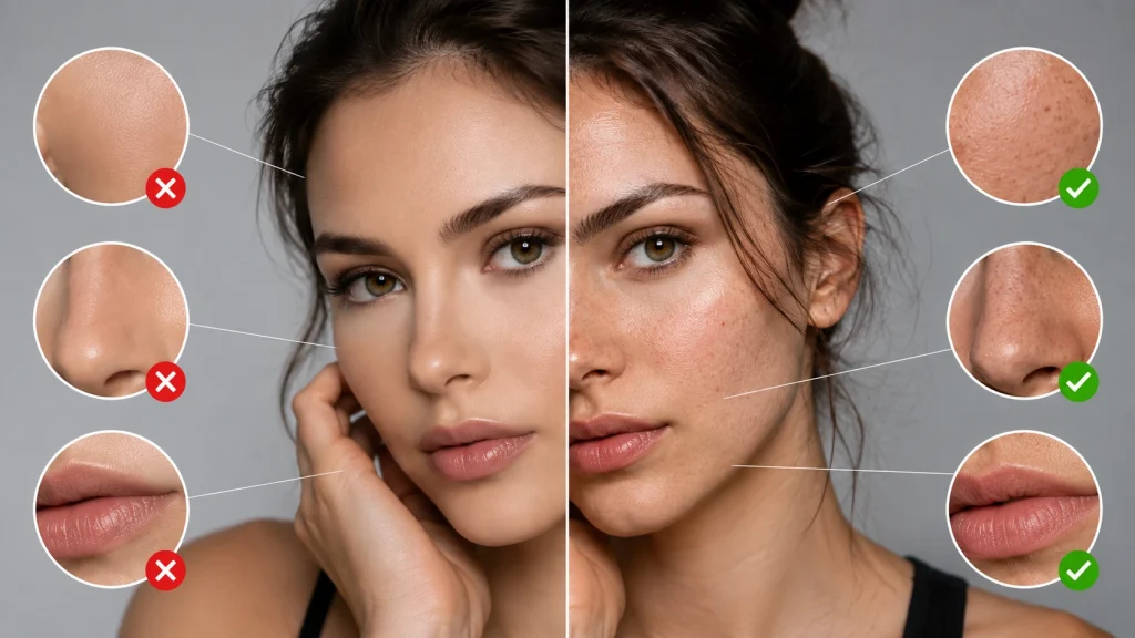
Retouching works best when the viewer notices the subject, not the cleanup. Problems begin when improving skin, fabric, metal, or another surface also removes the small variations that make that material recognizable. The goal is usually to remove distractions while keeping enough natural texture, shape, and tonal behavior intact.
Smoothing Skin or Product Surfaces Until They Look Plastic
Applying heavy blur, aggressive frequency separation, or automated smoothing can erase pores, fabric weave, and subtle surface variation. The result may look clean at first and artificial on closer inspection. But it actually damages the real intent of the image.
So, to avoid such mistakes, treat uneven tone and texture separately. Heal temporary spots, use dodge and burn for tonal irregularities, and preserve high-frequency detail.
And if you want to know where ordinary correction ends and more detailed finishing begins, check out our content on photo retouching.
Whitening Teeth, Eyes, and Highlights Until They Start to Glow
Teeth are not naturally pure white. Neither are the white areas of the eyes. So it’s better not to push bright neutral white, which can make the face disconnected from the lighting around it. The same mistake can happen with pearls, jewelry, chrome, glass, and glossy product highlights.
Removing all that variation makes the edit look synthetic. So, your task with such elements is to slightly reduce unwanted yellow or red selectively and lift luminosity. Keep the local shadows intact. In case of shiny products, preserve the shape of specular highlights because they help describe curvature, finish, and material.
Removing Natural Detail Instead of Removing Distractions
A temporary pimple, dust spot, sensor mark, stray thread, or small scratch can often be removed safely. A permanent facial feature, seam, engraved mark, grain pattern, or product texture may be part of the subject itself.
Before cloning, ask whether the detail is a capture defect or a real characteristic. If it helps identify the material, construction, or person, preserve it unless the brief specifically asks for alteration.
Small Editing Decisions That Quietly Ruin the Result
Not every bad edit comes from one dramatic adjustment. Some of the most frustrating results come from several small choices that seem harmless on their own. A correction applied too broadly, an effect left slightly too strong, or a framing issue ignored early can gradually weaken an otherwise solid image.
Applying Global Adjustments When Only One Area Needs Fixing
A photo with too much bright sky and the subject in the correct position can be solved easily by lowering global exposure and underexposing the subject. But lifting the shadows afterward can create other editing mistakes.
So, mask the sky instead. The same logic applies to skin casts, product labels, distracting backgrounds, or overly sharp texture. Subject masks, color ranges, luminosity selections, and layer masks solve the problem where it exists. Check out our professional editing workflow to understand how local adjustments fit into a non-destructive process.
Letting Presets, Filters, and Vignettes Do Too Much
Applying the same preset settings to every image, regardless of type, is a huge mistake. Because the same preset reacts differently to exposure, lighting, camera profile, skin tone, and palette. At full strength, it can create clipped highlights, muddy blacks, or orange skin.
Correct exposure and white balance first, then modify the preset’s individual components. With vignettes, the viewer should feel a natural falloff, not see a dark ring announcing the effect.
Ignoring Crooked Horizons and Awkward Crops
A photo editor can quickly run into trouble when an image has a tilted horizon or a crop that cuts through fingertips, joints, handles, or essential negative space. These issues are especially noticeable in architecture, real estate, full-body portraits, and e-commerce grid images.
Before cropping, straighten the image first, then compose it for the final destination ratio. It’s also important to compare neighboring images: scale, headroom, product placement, and horizon level should feel intentional and consistent across the entire set.
Ecommerce Photo Editing Mistakes Customers Can Actually Notice

When editing photos for any e-commerce platform, always preserve the product’s true appearance, its color, size, shape, edges, proportions, and material. The image should accurately reflect how the product looks in real life. Any edit that alters these visual details can mislead customers and reduce the image’s effectiveness, no matter how polished or dramatic it looks.
Leaving Jagged Edges, Halos, or Missing Detail After Background Removal
Background removal becomes tricky, especially when the image has hair, fur, lace, transparent plastic, glass, soft fabric, and narrow openings. Those hard paths can create a cut-paper edge, while a loose mask leaves old background color as a fringe.
There are two ways to solve such photo editing mistakes: image masking and clipping paths. Choose the method based on the product’s edges and level of detail.
Use clipping paths for clean, solid boundaries and masking for soft, fine, or semi-transparent details. Always inspect the result against both light and dark backgrounds. The product background color can also affect how edge contamination and tonal separation appear.
Adding Shadows and Reflections That Do Not Match the Light
A shadow must agree with the light source. Direction, softness, opacity, contact point, and perspective all matter. When those cues disagree, the composite feels wrong even if the viewer cannot explain why.
Start your photo editing by adjusting the contact shadow, then build softer falloff away from the product. Reflections should follow geometry and material. A watch, matte shoe, and glass bottle cannot share the same reflection treatment.
Letting Color, Crop, Scale, or Background Drift Across a Product Catalog
When editing photos for an e-commerce catalog, consistency is essential. Making one image look polished while leaving flaws in others can make the entire collection feel disorganized, especially when product size, warmth, background value, or cropping varies from SKU to SKU.
Use measurable references from Amazon’s technical image requirements to maintain consistency in canvas size, product occupancy, baseline, background, color, shadow, and export settings. Amazon’s current requirements also state that product images should be at least 1,000 pixels on the longest side, so resolution and output checks should be part of the final QC process.
Breaking the Garment Shape in Ghost Mannequin Editing
When working to remove a mannequin, editors often struggle to maintain the garment’s construction around the neckline, sleeve openings, inner label, and back panel. Poor editing can reconstruct areas, create duplicated seams, uneven shoulders, stretched collars, or fabric that looks pasted on.
And rebuild missing areas from a compatible inside or back shot, align seam direction, preserve texture, and check symmetry at normal view. Similar material discipline applies to reflective products, which is why jewelry photo editing requires controlled reflections without erasing real surface character.
Workflow Mistakes That Make Easy Editing Difficult
Sometimes the final image fails because of the way the edit was handled, not because the editor lacked technical skill. A weak workflow makes corrections harder to reverse, increases inconsistency, and creates unnecessary problems during revision or export. Good post-production should leave enough control to change direction without rebuilding the file.
Editing Destructively Without a Clean Original or Version
If you paint, erase, filter, and transform only the working layer, then every new decision depends on the previous one. That can become a problem when you need the original texture back or discover that an early correction caused the issue.
Keep the main source untouched. Use adjustment layers, masks, Smart Objects, and layered masters where revisions are likely. The goal is not dozens of layers. It is keeping important decisions reversible.
Skipping Lens and Geometry Corrections Until the End
Distortion, chromatic aberration, perspective convergence, and vignetting can affect later choices. Correcting strong perspective after a final crop may remove more frames than expected, while late vignette removal can change edge brightness enough to upset earlier tonal work.
Fix obvious optical issues near the beginning. For repeated product or real estate sets, apply consistent profiles when the same camera and lens combination is used.
Re-Saving JPEGs Until Compression Starts Damaging the Image
JPEG is efficient for delivery but uses poor compression. Repetitive editing and saving can introduce blockiness, ringing, color smearing, and fine-detail loss, especially around text and high-contrast edges.
Keep a RAW, PSD, TIFF, or another suitable master, then export delivery JPEGs from it. If the source is already JPEG, avoid unnecessary save cycles and work from the highest-quality version available.
A damaged scan is a different task. If your question is how to edit damaged photos with tears, scratches, fading, or missing areas, that belongs to restoration. The tools overlap, but reconstruction and authenticity decisions are different from correcting an ordinary edit.
AI Photo Editing Mistakes That Still Need Human Review

Yes, AI can speed up selections, cleanup, background removal, and repetitive adjustments. However, AI-edited photos can still contain subtle errors and require human review to ensure the final result is accurate, natural, and fit for purpose. Generative tools can look convincing while quietly changing something the job requires you to preserve.
Trusting Auto-Enhance Without Checking What It Changed
Auto-enhance can adjust exposure, color, contrast, sharpening, and noise reduction together. That is fast, but it can hide which change caused a bad result.
Use automation as a first pass. Toggle against the original, inspect important colors and tones, then reduce individual corrections where needed. For batch work, test different image types before applying one setting to the entire folder.
Accepting AI Artifacts Around Faces, Hair, Hands, Text, or Reflections
Generative editing creates plausible pixels, but that does not guarantee a finished or accurate result. Check fingers, earrings, hair strands, labels, logos, patterns, reflections, jewelry settings, fabric stitching, and straight architectural lines.
For accuracy-sensitive work, compare the generated region with another source image. If cleanup changes a bottle shape or shoe stitching, it has become a product alteration. Our guide on whether AI can edit photos professionally explains where automation helps and where manual control still matters.
Using Generative Editing When Product Accuracy Must Stay Exact
A lifestyle campaign may allow creative generation, but e-commerce product listings require a much higher level of accuracy. Be extra careful when working with AI; it can produce an instant, polished result while unintentionally changing the product itself.
Restrict AI to tasks that do not redefine the product, then verify against the source. Keep an untouched reference visible during QC. The more commercially specific the detail, the less useful “looks believable” becomes as the only standard.
How Much Photo Editing Is Too Much?
There is no universal slider value where editing suddenly becomes excessive. The limit depends on what the image needs to accomplish. I consider an edit too heavy when additional changes stop solving visible problems and begin damaging useful detail, accuracy, consistency, or the natural relationship between different parts of the image.
Use the 4-Question Overediting Test
Before export, ask:
1. Does the image still look believable at normal viewing size?
2. Have I preserved important texture and tonal detail?
3. Are skin tones or product colors still plausible and accurate?
4. Does this image still match the rest of the gallery or catalog?
If two answers make you hesitate, pull the edit back and compare after a short visual break. Your eyes adapt quickly, so fresh viewing often reveals saturation, warmth, contrast, or smoothing that felt normal minutes earlier.
Run a 3-Stage Quality Check Before Export
First, inspect at 100% zoom for sharpening halos, noise, masking fringes, cloning repeats, skin texture, dust, and AI artifacts. Then return to fit the view to judge contrast, color balance, crop, and overall realism.
Finally, make a reference comparison against the original, approved sample, or neighboring images. That catches drift. If you are building a repeatable routine, these photo editing tips add practical checks without turning QC into a complicated process.
How to Stop Making the Same Photo Editing Mistakes
Spotting a mistake once is useful, but repeatedly catching it at the end of production wastes time. The better solution is to build checks into the editing process itself. A consistent order, reliable references, and deliberate quality control make problems easier to catch before they spread across the final image or an entire batch.
Build a Repeatable Editing and QC Order
Set a workflow and use it when working with repetitive editing. Start with source checking, lens correction, baseline exposure and white balance, local corrections, color work, retouching, sharpening, crop/output, and final QC. Change it when the job requires, but avoid random slider chasing.
For repeated sets, keep the first approved file visible. Use it as the control for crop, color, shadow, and retouching style. That reduces drift far better than trying to remember how the previous image looked.
Know When a Second Pair of Eyes Makes Sense
Don’t assume the job is finished just because the editing is done. The final image still needs a careful review. After prolonged editing, it’s easy to lose perspective; warm images may no longer feel warm enough, or heavy smoothing may begin to look excessive.
As a second reviewer, don’t redo the file. You just need to spot what the primary editor has failed to see.
For critical work, separate editing and QC when possible. Compare against the brief and reference, not personal taste. Even a short visual break before review can expose problems that were invisible during the edit.
When High-Volume Editing Becomes a Workflow Problem
If the same mistake appears across dozens of files, define the standard instead of adding more random corrections: approved sample, crop rules, background value, color reference, retouching limits, naming convention, export profile, and QC checklist.
Outsourcing can make sense at that stage, but the value is not simply speed. A strong production team follows a repeatable specification, isolates exceptions, and reduces the correction work that comes back to your side.
Frequently Asked Questions
What Is the Most Common Mistake in Photo Editing?
There is no reliable dataset proving one universal winner. In practice, over-editing appears repeatedly because it produces several familiar problems: oversaturation, excessive contrast, oversharpening, heavy smoothing, and unnecessary effects. Smaller adjustments and frequent comparisons with the original are safer than one large correction.
Why Do My Edited Photos Look Fake?
Photos usually look fake when editing removes natural variation. Check for clipped highlights, crushed shadows, neon color, plastic skin, glowing whites, excessive local contrast, artificial shadows, and inconsistent generated detail. Texture, tonal transitions, edge quality, and familiar colors such as skin are the fastest diagnostic clues.
Can You Recover Detail From an Overexposed Photo?
Sometimes. RAW files often retain more highlight information than the preview suggests, so Highlights, Whites, or Exposure may recover usable texture. If pixels are genuinely clipped, however, normal tonal correction cannot reconstruct the original detail. Darkening a blank highlight is not the same as recovering information.
How Can You Tell if a Photo Is Oversharpened?
View it at 100% and inspect high-contrast edges. Bright or dark halos, jagged boundaries, exaggerated pores, noisy smooth areas, and brittle texture are common signs. Then check the normal viewing size. Sharpening should improve definition without looking like a visible effect.
Is RAW Better Than JPEG for Fixing Editing Problems?
RAW normally gives more latitude for exposure and white balance corrections because it contains less-processed capture data. JPEG can still be edited well, but aggressive recovery is less forgiving. Whatever the source, keep a clean original and avoid repeated JPEG saves when revisions are likely.
How Do You Know When to Stop Editing?
Stop when the image meets its purpose, important details remain believable, and another adjustment is no longer solving a specific problem. Compare with the original and the rest of the set. If you are moving sliders only because the image feels unfinished, review it after a short break.
Do Professional Photo Editors Make Mistakes Too?
Yes. Experience reduces predictable errors, but professionals can still develop visual fatigue, miss a mask edge, push a grade too far, or overlook inconsistency. Reliable editors use references, reversible workflows, calibrated tools, and structured QC to catch those problems before delivery.
Final Thoughts
Most common photo editing mistakes trace back to the same handful of causes: rushing the edit, trusting default settings, or skipping the second look that would have caught the problem.
Building a quick review habit, whether that is the histogram, the 100 percent zoom test, or a second-eye check, fixes the majority of these before they ever reach a client or a customer. For catalogs and high-volume work where consistency matters most, handing the editing to a team that runs these checks on every single image is usually the faster and more reliable fix.