Have you ever edited a photo or video that looked technically correct but still lacked depth, mood, or visual impact? That’s where color grading makes the difference. It transforms balanced images into polished visuals by refining color relationships, tonal contrast, and overall atmosphere.
Unlike color correction, which fixes technical issues, color grading focuses on creating a consistent and intentional visual style. Whether you’re editing portraits, product photos, real estate images, or cinematic footage, understanding the right workflow helps you achieve natural, professional-looking results instead of relying on presets or guesswork.
In this guide, you’ll learn what color grading is, how it works, the tools professionals use, common mistakes to avoid, and how AI is changing modern post-production.
See how our eCommerce Image Editing Services help brands create clean, consistent, and high-converting product catalogs.
What Is Color Grading?
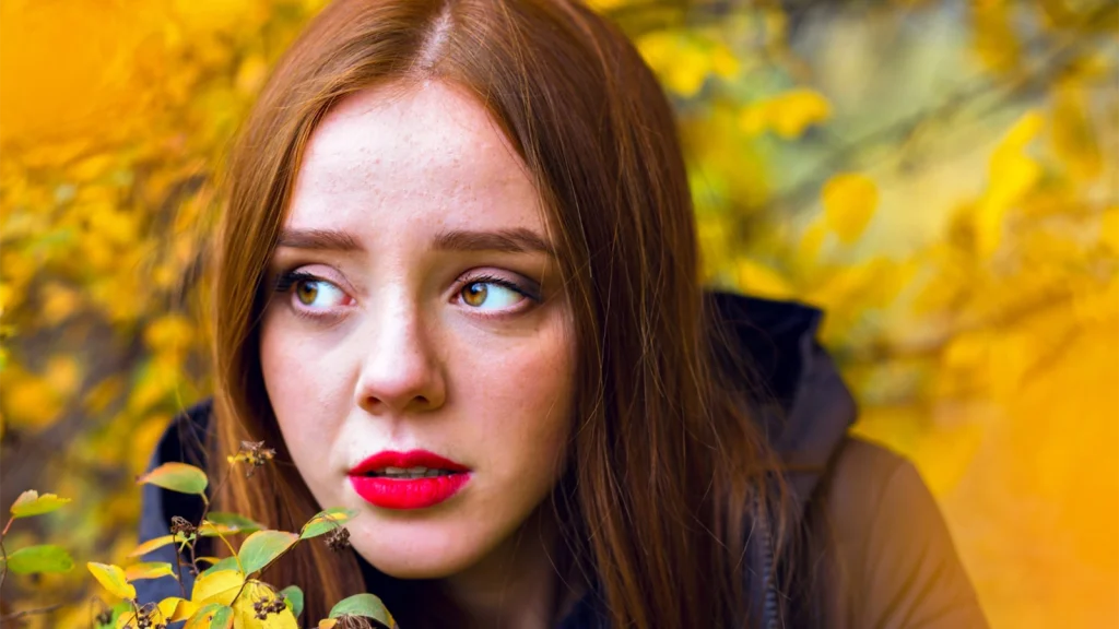
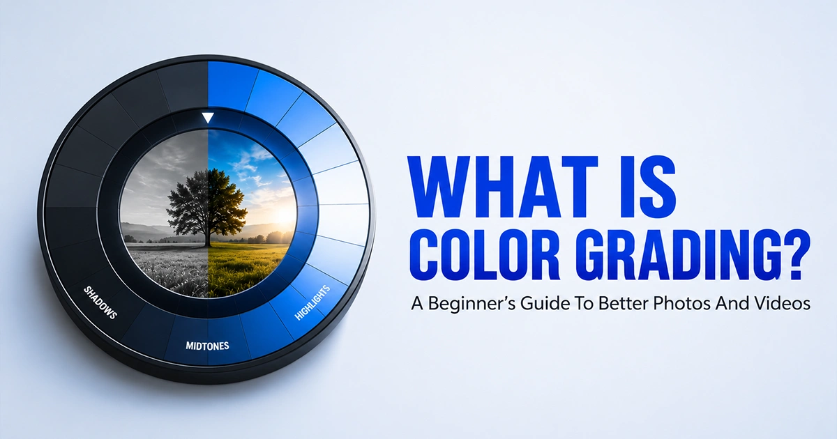
Color grading is the process of controlling how an image’s luminance, color relationships, and tonal separation work together after the technical color corrections are complete. Instead of fixing editing errors, it refines the visual balance between the subject, lighting, and surrounding colors to produce a consistent result.
This allows photographers and retouchers to maintain accurate skin tones, preserve brand colors, match images from different cameras, and create a unified look across an entire project.
What Does Color Grading Actually Change?
Image grading doesn’t simply make an image more colorful. It changes how the entire image is perceived by controlling the balance between light, color, and contrast. Every adjustment should support the subject instead of distracting from it.
A professional color grade can refine:
- Highlights and shadows to add depth without losing important details.
- Midtones to keep skin tones and key subjects looking natural.
- Contrast and tonal range to create better separation between light and dark areas.
- Color balance to remove unwanted color bias and build a consistent look.
- Individual colors using HSL or color wheels to strengthen or soften specific hues.
Beyond these adjustments, image grading also plays an important role in professional workflows by helping editors:
- Establish a consistent visual style across all photos and videos.
- Guide the viewer’s attention toward the main subject.
- Match images or footage captured with different cameras and lighting conditions.
- Maintain accurate brand colors and natural skin tones throughout a project.
Why Does Color Grading Matter?
A technically correct image isn’t always visually engaging. Good color grading adds emotion, depth, and consistency without making the edit look artificial.
It matters because it helps you:
- Create a mood that matches the story, brand, or subject.
- Build a consistent look across an entire photo gallery or video.
- Improve subject separation using color and tonal contrast.
- Make portraits feel more natural with balanced skin tones.
- Keep product colors consistent across eCommerce catalogs.
- Deliver images that look polished on websites, social media, and print.
Professional photographers and retouchers don’t grade images to make them look “more colorful.” They grade them to control how viewers experience the final image.
How Professionals Grade Photos and Videos?
Post-production grading begins after color correction. First, photographers or retouchers balance the image by correcting exposure, white balance, and overall color accuracy. Only then do they apply creative adjustments.
A typical creative grading workflow looks like this:
- Correct exposure and white balance.
- Balance highlights, shadows, and midtones.
- Refine individual colors with HSL, Curves, or Selective Color.
- Apply a creative look using Color Wheels or LUTs.
- Fine-tune skin tones, brand colors, and overall color harmony.
- Review the final image for consistency across the entire project.
The goal isn’t to apply dramatic effects. It’s to create a natural, cohesive look that supports the subject and remains consistent from the first image to the last.
Color Grading vs. Color Correction
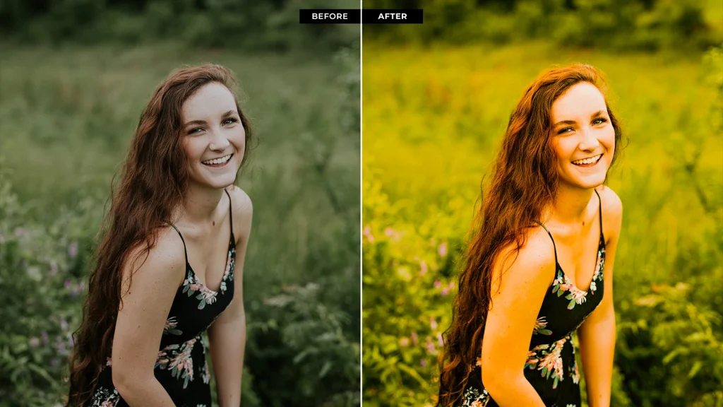
Color correction and color grading are two separate stages of post-production. Color correction restores technical accuracy, while image grading refines the image’s visual character.
Understanding this difference helps you build a non-destructive editing workflow and prevents creative adjustments from amplifying technical defects.
| Color Correction | Color Grading |
|---|---|
| Corrects exposure and white balance. | Shapes the image’s visual style. |
| Removes color casts and restores neutral colors. | Refines color relationships and tonal contrast. |
| Recovers highlight and shadow detail where possible. | Directs attention using color and luminance. |
| Prioritizes color accuracy and consistency. | Prioritizes mood, depth, and visual identity. |
| Creates the editing foundation. | Builds on the corrected image. |
What Is Color Correction?
Color correction is the process of normalizing an image before creative editing begins. It corrects exposure, white balance, color casts, contrast, black and white points, and overall color accuracy so the image becomes a reliable base for further adjustments. The objective is technical consistency, not creative styling.
Why Do Professionals Always Correct Colors Before Grading?
Every grading adjustment is based on the image’s existing color and tonal data. If exposure or white balance is inaccurate, grading pushes those errors further instead of fixing them.
Professional editors correct first because it allows them to:
- Preserve maximum dynamic range before creative adjustments.
- Produce accurate skin tones and product colors.
- Match files captured under different lighting or camera profiles.
- Maintain consistent luminance and color balance across the project.
- Apply LUTs and color wheels without introducing unwanted color shifts.
For this reason, professional workflows always follow the same order:
RAW Processing → Color Correction → Color Grading → Final Export
Where is it used?
Color grading has become a standard part of modern post-production across photography, filmmaking, advertising, and digital content. According to the International Color Consortium, consistent color management is essential for maintaining accurate color reproduction across different devices, displays, and print workflows. Professional color grading builds on this consistency to create visually cohesive results.
How Does Color Grading Enhance Photos?
Color grading in photo editing focuses on refining an image’s luminance, color balance, and local color relationships after correction. By selectively controlling tonal regions and individual colors, editors enhance subject separation, depth, color harmony, and visual consistency while preserving accurate details and natural-looking results.
Professional editors rarely increase global saturation. Instead, they selectively adjust individual colors, luminance, and tonal transitions to keep the image realistic and visually balanced.
Using Color Grading in Video Production
Color grading in video editing refines the visual style of an entire sequence by controlling color consistency, tonal balance, and scene-to-scene continuity. Editors selectively adjust shadows, midtones, highlights, and individual colors to maintain visual continuity, direct viewer attention, reinforce mood, and create a cohesive look across every shot.
The Role of Color Grading in Film
Color grading in film production shapes the visual identity of a movie by refining color palettes, tonal contrast, and scene continuity. It establishes a consistent cinematic look, reinforces mood, guides audience attention, and supports the narrative through deliberate color relationships across every scene.
Film grading is evaluated across hundreds of consecutive shots. Every transition must look seamless, ensuring the audience stays immersed in the story rather than noticing changes in color or exposure.
Professionals Color Grade Images in 6 Steps
Professional creative grading follows a structured workflow in which each adjustment builds on the previous one. Following the correct sequence helps produce balanced colors, controlled contrast, and consistent results without introducing unwanted color shifts.
Step 1: Start With a Clean, Corrected Image
Before creative grading, correct technical issues so you have a reliable foundation for every adjustment.
What to do:
- Correct exposure and white balance.
- Remove lens distortions, noise, and color fringing.
- Recover highlight and shadow details.
Step 2: Balance Exposure and White Balance
A neutral image makes every color adjustment more predictable and easier to control.
What to do:
- Set accurate exposure and black/white points.
- Neutralize unwanted color casts.
- Verify adjustments using the Histogram or Waveform.
Step 3: Shape Contrast and Tonal Range
Build depth by refining tonal relationships before changing colors.
What to do:
- Adjust contrast with Curves.
- Balance shadows, midtones, and highlights.
- Preserve texture by avoiding clipped tones.
Step 4: Build the Color Mood With Curves, Color Wheels, or LUTs
Once the image is balanced, develop a color palette that complements the subject and lighting.
What to do:
- Refine colors with Curves, Color Wheels, or HSL.
- Apply LUTs only as a starting point.
- Compare with the original to maintain natural colors.
Step 5: Protect Skin Tones and Important Colors
Not every color needs equal adjustment. Prioritize colors that viewers notice most.
What to do:
- Fine-tune skin tones and brand colors.
- Use masks or selective color adjustments.
- Keep colors realistic and consistent.
Step 6: Review, Match, and Export
Check the entire project before exporting to ensure every image or clip looks consistent.
What to do:
- Compare images side by side.
- Check exposure, contrast, and color consistency.
- Export using the appropriate color space.
Essential Tools Every Editor Should Know
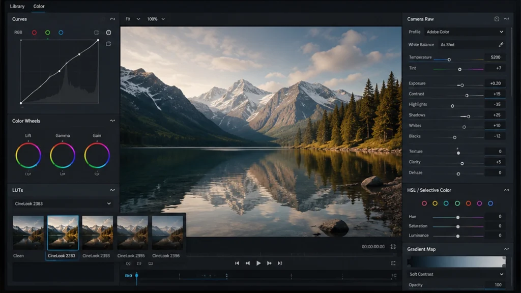
No single tool can produce a professional color grade. Each one solves a specific problem, whether it’s balancing tones, refining individual colors, matching footage, or creating a consistent visual style. Understanding the purpose of each tool helps you choose the right adjustment instead of relying on presets.
Curves
Best for controlling tonal contrast.
Curves adjust the brightness of shadows, midtones, and highlights independently, allowing editors to build balanced contrast before adding creative color. It also corrects unwanted color casts through individual RGB channels.
Color Wheels
Best for balancing different tonal regions.
Color Wheels let editors warm or cool shadows, midtones, and highlights separately, making it easier to create natural color balance, match footage, and build cinematic color contrast.
LUTs (Lookup Tables)
Best for creating a consistent starting point.
LUTs instantly convert color profiles or apply a predefined look, helping editors normalize LOG footage or establish a base grade that can be refined manually.
Camera Raw
Best for recovering image data before grading.
Camera Raw restores highlight and shadow detail while correcting exposure and white balance, giving editors cleaner color information for more flexible grading.
HSL & Selective Color
Best for refining individual colors.
These tools adjust specific colors without affecting the entire image, making them ideal for correcting skin tones, preserving product colors, and improving overall color harmony.
Gradient Maps
Best for creating creative color styles.
Gradient Maps map different colors to shadows and highlights, allowing editors to build cinematic looks while preserving the image’s tonal structure through subtle blending.
Best Software for Professional Color Grading
Professional grading software differs in color management, grading tools, and workflow. Choosing the right application depends on whether you’re editing photos, videos, or commercial projects that require precise color control.
Adobe Photoshop
Photoshop is ideal for single-image color grading because it combines powerful adjustment layers with precise masking and retouching tools.
It helps you:
- Grade individual photos non-destructively using Adjustment Layers.
- Target specific subjects with masks and selections.
- Combine Curves, Selective Color, Gradient Maps, and Camera Raw in one workflow.
- Refine every adjustment at the pixel level.
Best for: Portraits, product photography, commercial retouching, fashion, automotive, and creative photo editing.
Adobe Lightroom
Lightroom focuses on batch photo color grading and RAW workflow efficiency. Instead of editing one image at a time, it allows photographers to maintain consistent colors across hundreds or thousands of photos.
It helps you:
- Apply the same grade to entire photo collections.
- Synchronize white balance, tone, and color adjustments.
- Organize, compare, and export large image libraries.
- Preserve non-destructive RAW edits.
Best for: Wedding, travel, wildlife, event, and lifestyle photographers.
DaVinci Resolve
DaVinci Resolve is widely regarded as the industry standard for professional color grading. According to Blackmagic Design, its advanced color management, node-based workflow, HDR grading tools, and professional scopes are designed for everything from online content to feature-film production.
It helps you:
- Grade LOG, RAW, HDR, and cinema footage with exceptional precision.
- Match footage from multiple cameras.
- Isolate colors using Qualifiers and Power Windows.
- Monitor exposure and color using Waveform, Vectorscope, RGB Parade, and Histogram.
Best for: Commercials, documentaries, films, YouTube production, broadcast, and high-end video work.
Adobe Premiere Pro
Premiere Pro combines video editing and post-production grading in a single application through the Lumetri Color panel. While it doesn’t offer the same depth as DaVinci Resolve, it provides enough control for most content creators and marketing teams.
It helps you:
- Edit and grade videos without switching software.
- Apply LUTs and corrections directly on the timeline.
- Balance exposure, white balance, and color quickly.
- Deliver social media, YouTube, and marketing videos efficiently.
Best for: YouTube creators, agencies, social media teams, and marketing professionals.
Which One Is Best for Beginners?
If you’re new to creative grading, Adobe Lightroom is usually the easiest place to start for photo editing, while Adobe Premiere Pro offers the smoothest learning curve for video editing.
Both provide intuitive interfaces, non-destructive workflows, and enough professional tools to learn the fundamentals without overwhelming you.
However, there isn’t a single “best” image grading software; there’s a best tool for your workflow:
| Choose… | Why? |
|---|---|
| Adobe Lightroom | Beginner-friendly interface, excellent RAW workflow, and fast batch editing. |
| Adobe Photoshop | Unmatched control with layers, masks, Camera Raw, Curves, and selective adjustments. |
| Adobe Premiere Pro | Integrated editing and Lumetri Color make it easy to learn while editing videos. |
| DaVinci Resolve | Industry-standard color science, advanced scopes, node-based grading, and HDR capabilities. |
Can AI Do Color Grading?
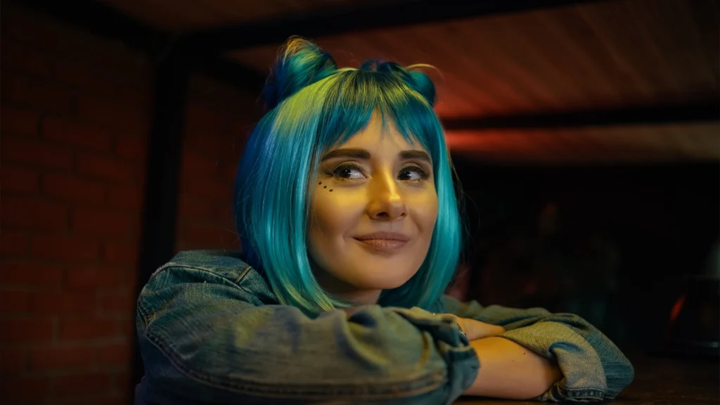
Yes, but only to a certain extent. AI can automate many technical aspects of colour enhancement, such as exposure balancing, white balance correction, color matching, and subject masking.
However, it still relies on learned patterns rather than creative judgment, so professional colorists use AI to speed up repetitive tasks while manually refining the final look.
How AI Helps With Color Grading
AI helps by analyzing an image before manual grading begins. Instead of replacing creative decisions, it identifies technical issues, suggests balanced color adjustments, and automates repetitive corrections, allowing editors to spend more time refining the final look.
AI can help with colour enhancement by:
- Detecting exposure and white balance issues.
- Suggesting balanced color and contrast adjustments.
- Generating subject-aware masks for selective grading.
- Matching colors across multiple images or video clips.
- Automating consistent batch image grading.
Example AI Prompt:
“Analyze this image and apply a natural color grade by correcting exposure, white balance, and color balance. Preserve skin tones, recover highlight and shadow details, and maintain realistic colors without oversaturation.”
Where AI Still Falls Short
AI can process colors accurately, but it cannot understand the creative purpose behind an image. Professional post-production grading often requires decisions based on storytelling, emotion, and commercial accuracy that AI still cannot reliably interpret.
AI still struggles with:
- Mixed lighting and multiple color temperatures.
- Natural skin tones across different lighting conditions.
- Brand and product color accuracy.
- Matching footage from different camera color sciences.
- Building intentional cinematic mood and visual storytelling.
AI vs. Manual Color Grading
AI and manual grading work best together rather than replacing one another. AI improves speed by automating technical corrections, while manual grading ensures creative control, accurate colors, and consistent commercial-quality results.
| Feature | AI Color Grading | Manual Color Grading |
|---|---|---|
| Best At | Technical corrections and batch processing | Creative control and precision |
| Limitation | Limited creative judgment | More time and experience required |
| Ideal Use | Initial color balancing | Final commercial-grade refinement |
Verdict: AI is an excellent productivity tool, but it’s not a replacement for professional colour enhancement. The best results come from combining AI-assisted corrections with manual refinement.
Mistakes That Ruin a Professional Grade
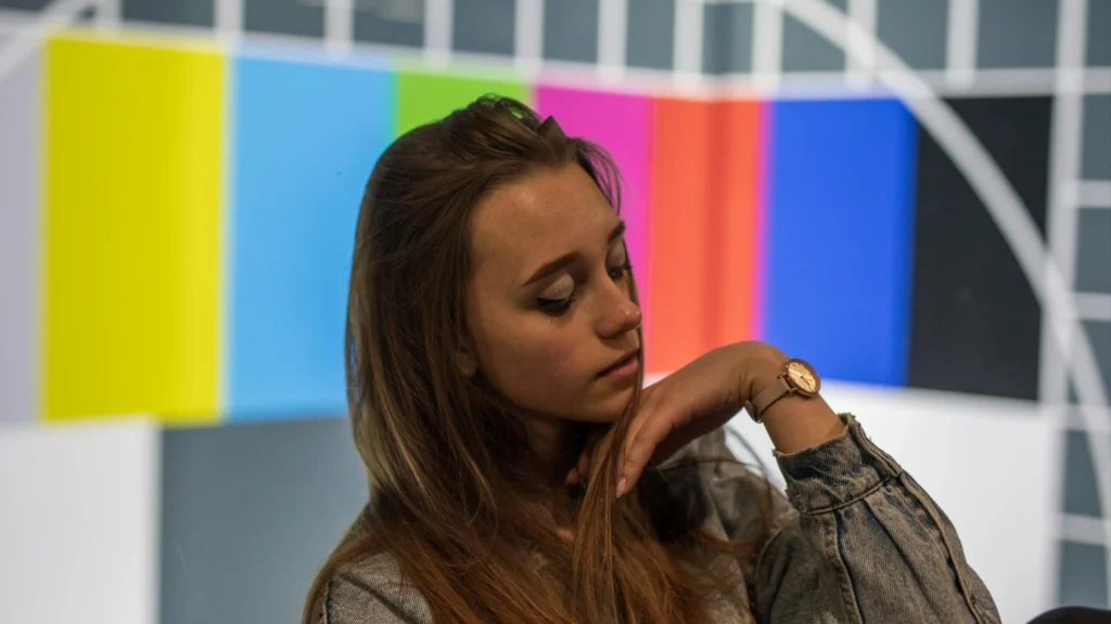
Most color enhancement mistakes don’t happen because of limited software; they happen because beginners follow the wrong editing sequence. Creative adjustments work best on a technically balanced image, so skipping the fundamentals often produces unnatural colors, inconsistent contrast, and poor tonal separation.
Skipping Color Correction
Colour enhancement should always begin with a corrected image. Applying LUTs or creative adjustments before fixing exposure and white balance amplifies existing color casts and tonal problems, making the final grade harder to control.
Over-Saturating Colors
Increasing global Saturation or Vibrance affects every color equally, often causing skin tones, foliage, and bright objects to appear unnatural. Professional editors refine individual colors with HSL or Selective Color instead of boosting the entire image.
Ignoring Skin Tones
Skin is one of the most recognizable colors in any image, so even slight shifts look unnatural. Strong LUTs or aggressive contrast can push skin toward orange, magenta, or green, which is why professionals isolate and refine skin tones separately.
Applying LUTs Without Adjustment
A LUT isn’t a finished color grade. Since it assumes a specific exposure, white balance, and camera profile, applying it without further adjustments often results in inaccurate contrast, clipped highlights, or unrealistic colors.
Editing on an Uncalibrated Display
Grading is only as accurate as your display. An uncalibrated monitor can make images appear warmer, cooler, brighter, or more saturated than they actually are, leading to inconsistent results across different screens and print outputs.
How Offshore Clipping Can Help With Color Grading
Editing hundreds of images while maintaining accurate colors, consistent tones, and fast turnaround can quickly become a production bottleneck. Offshore Clipping helps photographers, eCommerce brands, agencies, and creative studios streamline post-production with professionally color-graded images that meet commercial standards.
Why choose Offshore Clipping?
- ✔ Accurate color correction and professional color grading
- ✔ Consistent results across every image and project
- ✔ Fast turnaround for high-volume editing
- ✔ Dedicated quality control by experienced editors
Stop spending hours perfecting every image. Start your Free Trial or Get a Free Quote today and let our experts deliver consistent, publication-ready results while you focus on creating more content.
Great color grading begins long before creative adjustments. Discover how our Photo Color Correction Services help photographers and brands achieve accurate, consistent, and professional results.
Frequently Asked Questions
Can Photoshop do professional color grading?
Yes. Photoshop offers professional creative grading with Camera Raw, Curves, Color Balance, Selective Color, Gradient Maps, masks, and adjustment layers for precise, non-destructive editing.
Can you color grade a JPEG?
Yes, but with limitations. JPEG files have less color and tonal data than RAW files, reducing flexibility and increasing the risk of banding or clipping after heavy adjustments.
Do I need RAW files for color grading?
No, but RAW files provide greater dynamic range and color information, allowing more precise exposure, highlight, shadow, and color adjustments without sacrificing image quality.
Is color grading difficult to learn?
The basics are easy to learn, but mastering image grading takes practice. Understanding light, color relationships, and tonal balance is more important than relying on presets.
Can AI replace professional color grading?
No. AI speeds up technical corrections, but it cannot consistently deliver creative decisions, storytelling, accurate brand colors, or the precision required for professional commercial work.
What is cinematic color grading?
Cinematic finishing shapes mood through controlled contrast, balanced colors, and tonal separation, guiding the viewer’s attention while reinforcing the story and visual atmosphere.
Which software is best for color grading?
It depends on your needs: Lightroom for batch photo editing, Photoshop for advanced image grading, Premiere Pro for video, and DaVinci Resolve for professional filmmaking.
Can beginners learn color grading?
Yes. Start with exposure, white balance, and contrast before exploring creative styles. Mastering the workflow builds stronger editing skills than relying on presets alone.
Conclusion
Color grading is more than enhancing colors; it’s about creating images and videos that look balanced, consistent, and visually engaging. By mastering the fundamentals of exposure, white balance, contrast, and color relationships, you can build grades that feel natural rather than overprocessed.
While AI and presets can speed up technical adjustments, they work best as starting points, not complete solutions. Whether you’re editing personal projects or commercial work, following a structured workflow and refining your creative decisions will consistently produce better results. Great color grading doesn’t distract from the subject; it enhances the story, mood, and overall visual impact.